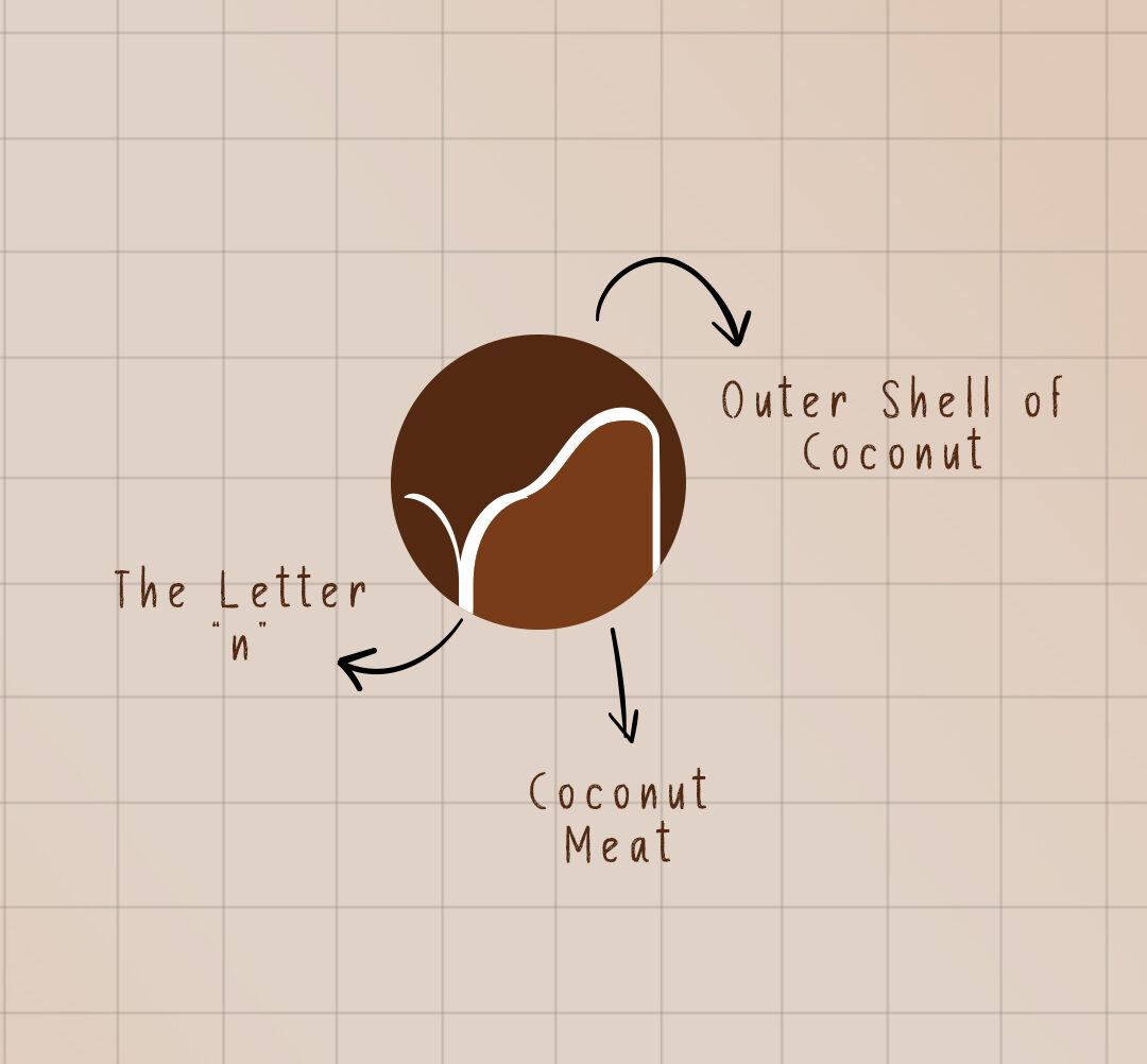
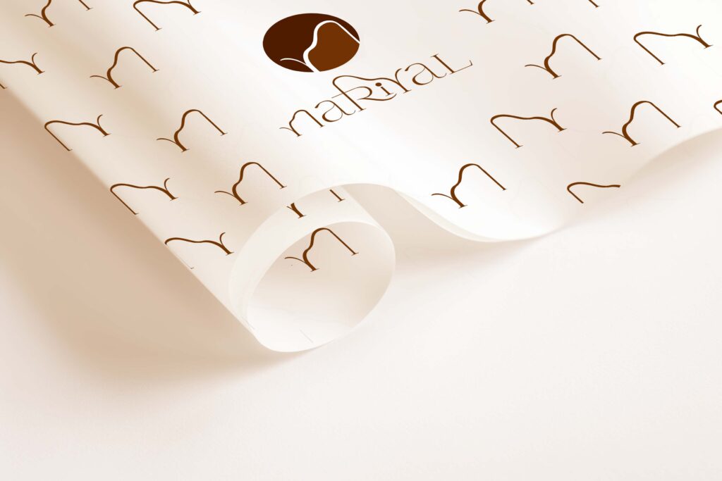
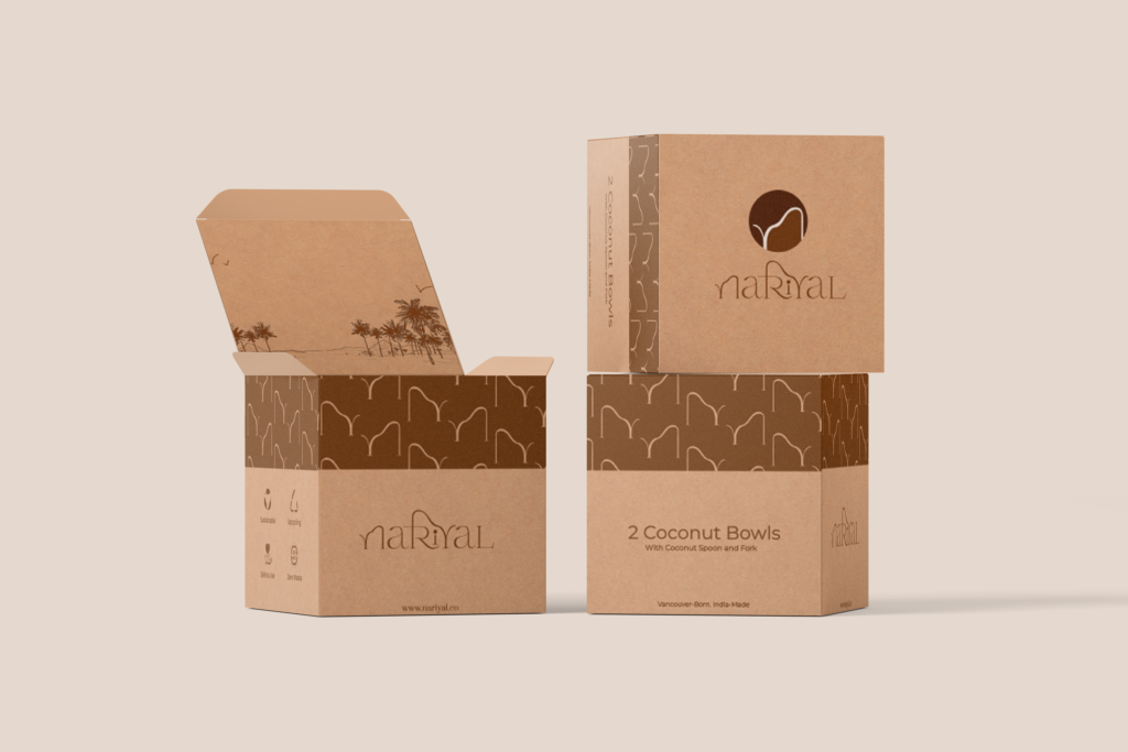
From concept to creation, we brought the essence of Nariyal to life with a brand identity that’s as refreshing and rooted as the product itself. One of our biggest challenges was positioning Nariyal — a Canada-based Indian brand — in a way that felt authentically Indian yet globally appealing. To bridge this cultural connection, we thoughtfully incorporated a Devanagari ‘R’ into the logo, subtly tying back to its Indian roots, while blending it with the silhouette of a coconut tree to reflect freshness and nature.
The visual language — from serene color palettes and minimal typography to packaging that feels both premium and grounded — was designed to reflect purity, wellness, and simplicity, making Nariyal stand out on shelves and stay top-of-mind in hearts
Professional product photography that fits your budget. 🤝
You get👇
✅High-quality, scroll-stopping product photos
✅Styled setups that match your brand vibe
✅Content you can actually use across Instagram, website & ads
And the best part —
This isn’t a high-agency budget situation.
So if you’re serious about upgrading your brand visuals
DM us ‘SHOOT’ and let’s make your products look as good as they deserve.📸
--
Product Photography, Product Shoot, Visual Branding, Content Creation, Brand Photoshoot, Premium Brand Look, Brand Glow Up, Upgrade Your Visuals, Better Product Photos, Small Brands, Startup Brands, Handmade Business, Elevate Your Brand, Premium Visuals, Studio Quality, Creative Direction, Product Styling, Brand Identity, Design Studio, Indian Brands
#limitedslots #bookashoot #brandingagencyindia
You’ve already worked hard on your product 💫
Don’t let average visuals make it look average
DM us “SHOOT”and let’s fix that 💌👀
--
Product Photography, Product Shoot, Visual Branding, Content Creation, Brand Photoshoot, Premium Brand Look, Brand Glow Up, Upgrade Your Visuals, Better Product Photos, Small Brands, Startup Brands, Handmade Business, Elevate Your Brand, Premium Visuals, Studio Quality, Creative Direction, Product Styling, Brand Identity, Design Studio, Indian Brands
#limitedslots #bookashoot #brandingagencyindia
Many people focus only on the design and forget about the material it’s printed on.
Different papers have different textures, strength, and feel.When the right paper meets the right design, the finished product truly comes to life. But when it’s ignored, even a great design can lose its charm.
Because in printed materials, the canvas matters just as much as the artwork. 🎨📄✨
--
Packaging Design, Paper Insights, Packaging Strategy, Brand Collaterals, Textured Paper, Matte Paper, Glossy Paper, Kraft Paper, Recycled Paper, Paper Finish, Premium Branding, Print Design, Branding 2026, Startup Advice, Sensory Branding, Brand Perception Strategy, Modern Brand Building, Brand Transformation
#packagingdesign #printdesign #luxurypackaging #designinsights #graphicdesignerindia graphicdesignermumbai designagencyindia designagencymumbai logodesignerindia
If this reel finds a girl building her brand from scratch… this is your sign ✨
You don’t need a huge budget to make your products look premium.
You just need the right shoot.
We offer professional product photography that actually makes sense—no overpricing, just quality that sells.
Comment “Hi” and let’s create something amazing together 💬
[Girls, Women, Business, Girl led Business, Women Led Brand, Product Shoot, Photo Shoot, Photography, Product Photography, Scribbled Space, Building Brands, Trending, Collaboration, Lets Collab]
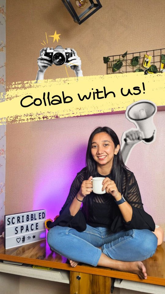
Calling all small brands ✨
We’re offering professional product shoots - without the hefty price tag.
Want to collaborate and showcase your brand?
DM “SHOOT” 📩
Know someone who needs this? Share this reel with them.
--
Small Brands, Product Photography, Brand Shoot, Product Shoot, Product Styling, Blurry Photos, Bad Lighting, Stock Images, Branding Mistakes, Content Problems, Brand Struggles, Small Business Problems, Brand Glowup, Levelup Your Brand, Photoshoot, Brand Identity, Creative Direction, Design Studio, Indian Brands
#limitedslots #workwithus #bookashoot #brandingagencyindia
Quick question—what’s the FIRST thing you see in a café? ☕👀
--
[Brand Identity, Interior Branding, Brand Experience, Design Storytelling, Brand Aesthetics, Color Palette, Typography Design, Menu Design, Custom Tableware, Logo Design, Brand Strategy, Cafe Branding, Creative Direction, Premium Branding, Design Studio, Indian Brands, Menu Design, Branding Inspiration]
#interiorbranding #brandingdesign #cafebranding #brandingagencyindia #designagencyindia graphicdesignagencyindia
Watch till the end to see how we built this brand identity. 🔥 @madrascrust
An outdoor pizzeria café inspired by nature, open fire, and the art of slow-crafted food. Every detail is designed to feel raw, warm, and just a little magical. ✨🍕
If you love thoughtful, detail-driven logo design like this, get in touch with us.
--
[Brand Identity, Logo Design, Brand Strategy, Cafe Branding, Icon Logo, Chennai , Food Outlets
Brand Collaterals, Creative Direction, Premium Branding, Design Studio, Indian Brands, Minimalist Branding, Menu Design, Branding Inspiration, Pizzeria Branding, Cafe Opening, Opening, Launch]
#brandingdesign #cafebranding #brandingagencyindia #designagencyindia #graphicdesignagencyindia
BTW... you can tap on any reel here and watch it instantly 👀
Loved the new update😍🔥
--
Branding, New Update, New Feature, One Reel, Brand Communication, Brand Experts, Business Owners, Brand Audit, Brand Identity, Brand Building, Brand Positioning, Branding 2026, Brand Transformation
#designagencyindia #brandingagencymumbai #brandingagency
Branding an outdoor pizzeria cafe inspired by nature, fire, and slow-crafted food.⭐️
@madrascrust approached us to build their brand identity from scratch with three key emotions in mind premium, peaceful, and familiar.
An outdoor pizzeria in Chennai inspired by nature, relaxation, and artisan food, the goal was to create a dining experience that feels like a calm escape from the city’s chaos.
To shape the brand, we worked around four defining elements:
Freshness & Wholesomeness
Wood Fire & Craftsmanship
Familiarity & Comfort
Nature & Nurture
The logo was designed as an icon-based mark, while the subtle curves in the letters “d” and “c” are inspired by Tamil script, reflecting the brand’s Madras roots.
For the color palette, we chose earthy tones,rich greens, terracotta, sand, and hints of flame orange capturing the warmth of wood-fire cooking and the calmness of nature.
The visual elements echo the ambience of the space wood-fire pizza, slow-made craftsmanship, open green surroundings, and a handcrafted homely atmosphere.
Extending the identity further, we designed brand collaterals including the menu card, where the text placement invites customers to rotate the menu for a dual-sided viewing experience, along with a comprehensive style guide to ensure consistency across the brand.
The final result is a brand that feels premium, peaceful, and familiar perfectly reflecting the essence of Madras Crust.😍
From scratch to logo to menu to full branding, every detail was designed to create a calm, welcoming identity rooted in craft, comfort, and nature.
Swipe to escape the city without leaving it.➡️
--
[Brand Identity, Logo Design, Brand Strategy, Cafe Branding, Icon Logo, Chennai , Food Outlets
Brand Collaterals, Creative Direction, Premium Branding, Design Studio, Indian Brands, Minimalist Branding, Menu Design, Branding Inspiration, Pizzeria Branding, Cafe Opening, Opening, Launch]
#brandingdesign #cafebranding #brandingagencyindia #designagencyindia #graphicdesignagencyindia
Not sure what your brand should do next? 🤔
That’s exactly what we help with.
Comment “CONSULTATION” 💬 for more details.
—
Brand Consultation, Brand Direction, Brand Clarity, Brand Positioning, Brand Communication, Brand Experts, Business Owners, Brand Audit, Brand Identity, Brand Building, Startup Advice, Start Up Branding
#brandingagencyindia #graphicdesignagencyindia #designagencyindia #brandingagencymumbai #brandingagency
Feeling like something’s ‘off’ in your brand? Let’s fix it through a focused Brand Consultation.🎯
--
Brand Realignment, Brand Positioning, Brand Communication, Brand Gap, Product-Perception Gap, Build Your Brand, Business Growth, Digital Brand Presence, Brand vs Product, Branding vs Marketing, Business Owners, Audit, Logo, Color Palette, Typography, Photography, Brand Consultation, Brand Clarity, Brand Building, Startup Advice, Start Up Branding
#brandingagencyindia #graphicdesignagencyindia #designagencyindia #brandingagencymumbai #brandingagency
2026 just rewrote the branding rulebook. And most brands didn’t even notice. 👀⚠️
--
Branding 2026, AI & Branding, Digital Brand Evolution, Brand Strategy, Brand Clarity, Brand Building, Business Growth, Startup Advice, Brand vs Product, Branding vs Marketing, Sensory Branding, Brand Perception Strategy, Real vs AI Content, Brand Differentiation, Modern Brand Building, Brand Transformation, Branding
#graphicdesignerindia #graphicdesignermumbai #designagencyindia #designagencymumbai #logodesignerindia
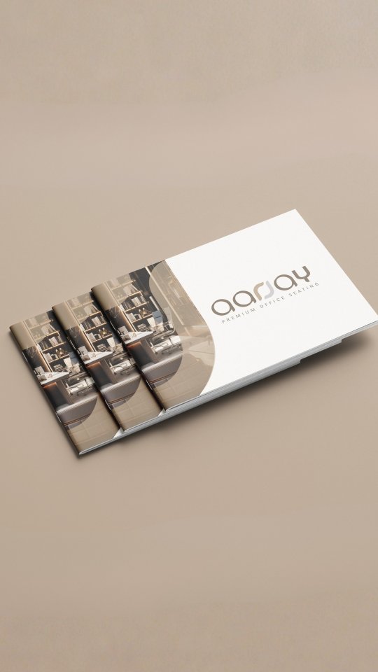
Rebranding Aarjay; A Fresh Take on Premium Seating
Aarjay is known for its wide range of office chairs and home seating, but their old identity didn’t quite match the premium quality of their products.
⚠️They reached out to us for a complete rebrand, with one clear goal , to look and feel as premium as the experience they offer.
👉We took a step back and decided to switch things up. From refining the logo and its elements to introducing a cleaner color palette and modern typography, every detail was reworked to give the brand a more polished and contemporary direction.
The idea was simple: keep it minimal, refined, and timeless.
Beyond the core identity, we carried the new look across all brand touchpoints; brand collaterals, stationery, and social media. To maintain a consistent and elevated presence online, we also used AI-generated imagery that aligns seamlessly with the brand’s new visual language.
The result is a brand that finally feels as premium as the seating it creates.
Swipe through to see the transformation⚡️
--
Rebranding, Brand Identity, Logo Design, Visual Identity, Typography Design, Color Palette, Brand Collaterals, Stationery Design, Social Media Design, Creative Direction, Premium Furniture, Brand Transformation, Branding, Premium Branding, Furniture Brand, Design Studio, Indian Brands
#graphicdesignerindia #graphicdesignermumbai #designagencyindia #designagencymumbai #logodesignerindia


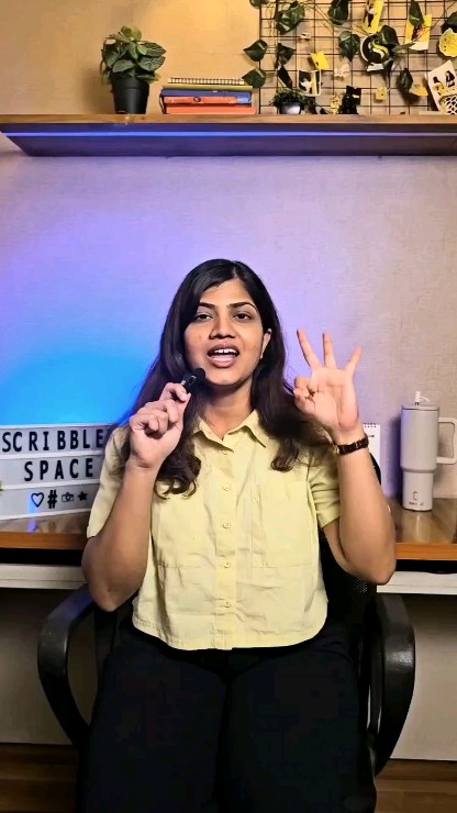
![If this reel finds a girl building her brand from scratch… this is your sign ✨
You don’t need a huge budget to make your products look premium.
You just need the right shoot.
We offer professional product photography that actually makes sense—no overpricing, just quality that sells.
Comment “Hi” and let’s create something amazing together 💬
[Girls, Women, Business, Girl led Business, Women Led Brand, Product Shoot, Photo Shoot, Photography, Product Photography, Scribbled Space, Building Brands, Trending, Collaboration, Lets Collab]](https://scribbledspace.in/wp-content/uploads/2025/03/671114966_18227987749311590_6868305233484609768_n.jpg)
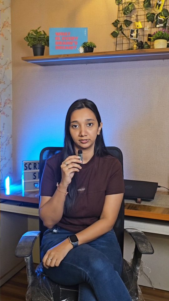
![POV: Your brand finally gets the photos it deserves 📸🔥
--
[Small Brands, Product Photography, Small Brand Photography, Brand Visuals, Product Shoot, Startup Brands, Elevate Your Brand, Premium Visuals, Studio Quality, Creative Direction, Product Styling, Brand Glowup, Levelup Your Brand, Photoshoot, Brand Identity, Design Studio, Indian Brands]
#collab #bookashoot #brandingagency #logodesinger #mumbaidesigner](https://scontent-bom2-3.cdninstagram.com/v/t51.82787-15/670343674_18227339524311590_8792348788362360982_n.webp?stp=dst-jpg_e35_tt6&_nc_cat=103&ccb=7-5&_nc_sid=18de74&efg=eyJlZmdfdGFnIjoiQ0FST1VTRUxfSVRFTS5iZXN0X2ltYWdlX3VybGdlbi5DMyJ9&_nc_ohc=QLTgsTxe7c0Q7kNvwEgr7g3&_nc_oc=AdpXdK7vlcvdu71jZOaA8amsu4Sj2BrpHbrxZ1WCYRB35dSM8aQROpL3Zt31Zt_duX5rPAhuTvmXXg3EaA1a1cXk&_nc_zt=23&_nc_ht=scontent-bom2-3.cdninstagram.com&edm=ANo9K5cEAAAA&_nc_gid=DxFLG5mNvYXMRW_1NpqXzQ&_nc_tpa=Q5bMBQE6f-CFTkE_ECwOoR2EXdPjCSgzQ45_e-pjC0ZWc0DC72_T2mwUTT6GIOZKAU4mIuNqhEQZpBXq&oh=00_Af_Gb_XBX4YHWB9FmHm6kHnO-r9V07sxH8mNltjbFyIdOw&oe=6A3297F6)
![POV: Your brand finally gets the photos it deserves 📸🔥
--
[Small Brands, Product Photography, Small Brand Photography, Brand Visuals, Product Shoot, Startup Brands, Elevate Your Brand, Premium Visuals, Studio Quality, Creative Direction, Product Styling, Brand Glowup, Levelup Your Brand, Photoshoot, Brand Identity, Design Studio, Indian Brands]
#collab #bookashoot #brandingagency #logodesinger #mumbaidesigner](https://scontent-bom2-3.cdninstagram.com/v/t51.82787-15/670006146_18227339515311590_6512975998880644735_n.webp?stp=dst-jpg_e35_tt6&_nc_cat=103&ccb=7-5&_nc_sid=18de74&efg=eyJlZmdfdGFnIjoiQ0FST1VTRUxfSVRFTS5iZXN0X2ltYWdlX3VybGdlbi5DMyJ9&_nc_ohc=_wnK71xC8kUQ7kNvwGUub33&_nc_oc=AdrujZK6ucn4G-RcoW2tigVa9uyvrWAYtQq8zNpdJ9I5mx8DovasIkXI-mlqow3EicmftBRP-bS4kUkUiY4cgAe-&_nc_zt=23&_nc_ht=scontent-bom2-3.cdninstagram.com&edm=ANo9K5cEAAAA&_nc_gid=DxFLG5mNvYXMRW_1NpqXzQ&_nc_tpa=Q5bMBQHax7hC1d_W-PJF4zeMO9M6mJc-DrYMfpywRN9PJeAF4su1Kh3F2nIdFtbXm-P1YLLpbC5QlVXU&oh=00_Af_pNanvocRWHpAD0cwLqh9kK3JuvYZLwuENRhje_rLkYw&oe=6A3296A4)
![POV: Your brand finally gets the photos it deserves 📸🔥
--
[Small Brands, Product Photography, Small Brand Photography, Brand Visuals, Product Shoot, Startup Brands, Elevate Your Brand, Premium Visuals, Studio Quality, Creative Direction, Product Styling, Brand Glowup, Levelup Your Brand, Photoshoot, Brand Identity, Design Studio, Indian Brands]
#collab #bookashoot #brandingagency #logodesinger #mumbaidesigner](https://scontent-bom5-2.cdninstagram.com/v/t51.82787-15/670823383_18227339533311590_510160244516602930_n.webp?stp=dst-jpg_e35_tt6&_nc_cat=100&ccb=7-5&_nc_sid=18de74&efg=eyJlZmdfdGFnIjoiQ0FST1VTRUxfSVRFTS5iZXN0X2ltYWdlX3VybGdlbi5DMyJ9&_nc_ohc=hGl8gGSWQwMQ7kNvwHTWLZj&_nc_oc=Ado2gJT3Ol48j7ENYYz_4nCTHj9YkdJM8MbUqZ7naL1OhyxGa5liwPrgJlZViljvX1WxDcIDAOtA6fIf39bLSrzC&_nc_zt=23&_nc_ht=scontent-bom5-2.cdninstagram.com&edm=ANo9K5cEAAAA&_nc_gid=DxFLG5mNvYXMRW_1NpqXzQ&_nc_tpa=Q5bMBQGhcNHydevD11YBq0L_zVnynheWb3R98BAcWHk23S6Kt3hOKIyYTiggj1E2iyclGl9qIdi-Sbhe&oh=00_Af-xfcxml3ZUTyKsTu3t7q4S2nBA8xbRQiDMZkdgI2q3CQ&oe=6A327192)
![POV: Your brand finally gets the photos it deserves 📸🔥
--
[Small Brands, Product Photography, Small Brand Photography, Brand Visuals, Product Shoot, Startup Brands, Elevate Your Brand, Premium Visuals, Studio Quality, Creative Direction, Product Styling, Brand Glowup, Levelup Your Brand, Photoshoot, Brand Identity, Design Studio, Indian Brands]
#collab #bookashoot #brandingagency #logodesinger #mumbaidesigner](https://scontent-bom2-1.cdninstagram.com/v/t51.82787-15/670278328_18227339542311590_8090356755590287139_n.webp?stp=dst-jpg_e35_tt6&_nc_cat=107&ccb=7-5&_nc_sid=18de74&efg=eyJlZmdfdGFnIjoiQ0FST1VTRUxfSVRFTS5iZXN0X2ltYWdlX3VybGdlbi5DMyJ9&_nc_ohc=EGUno3moOiAQ7kNvwElz9AZ&_nc_oc=Adrr2teo0-vKBuOMLEzma_Hc4ZO0PYhksWsMQIzcQvya7mEkW3yDlpDy7su3K0clg0WTk4anT_HLOxWQzRH1zmL6&_nc_zt=23&_nc_ht=scontent-bom2-1.cdninstagram.com&edm=ANo9K5cEAAAA&_nc_gid=DxFLG5mNvYXMRW_1NpqXzQ&_nc_tpa=Q5bMBQHrWWw9AKPzezUK0v1EFnm0BMbV7bo-MqDK4ecg82MQhZOAD0eWN7xNFz6wz5i_qtNgixjQBE5z&oh=00_Af865bpDsw3UTAXR_xPBCbqFBTuMyAVJOa4Fror9n5VrCw&oe=6A3289E1)
![Quick question—what’s the FIRST thing you see in a café? ☕👀
--
[Brand Identity, Interior Branding, Brand Experience, Design Storytelling, Brand Aesthetics, Color Palette, Typography Design, Menu Design, Custom Tableware, Logo Design, Brand Strategy, Cafe Branding, Creative Direction, Premium Branding, Design Studio, Indian Brands, Menu Design, Branding Inspiration]
#interiorbranding #brandingdesign #cafebranding #brandingagencyindia #designagencyindia graphicdesignagencyindia](https://scribbledspace.in/wp-content/uploads/2025/03/661730068_18226722064311590_6682878964062534332_n.jpg)
![Watch till the end to see how we built this brand identity. 🔥 @madrascrust
An outdoor pizzeria café inspired by nature, open fire, and the art of slow-crafted food. Every detail is designed to feel raw, warm, and just a little magical. ✨🍕
If you love thoughtful, detail-driven logo design like this, get in touch with us.
--
[Brand Identity, Logo Design, Brand Strategy, Cafe Branding, Icon Logo, Chennai , Food Outlets
Brand Collaterals, Creative Direction, Premium Branding, Design Studio, Indian Brands, Minimalist Branding, Menu Design, Branding Inspiration, Pizzeria Branding, Cafe Opening, Opening, Launch]
#brandingdesign #cafebranding #brandingagencyindia #designagencyindia #graphicdesignagencyindia](https://scribbledspace.in/wp-content/uploads/2025/04/659982991_18226304473311590_8227529019433523932_n.jpg)
![Branding an outdoor pizzeria cafe inspired by nature, fire, and slow-crafted food.⭐️
@madrascrust approached us to build their brand identity from scratch with three key emotions in mind premium, peaceful, and familiar.
An outdoor pizzeria in Chennai inspired by nature, relaxation, and artisan food, the goal was to create a dining experience that feels like a calm escape from the city’s chaos.
To shape the brand, we worked around four defining elements:
Freshness & Wholesomeness
Wood Fire & Craftsmanship
Familiarity & Comfort
Nature & Nurture
The logo was designed as an icon-based mark, while the subtle curves in the letters “d” and “c” are inspired by Tamil script, reflecting the brand’s Madras roots.
For the color palette, we chose earthy tones,rich greens, terracotta, sand, and hints of flame orange capturing the warmth of wood-fire cooking and the calmness of nature.
The visual elements echo the ambience of the space wood-fire pizza, slow-made craftsmanship, open green surroundings, and a handcrafted homely atmosphere.
Extending the identity further, we designed brand collaterals including the menu card, where the text placement invites customers to rotate the menu for a dual-sided viewing experience, along with a comprehensive style guide to ensure consistency across the brand.
The final result is a brand that feels premium, peaceful, and familiar perfectly reflecting the essence of Madras Crust.😍
From scratch to logo to menu to full branding, every detail was designed to create a calm, welcoming identity rooted in craft, comfort, and nature.
Swipe to escape the city without leaving it.➡️
--
[Brand Identity, Logo Design, Brand Strategy, Cafe Branding, Icon Logo, Chennai , Food Outlets
Brand Collaterals, Creative Direction, Premium Branding, Design Studio, Indian Brands, Minimalist Branding, Menu Design, Branding Inspiration, Pizzeria Branding, Cafe Opening, Opening, Launch]
#brandingdesign #cafebranding #brandingagencyindia #designagencyindia #graphicdesignagencyindia](https://scontent-bom5-1.cdninstagram.com/v/t51.82787-15/650171766_18222402493311590_1480718506250368553_n.heic?stp=dst-jpg_e35_tt6&_nc_cat=110&ccb=7-5&_nc_sid=18de74&efg=eyJlZmdfdGFnIjoiQ0FST1VTRUxfSVRFTS5iZXN0X2ltYWdlX3VybGdlbi5DMyJ9&_nc_ohc=aCaEeC3FawAQ7kNvwHJaPX3&_nc_oc=AdoOVJi0RzP6hkENfZI4bGnvvStsd_qs3qtfZm_ZmSj5siKeRcalJxep535rOThefmNqWLpKfPpB_5MDCyAruUnb&_nc_zt=23&_nc_ht=scontent-bom5-1.cdninstagram.com&edm=ANo9K5cEAAAA&_nc_gid=DxFLG5mNvYXMRW_1NpqXzQ&_nc_tpa=Q5bMBQFnVxdhfl59yFKm4tqUA2wc60bz12jHcja2Hl-i0AV1bLUvsJETK_q6Y7r1SM93cxmBE8ZdIrG3&oh=00_Af9YcwU1ELFrLv4wg3B8JVPsVxuWCfyV20czKpnj4NfDaQ&oe=6A32792E)
![Branding an outdoor pizzeria cafe inspired by nature, fire, and slow-crafted food.⭐️
@madrascrust approached us to build their brand identity from scratch with three key emotions in mind premium, peaceful, and familiar.
An outdoor pizzeria in Chennai inspired by nature, relaxation, and artisan food, the goal was to create a dining experience that feels like a calm escape from the city’s chaos.
To shape the brand, we worked around four defining elements:
Freshness & Wholesomeness
Wood Fire & Craftsmanship
Familiarity & Comfort
Nature & Nurture
The logo was designed as an icon-based mark, while the subtle curves in the letters “d” and “c” are inspired by Tamil script, reflecting the brand’s Madras roots.
For the color palette, we chose earthy tones,rich greens, terracotta, sand, and hints of flame orange capturing the warmth of wood-fire cooking and the calmness of nature.
The visual elements echo the ambience of the space wood-fire pizza, slow-made craftsmanship, open green surroundings, and a handcrafted homely atmosphere.
Extending the identity further, we designed brand collaterals including the menu card, where the text placement invites customers to rotate the menu for a dual-sided viewing experience, along with a comprehensive style guide to ensure consistency across the brand.
The final result is a brand that feels premium, peaceful, and familiar perfectly reflecting the essence of Madras Crust.😍
From scratch to logo to menu to full branding, every detail was designed to create a calm, welcoming identity rooted in craft, comfort, and nature.
Swipe to escape the city without leaving it.➡️
--
[Brand Identity, Logo Design, Brand Strategy, Cafe Branding, Icon Logo, Chennai , Food Outlets
Brand Collaterals, Creative Direction, Premium Branding, Design Studio, Indian Brands, Minimalist Branding, Menu Design, Branding Inspiration, Pizzeria Branding, Cafe Opening, Opening, Launch]
#brandingdesign #cafebranding #brandingagencyindia #designagencyindia #graphicdesignagencyindia](https://scontent-bom5-1.cdninstagram.com/v/t51.82787-15/649976817_18222402502311590_3001001912357429784_n.heic?stp=dst-jpg_e35_tt6&_nc_cat=111&ccb=7-5&_nc_sid=18de74&efg=eyJlZmdfdGFnIjoiQ0FST1VTRUxfSVRFTS5iZXN0X2ltYWdlX3VybGdlbi5DMyJ9&_nc_ohc=k7OjIfWmA-wQ7kNvwFOv1MH&_nc_oc=Adou9ldNiuGv-w8Uj4_1kl9wmsCEkpyZXMkNilP1yyZYrvUWXfH5rInBarF7rfVDBUKQZ1WpyMYt_Typ2peUyPsz&_nc_zt=23&_nc_ht=scontent-bom5-1.cdninstagram.com&edm=ANo9K5cEAAAA&_nc_gid=DxFLG5mNvYXMRW_1NpqXzQ&_nc_tpa=Q5bMBQGwWgv37YeDBuRHI6ki_9oD0nwlxO5FfNwMvLmfKOlHDGiCeGNVO6E-1n_r1TfVtkWwX3QoOaKm&oh=00_Af87kP9SNXyVSHnDhtlaqFVbBpPOsTLzkE3V7ZHT3Hklvg&oe=6A32A588)
![Branding an outdoor pizzeria cafe inspired by nature, fire, and slow-crafted food.⭐️
@madrascrust approached us to build their brand identity from scratch with three key emotions in mind premium, peaceful, and familiar.
An outdoor pizzeria in Chennai inspired by nature, relaxation, and artisan food, the goal was to create a dining experience that feels like a calm escape from the city’s chaos.
To shape the brand, we worked around four defining elements:
Freshness & Wholesomeness
Wood Fire & Craftsmanship
Familiarity & Comfort
Nature & Nurture
The logo was designed as an icon-based mark, while the subtle curves in the letters “d” and “c” are inspired by Tamil script, reflecting the brand’s Madras roots.
For the color palette, we chose earthy tones,rich greens, terracotta, sand, and hints of flame orange capturing the warmth of wood-fire cooking and the calmness of nature.
The visual elements echo the ambience of the space wood-fire pizza, slow-made craftsmanship, open green surroundings, and a handcrafted homely atmosphere.
Extending the identity further, we designed brand collaterals including the menu card, where the text placement invites customers to rotate the menu for a dual-sided viewing experience, along with a comprehensive style guide to ensure consistency across the brand.
The final result is a brand that feels premium, peaceful, and familiar perfectly reflecting the essence of Madras Crust.😍
From scratch to logo to menu to full branding, every detail was designed to create a calm, welcoming identity rooted in craft, comfort, and nature.
Swipe to escape the city without leaving it.➡️
--
[Brand Identity, Logo Design, Brand Strategy, Cafe Branding, Icon Logo, Chennai , Food Outlets
Brand Collaterals, Creative Direction, Premium Branding, Design Studio, Indian Brands, Minimalist Branding, Menu Design, Branding Inspiration, Pizzeria Branding, Cafe Opening, Opening, Launch]
#brandingdesign #cafebranding #brandingagencyindia #designagencyindia #graphicdesignagencyindia](https://scontent-bom2-4.cdninstagram.com/v/t51.82787-15/650280299_18222402523311590_1833353524936066491_n.heic?stp=dst-jpg_e35_tt6&_nc_cat=106&ccb=7-5&_nc_sid=18de74&efg=eyJlZmdfdGFnIjoiQ0FST1VTRUxfSVRFTS5iZXN0X2ltYWdlX3VybGdlbi5DMyJ9&_nc_ohc=kB8KmWSeffcQ7kNvwHBs2Qu&_nc_oc=Adp1NP4rxwc2rVzhMB1hrWxvjGgonCEbJh_d0zojpL09fKsXCa_LNYSIvY74xHkHXjClWDpLukPblULlkOYHEa0D&_nc_zt=23&_nc_ht=scontent-bom2-4.cdninstagram.com&edm=ANo9K5cEAAAA&_nc_gid=DxFLG5mNvYXMRW_1NpqXzQ&_nc_tpa=Q5bMBQHNTGaUOGbJcCy5bBmefqvhimpAlzkgIy3sVDZaQLYqrvFOWTLyGE7D8BJ6uXClgfBmjELLpYQZ&oh=00_Af-XHJWhKu-3ygzQVZXFR0x9YvrBKOEMkKGV7SBHdCTueQ&oe=6A328341)
![Branding an outdoor pizzeria cafe inspired by nature, fire, and slow-crafted food.⭐️
@madrascrust approached us to build their brand identity from scratch with three key emotions in mind premium, peaceful, and familiar.
An outdoor pizzeria in Chennai inspired by nature, relaxation, and artisan food, the goal was to create a dining experience that feels like a calm escape from the city’s chaos.
To shape the brand, we worked around four defining elements:
Freshness & Wholesomeness
Wood Fire & Craftsmanship
Familiarity & Comfort
Nature & Nurture
The logo was designed as an icon-based mark, while the subtle curves in the letters “d” and “c” are inspired by Tamil script, reflecting the brand’s Madras roots.
For the color palette, we chose earthy tones,rich greens, terracotta, sand, and hints of flame orange capturing the warmth of wood-fire cooking and the calmness of nature.
The visual elements echo the ambience of the space wood-fire pizza, slow-made craftsmanship, open green surroundings, and a handcrafted homely atmosphere.
Extending the identity further, we designed brand collaterals including the menu card, where the text placement invites customers to rotate the menu for a dual-sided viewing experience, along with a comprehensive style guide to ensure consistency across the brand.
The final result is a brand that feels premium, peaceful, and familiar perfectly reflecting the essence of Madras Crust.😍
From scratch to logo to menu to full branding, every detail was designed to create a calm, welcoming identity rooted in craft, comfort, and nature.
Swipe to escape the city without leaving it.➡️
--
[Brand Identity, Logo Design, Brand Strategy, Cafe Branding, Icon Logo, Chennai , Food Outlets
Brand Collaterals, Creative Direction, Premium Branding, Design Studio, Indian Brands, Minimalist Branding, Menu Design, Branding Inspiration, Pizzeria Branding, Cafe Opening, Opening, Launch]
#brandingdesign #cafebranding #brandingagencyindia #designagencyindia #graphicdesignagencyindia](https://scontent-bom2-4.cdninstagram.com/v/t51.82787-15/641114513_18222402511311590_7190183784389504845_n.heic?stp=dst-jpg_e35_tt6&_nc_cat=106&ccb=7-5&_nc_sid=18de74&efg=eyJlZmdfdGFnIjoiQ0FST1VTRUxfSVRFTS5iZXN0X2ltYWdlX3VybGdlbi5DMyJ9&_nc_ohc=p_hNHT8u5xsQ7kNvwH2buW2&_nc_oc=AdopenUBUB6Ig6R0gC0Lmgyvx1MnuTYXJOX-K7HOri9cdNPFBI_6T8cYbbigWUfmObOIOOoWR1rDVfSastD_bEk_&_nc_zt=23&_nc_ht=scontent-bom2-4.cdninstagram.com&edm=ANo9K5cEAAAA&_nc_gid=DxFLG5mNvYXMRW_1NpqXzQ&_nc_tpa=Q5bMBQEybl7MURaFfO5vtqFEy8A20-4JjMvb6yR9EN4Y1JoYhTa4gfIifxJrjbUBiJKB3OtJwWDqvS6f&oh=00_Af9mSy30vdUC1KVjB0IGlmnbsYHwIn0fFh61TPOUCmzb8Q&oe=6A3274A4)
![Branding an outdoor pizzeria cafe inspired by nature, fire, and slow-crafted food.⭐️
@madrascrust approached us to build their brand identity from scratch with three key emotions in mind premium, peaceful, and familiar.
An outdoor pizzeria in Chennai inspired by nature, relaxation, and artisan food, the goal was to create a dining experience that feels like a calm escape from the city’s chaos.
To shape the brand, we worked around four defining elements:
Freshness & Wholesomeness
Wood Fire & Craftsmanship
Familiarity & Comfort
Nature & Nurture
The logo was designed as an icon-based mark, while the subtle curves in the letters “d” and “c” are inspired by Tamil script, reflecting the brand’s Madras roots.
For the color palette, we chose earthy tones,rich greens, terracotta, sand, and hints of flame orange capturing the warmth of wood-fire cooking and the calmness of nature.
The visual elements echo the ambience of the space wood-fire pizza, slow-made craftsmanship, open green surroundings, and a handcrafted homely atmosphere.
Extending the identity further, we designed brand collaterals including the menu card, where the text placement invites customers to rotate the menu for a dual-sided viewing experience, along with a comprehensive style guide to ensure consistency across the brand.
The final result is a brand that feels premium, peaceful, and familiar perfectly reflecting the essence of Madras Crust.😍
From scratch to logo to menu to full branding, every detail was designed to create a calm, welcoming identity rooted in craft, comfort, and nature.
Swipe to escape the city without leaving it.➡️
--
[Brand Identity, Logo Design, Brand Strategy, Cafe Branding, Icon Logo, Chennai , Food Outlets
Brand Collaterals, Creative Direction, Premium Branding, Design Studio, Indian Brands, Minimalist Branding, Menu Design, Branding Inspiration, Pizzeria Branding, Cafe Opening, Opening, Launch]
#brandingdesign #cafebranding #brandingagencyindia #designagencyindia #graphicdesignagencyindia](https://scontent-bom5-2.cdninstagram.com/v/t51.82787-15/649925945_18222402532311590_2247791885157325207_n.heic?stp=dst-jpg_e35_tt6&_nc_cat=104&ccb=7-5&_nc_sid=18de74&efg=eyJlZmdfdGFnIjoiQ0FST1VTRUxfSVRFTS5iZXN0X2ltYWdlX3VybGdlbi5DMyJ9&_nc_ohc=HJv3l5y9spAQ7kNvwE1dfnb&_nc_oc=AdpnPq3tOLDNSF09Gy-szEe6VHlp3pl3UMWGvxEv_lAqPaj3KvtgAjJ5F36f8Lpl1EYGbK2qvd1DU1mIThruC7KX&_nc_zt=23&_nc_ht=scontent-bom5-2.cdninstagram.com&edm=ANo9K5cEAAAA&_nc_gid=DxFLG5mNvYXMRW_1NpqXzQ&_nc_tpa=Q5bMBQHA5XBo0rbWb9U6xJFvd_Zu09KJi69or5ICl9-aQXhZnIiswTT1-sL_DQ4wRB8jIGcauWJUJNk3&oh=00_Af_hqP_BvRdAKGK9HvpFjzzuoYFrIkIc-pMR8J23NU8qOg&oe=6A32946D)
![Branding an outdoor pizzeria cafe inspired by nature, fire, and slow-crafted food.⭐️
@madrascrust approached us to build their brand identity from scratch with three key emotions in mind premium, peaceful, and familiar.
An outdoor pizzeria in Chennai inspired by nature, relaxation, and artisan food, the goal was to create a dining experience that feels like a calm escape from the city’s chaos.
To shape the brand, we worked around four defining elements:
Freshness & Wholesomeness
Wood Fire & Craftsmanship
Familiarity & Comfort
Nature & Nurture
The logo was designed as an icon-based mark, while the subtle curves in the letters “d” and “c” are inspired by Tamil script, reflecting the brand’s Madras roots.
For the color palette, we chose earthy tones,rich greens, terracotta, sand, and hints of flame orange capturing the warmth of wood-fire cooking and the calmness of nature.
The visual elements echo the ambience of the space wood-fire pizza, slow-made craftsmanship, open green surroundings, and a handcrafted homely atmosphere.
Extending the identity further, we designed brand collaterals including the menu card, where the text placement invites customers to rotate the menu for a dual-sided viewing experience, along with a comprehensive style guide to ensure consistency across the brand.
The final result is a brand that feels premium, peaceful, and familiar perfectly reflecting the essence of Madras Crust.😍
From scratch to logo to menu to full branding, every detail was designed to create a calm, welcoming identity rooted in craft, comfort, and nature.
Swipe to escape the city without leaving it.➡️
--
[Brand Identity, Logo Design, Brand Strategy, Cafe Branding, Icon Logo, Chennai , Food Outlets
Brand Collaterals, Creative Direction, Premium Branding, Design Studio, Indian Brands, Minimalist Branding, Menu Design, Branding Inspiration, Pizzeria Branding, Cafe Opening, Opening, Launch]
#brandingdesign #cafebranding #brandingagencyindia #designagencyindia #graphicdesignagencyindia](https://scontent-bom2-1.cdninstagram.com/v/t51.82787-15/650373668_18222402541311590_5778898623459408510_n.heic?stp=dst-jpg_e35_tt6&_nc_cat=107&ccb=7-5&_nc_sid=18de74&efg=eyJlZmdfdGFnIjoiQ0FST1VTRUxfSVRFTS5iZXN0X2ltYWdlX3VybGdlbi5DMyJ9&_nc_ohc=Y2SbvoZUXCgQ7kNvwEMOkd7&_nc_oc=Adqwz18UjdKQIXGytQSu7paACmcwTgyXIicvJ5uxnn9AH3NyHAfuH-PYqizso9HqrfHFJqocI1R1LDAy8d3mjMNu&_nc_zt=23&_nc_ht=scontent-bom2-1.cdninstagram.com&edm=ANo9K5cEAAAA&_nc_gid=DxFLG5mNvYXMRW_1NpqXzQ&_nc_tpa=Q5bMBQFTNONTAyFsL0r01X0VurreWWgZZvoeGqUdHcduImoxHK1AHelxLsyKeBYiyZvEsmZUtfTLTLph&oh=00_Af-MrvP2sJ7T5Wq5jt9s1G2E6g2KAYUmDkvoa9tsyG5aKA&oe=6A328758)
![Branding an outdoor pizzeria cafe inspired by nature, fire, and slow-crafted food.⭐️
@madrascrust approached us to build their brand identity from scratch with three key emotions in mind premium, peaceful, and familiar.
An outdoor pizzeria in Chennai inspired by nature, relaxation, and artisan food, the goal was to create a dining experience that feels like a calm escape from the city’s chaos.
To shape the brand, we worked around four defining elements:
Freshness & Wholesomeness
Wood Fire & Craftsmanship
Familiarity & Comfort
Nature & Nurture
The logo was designed as an icon-based mark, while the subtle curves in the letters “d” and “c” are inspired by Tamil script, reflecting the brand’s Madras roots.
For the color palette, we chose earthy tones,rich greens, terracotta, sand, and hints of flame orange capturing the warmth of wood-fire cooking and the calmness of nature.
The visual elements echo the ambience of the space wood-fire pizza, slow-made craftsmanship, open green surroundings, and a handcrafted homely atmosphere.
Extending the identity further, we designed brand collaterals including the menu card, where the text placement invites customers to rotate the menu for a dual-sided viewing experience, along with a comprehensive style guide to ensure consistency across the brand.
The final result is a brand that feels premium, peaceful, and familiar perfectly reflecting the essence of Madras Crust.😍
From scratch to logo to menu to full branding, every detail was designed to create a calm, welcoming identity rooted in craft, comfort, and nature.
Swipe to escape the city without leaving it.➡️
--
[Brand Identity, Logo Design, Brand Strategy, Cafe Branding, Icon Logo, Chennai , Food Outlets
Brand Collaterals, Creative Direction, Premium Branding, Design Studio, Indian Brands, Minimalist Branding, Menu Design, Branding Inspiration, Pizzeria Branding, Cafe Opening, Opening, Launch]
#brandingdesign #cafebranding #brandingagencyindia #designagencyindia #graphicdesignagencyindia](https://scontent-bom5-1.cdninstagram.com/v/t51.82787-15/649663158_18222402550311590_8183310296624334926_n.heic?stp=dst-jpg_e35_tt6&_nc_cat=111&ccb=7-5&_nc_sid=18de74&efg=eyJlZmdfdGFnIjoiQ0FST1VTRUxfSVRFTS5iZXN0X2ltYWdlX3VybGdlbi5DMyJ9&_nc_ohc=5-_joQTOw6IQ7kNvwEuo8Zp&_nc_oc=Ado15GfNCQwaxryaM2xlPTtF0L6ALLDwPdhPv4i1w9Jo8FrnxfzOL-KyA5z1bA-AMELnWeX9hSLq3d_upBcZgOBs&_nc_zt=23&_nc_ht=scontent-bom5-1.cdninstagram.com&edm=ANo9K5cEAAAA&_nc_gid=DxFLG5mNvYXMRW_1NpqXzQ&_nc_tpa=Q5bMBQE8eiaUkvCf8Jh23WCbToOEyECmgX0CKu3CQ439Md7cKczT-l7cORt7e6iDqqZyLvTez7VLeV8x&oh=00_Af_IPIUxZ1xIDz1E1A2m1Qu5rEMD8S1AetooY4usBCfIEA&oe=6A3298DD)
![Branding an outdoor pizzeria cafe inspired by nature, fire, and slow-crafted food.⭐️
@madrascrust approached us to build their brand identity from scratch with three key emotions in mind premium, peaceful, and familiar.
An outdoor pizzeria in Chennai inspired by nature, relaxation, and artisan food, the goal was to create a dining experience that feels like a calm escape from the city’s chaos.
To shape the brand, we worked around four defining elements:
Freshness & Wholesomeness
Wood Fire & Craftsmanship
Familiarity & Comfort
Nature & Nurture
The logo was designed as an icon-based mark, while the subtle curves in the letters “d” and “c” are inspired by Tamil script, reflecting the brand’s Madras roots.
For the color palette, we chose earthy tones,rich greens, terracotta, sand, and hints of flame orange capturing the warmth of wood-fire cooking and the calmness of nature.
The visual elements echo the ambience of the space wood-fire pizza, slow-made craftsmanship, open green surroundings, and a handcrafted homely atmosphere.
Extending the identity further, we designed brand collaterals including the menu card, where the text placement invites customers to rotate the menu for a dual-sided viewing experience, along with a comprehensive style guide to ensure consistency across the brand.
The final result is a brand that feels premium, peaceful, and familiar perfectly reflecting the essence of Madras Crust.😍
From scratch to logo to menu to full branding, every detail was designed to create a calm, welcoming identity rooted in craft, comfort, and nature.
Swipe to escape the city without leaving it.➡️
--
[Brand Identity, Logo Design, Brand Strategy, Cafe Branding, Icon Logo, Chennai , Food Outlets
Brand Collaterals, Creative Direction, Premium Branding, Design Studio, Indian Brands, Minimalist Branding, Menu Design, Branding Inspiration, Pizzeria Branding, Cafe Opening, Opening, Launch]
#brandingdesign #cafebranding #brandingagencyindia #designagencyindia #graphicdesignagencyindia](https://scontent-bom5-1.cdninstagram.com/v/t51.82787-15/650066570_18222402562311590_8473910201062120355_n.heic?stp=dst-jpg_e35_tt6&_nc_cat=110&ccb=7-5&_nc_sid=18de74&efg=eyJlZmdfdGFnIjoiQ0FST1VTRUxfSVRFTS5iZXN0X2ltYWdlX3VybGdlbi5DMyJ9&_nc_ohc=An7Dfil0E_IQ7kNvwEfgLmh&_nc_oc=AdqGgjfsJTV5G5YvtDbNcDooB270Bc6K7_49iA_FCqesXIrvZrZNXkINZkIxHlkQfDQWl6TtPVjqxj_eO4VxLz5l&_nc_zt=23&_nc_ht=scontent-bom5-1.cdninstagram.com&edm=ANo9K5cEAAAA&_nc_gid=DxFLG5mNvYXMRW_1NpqXzQ&_nc_tpa=Q5bMBQEKNFm3OirADysFbIdc4PSZb4Qoniytt55v1P_iKzX3n7RYdOL884VfmVjmtoj5fHGCCtMc0A7h&oh=00_Af9eDIwvL2wLScO3twCxrHKqJEJx4BVmxGuoFWG1Qq4IMw&oe=6A329075)
![Branding an outdoor pizzeria cafe inspired by nature, fire, and slow-crafted food.⭐️
@madrascrust approached us to build their brand identity from scratch with three key emotions in mind premium, peaceful, and familiar.
An outdoor pizzeria in Chennai inspired by nature, relaxation, and artisan food, the goal was to create a dining experience that feels like a calm escape from the city’s chaos.
To shape the brand, we worked around four defining elements:
Freshness & Wholesomeness
Wood Fire & Craftsmanship
Familiarity & Comfort
Nature & Nurture
The logo was designed as an icon-based mark, while the subtle curves in the letters “d” and “c” are inspired by Tamil script, reflecting the brand’s Madras roots.
For the color palette, we chose earthy tones,rich greens, terracotta, sand, and hints of flame orange capturing the warmth of wood-fire cooking and the calmness of nature.
The visual elements echo the ambience of the space wood-fire pizza, slow-made craftsmanship, open green surroundings, and a handcrafted homely atmosphere.
Extending the identity further, we designed brand collaterals including the menu card, where the text placement invites customers to rotate the menu for a dual-sided viewing experience, along with a comprehensive style guide to ensure consistency across the brand.
The final result is a brand that feels premium, peaceful, and familiar perfectly reflecting the essence of Madras Crust.😍
From scratch to logo to menu to full branding, every detail was designed to create a calm, welcoming identity rooted in craft, comfort, and nature.
Swipe to escape the city without leaving it.➡️
--
[Brand Identity, Logo Design, Brand Strategy, Cafe Branding, Icon Logo, Chennai , Food Outlets
Brand Collaterals, Creative Direction, Premium Branding, Design Studio, Indian Brands, Minimalist Branding, Menu Design, Branding Inspiration, Pizzeria Branding, Cafe Opening, Opening, Launch]
#brandingdesign #cafebranding #brandingagencyindia #designagencyindia #graphicdesignagencyindia](https://scontent-bom2-3.cdninstagram.com/v/t51.82787-15/650894991_18222402571311590_9168316276595716553_n.heic?stp=dst-jpg_e35_tt6&_nc_cat=101&ccb=7-5&_nc_sid=18de74&efg=eyJlZmdfdGFnIjoiQ0FST1VTRUxfSVRFTS5iZXN0X2ltYWdlX3VybGdlbi5DMyJ9&_nc_ohc=3T6TvCa1BJwQ7kNvwGQ4KWo&_nc_oc=AdpW4UJD8IvOU4FszjZaeZX4PZkj9UMmsKQfF7rYgv_iUcZVLwcdO63CFYFE5NoY_oH10KOUr-X6OdZ6Xz5KA6OX&_nc_zt=23&_nc_ht=scontent-bom2-3.cdninstagram.com&edm=ANo9K5cEAAAA&_nc_gid=DxFLG5mNvYXMRW_1NpqXzQ&_nc_tpa=Q5bMBQG0L2-qBs-n1hVwCDoUY-qxFN0cFARdGsGdY0n00wqCkim2sE6XTb7RSnPDvV_0S-6wR9iQZb9Q&oh=00_Af8XldBJcyvwj-unoD97BLAznj0yck7DmTKb3cegxQlzQg&oe=6A32A6F2)