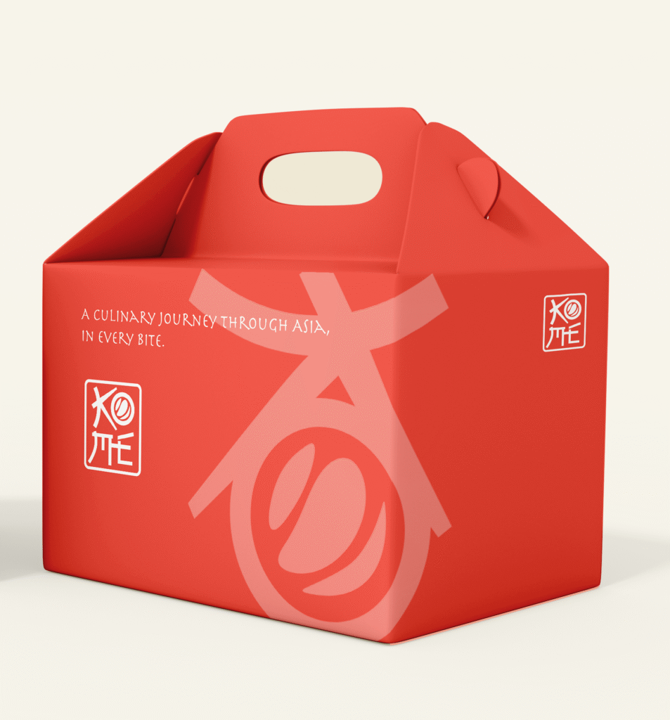
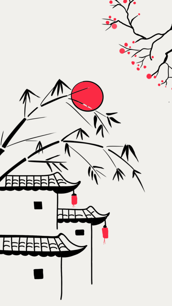
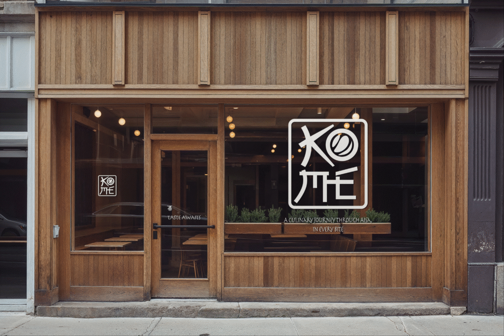
Kome is a passion project by Scribbled Space, designed as a contemporary Japanese-inspired dining experience rooted in simplicity, balance, and calm. The name and logo Kome, meaning “rice,” reflects the soul of Asian cuisine and became the foundation for both the spatial and branding
Kome stands as a holistic Asian restaurant, where branding, logo design, packaging design, and aesthetics work together to create a cohesive, premium dining experience.
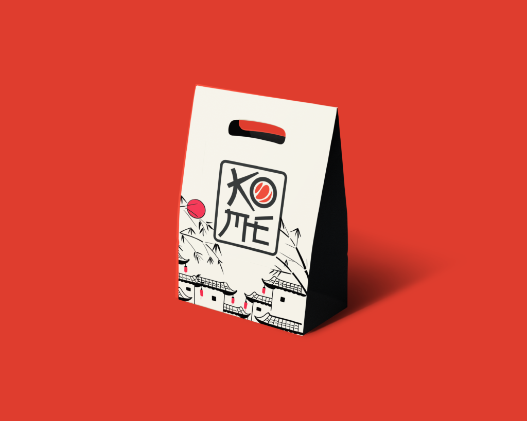
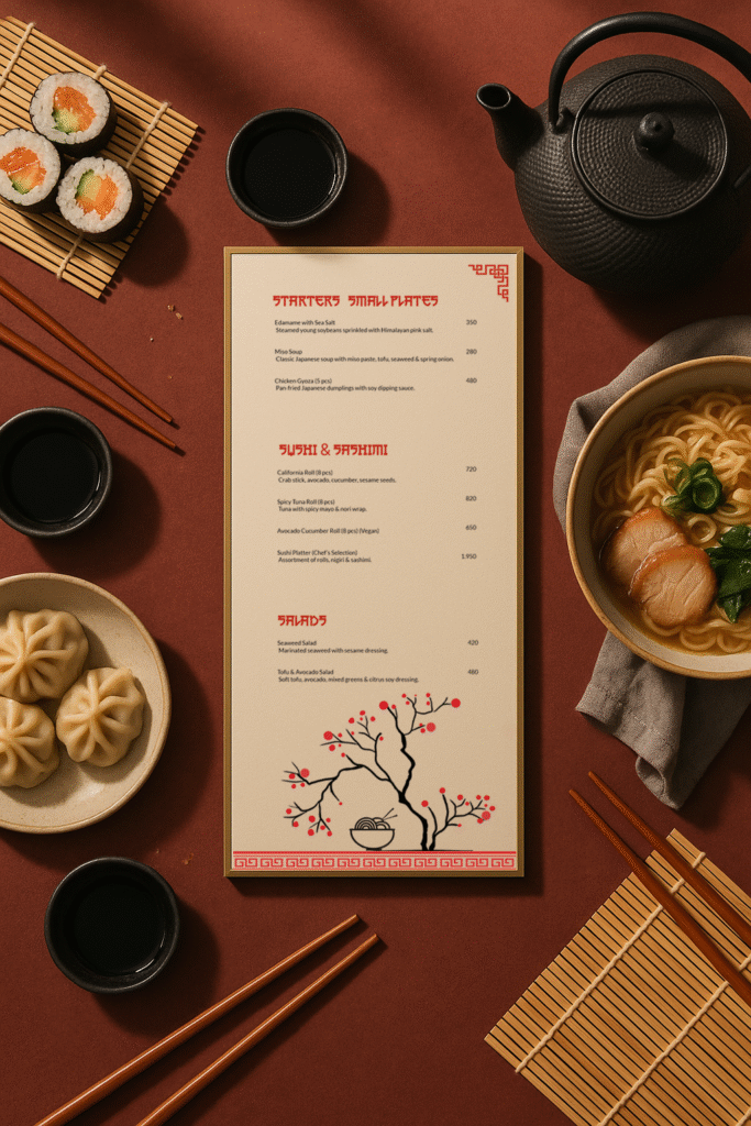
Our approach focused on modern minimalism infused with Japanese sensibility. Clean lines, muted tones, and intentional detailing come together to create a space that feels grounded, serene, and refined. Every packaging, element and menu was designed to let the food, the experience, and the brand breathe.
The menu, submark and brand elements celebrates the purity and precision of Japanese cooking, featuring sushi, sashimi, ramen, tempura, and classic preparations crafted with respect for tradition. To complement this core, subtle influences from neighboring Asian cultures were introduced through carefully curated Thai, Korean, and Chinese-inspired dishes, designed to harmonize rather than compete.
Kome is not just an Asian restaurant. It’s a thoughtfully branded dining experience where design, cuisine, and culture align seamlessly.
Watch till the end to see how we built this brand identity. 🔥
An outdoor pizzeria café inspired by nature, open fire, and the art of slow-crafted food. Every detail is designed to feel raw, warm, and just a little magical. ✨🍕
If you love thoughtful, detail-driven logo design like this, get in touch with us.
--
[Brand Identity, Logo Design, Brand Strategy, Cafe Branding, Icon Logo, Chennai , Food Outlets
Brand Collaterals, Creative Direction, Premium Branding, Design Studio, Indian Brands, Minimalist Branding, Menu Design, Branding Inspiration, Pizzeria Branding, Cafe Opening, Opening, Launch]
#brandingdesign #cafebranding #brandingagencyindia #designagencyindia #graphicdesignagencyindia
BTW... you can tap on any reel here and watch it instantly 👀
Loved the new update😍🔥
--
Branding, New Update, New Feature, One Reel, Brand Communication, Brand Experts, Business Owners, Brand Audit, Brand Identity, Brand Building, Brand Positioning, Branding 2026, Brand Transformation
#designagencyindia #brandingagencymumbai #brandingagency
Branding an outdoor pizzeria cafe inspired by nature, fire, and slow-crafted food.⭐️
@madrascrust approached us to build their brand identity from scratch with three key emotions in mind premium, peaceful, and familiar.
An outdoor pizzeria in Chennai inspired by nature, relaxation, and artisan food, the goal was to create a dining experience that feels like a calm escape from the city’s chaos.
To shape the brand, we worked around four defining elements:
Freshness & Wholesomeness
Wood Fire & Craftsmanship
Familiarity & Comfort
Nature & Nurture
The logo was designed as an icon-based mark, while the subtle curves in the letters “d” and “c” are inspired by Tamil script, reflecting the brand’s Madras roots.
For the color palette, we chose earthy tones,rich greens, terracotta, sand, and hints of flame orange capturing the warmth of wood-fire cooking and the calmness of nature.
The visual elements echo the ambience of the space wood-fire pizza, slow-made craftsmanship, open green surroundings, and a handcrafted homely atmosphere.
Extending the identity further, we designed brand collaterals including the menu card, where the text placement invites customers to rotate the menu for a dual-sided viewing experience, along with a comprehensive style guide to ensure consistency across the brand.
The final result is a brand that feels premium, peaceful, and familiar perfectly reflecting the essence of Madras Crust.😍
From scratch to logo to menu to full branding, every detail was designed to create a calm, welcoming identity rooted in craft, comfort, and nature.
Swipe to escape the city without leaving it.➡️
--
[Brand Identity, Logo Design, Brand Strategy, Cafe Branding, Icon Logo, Chennai , Food Outlets
Brand Collaterals, Creative Direction, Premium Branding, Design Studio, Indian Brands, Minimalist Branding, Menu Design, Branding Inspiration, Pizzeria Branding, Cafe Opening, Opening, Launch]
#brandingdesign #cafebranding #brandingagencyindia #designagencyindia #graphicdesignagencyindia
Not sure what your brand should do next? 🤔
That’s exactly what we help with.
Comment “CONSULTATION” 💬 for more details.
—
Brand Consultation, Brand Direction, Brand Clarity, Brand Positioning, Brand Communication, Brand Experts, Business Owners, Brand Audit, Brand Identity, Brand Building, Startup Advice, Start Up Branding
#brandingagencyindia #graphicdesignagencyindia #designagencyindia #brandingagencymumbai #brandingagency
Feeling like something’s ‘off’ in your brand? Let’s fix it through a focused Brand Consultation.🎯
--
Brand Realignment, Brand Positioning, Brand Communication, Brand Gap, Product-Perception Gap, Build Your Brand, Business Growth, Digital Brand Presence, Brand vs Product, Branding vs Marketing, Business Owners, Audit, Logo, Color Palette, Typography, Photography, Brand Consultation, Brand Clarity, Brand Building, Startup Advice, Start Up Branding
#brandingagencyindia #graphicdesignagencyindia #designagencyindia #brandingagencymumbai #brandingagency
2026 just rewrote the branding rulebook. And most brands didn’t even notice. 👀⚠️
--
Branding 2026, AI & Branding, Digital Brand Evolution, Brand Strategy, Brand Clarity, Brand Building, Business Growth, Startup Advice, Brand vs Product, Branding vs Marketing, Sensory Branding, Brand Perception Strategy, Real vs AI Content, Brand Differentiation, Modern Brand Building, Brand Transformation, Branding
#graphicdesignerindia #graphicdesignermumbai #designagencyindia #designagencymumbai #logodesignerindia
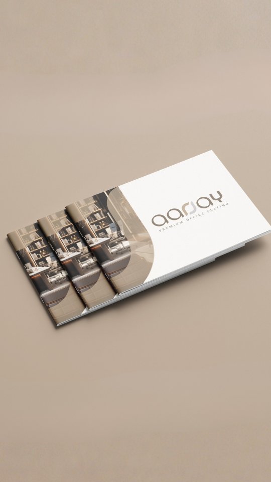
Rebranding Aarjay; A Fresh Take on Premium Seating
Aarjay is known for its wide range of office chairs and home seating, but their old identity didn’t quite match the premium quality of their products.
⚠️They reached out to us for a complete rebrand, with one clear goal , to look and feel as premium as the experience they offer.
👉We took a step back and decided to switch things up. From refining the logo and its elements to introducing a cleaner color palette and modern typography, every detail was reworked to give the brand a more polished and contemporary direction.
The idea was simple: keep it minimal, refined, and timeless.
Beyond the core identity, we carried the new look across all brand touchpoints; brand collaterals, stationery, and social media. To maintain a consistent and elevated presence online, we also used AI-generated imagery that aligns seamlessly with the brand’s new visual language.
The result is a brand that finally feels as premium as the seating it creates.
Swipe through to see the transformation⚡️
--
Rebranding, Brand Identity, Logo Design, Visual Identity, Typography Design, Color Palette, Brand Collaterals, Stationery Design, Social Media Design, Creative Direction, Premium Furniture, Brand Transformation, Branding, Premium Branding, Furniture Brand, Design Studio, Indian Brands
#graphicdesignerindia #graphicdesignermumbai #designagencyindia #designagencymumbai #logodesignerindia
Want to know how? Take our Brand Consultation.Comment “BRAND” 👇🎯
--
Brand Positioning, Brand Clarity, Brand Building, Confused Customers, Position Your Brand, Personal Branding, Business Growth, Startup Advice, D2C Branding, Marketing Debate, Start Up Branding, Digital Brand Presence, Brand vs Product, Branding vs Marketing, Shark Tank India
#brandingagencyindia #graphicdesignagencyindia #designagencyindia #brandingagencymumbai #brandingagency
👀Unpopular opinion: a good product alone is not enough anymore.
Your product might be amazing but without branding, packaging, and a website, how will people:
• trust you?
• remember you?
• choose you over 10 similar options?
___
Brand Strategy, Product Marketing, Personal Branding, Business Growth, Startup Advice, D2C Branding, Packaging Design, Brand Building, Marketing Debate, Start Up Branding, Digital Brand Presence, Brand vs Product, Branding vs Marketing, Nish Hair, Malkin, Shark Tank India
Curious where you stand on this 👇
Build your brand right — for FREE.
30th Jan 2026 (One day only)
DM us to register now | Limited slots
⏳ Register by 28th January
💰 This becomes a paid service after 30th Jan, 2026
[Consultation, Brand Consultation, Free Consultation, Free, Branding, Scribbled Space, One Day Consultation, Build Your Brand, Brand Positioning, Limited Slots, Growing Business, Register Now]
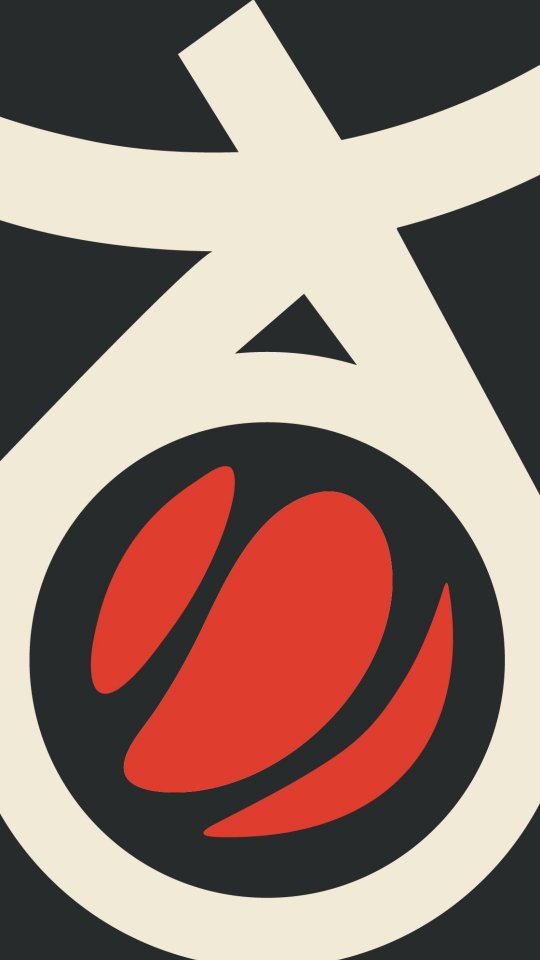
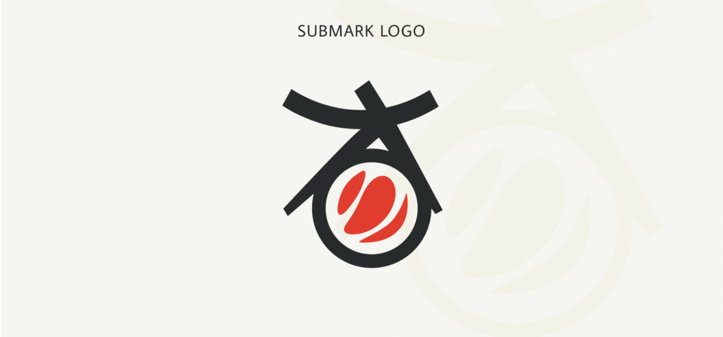
This little logo mark does a lot of talking indeed a detail we didn’t compromise on🍣🏯
-
Japanese Restaurant, Sushi Branding, Asian Restaurant Branding, Japanese Design, Minimalist Branding, Restaurant Identity, Japanese Aesthetics, Modern Restaurant, Sushi Bar Design, Branding Inspiration, Logo Design, Asian Fusion Branding, Japanese Brand Identity, Japanese Typography Design, Minimalist Restaurant Branding, Modern Asian Branding
#graphicdesignerindia #graphicdesignermumbai #designagencyindia #designagencymumbai #logodesignerindia logodesignermumbai brandingagencyindia brandingagencymumbai
What would you name a globally inspired brand? 🤔
--
Japanese Restaurant, Sushi Branding, Asian Restaurant Branding, Japanese Design, Minimalist Branding, Restaurant Branding, Japanese Aesthetics, Modern Japanese Restaurant, Sushi Bar Design, Branding Inspiration, Japanese Logo Design, Asian Fusion Branding, Japanese Brand Identity, Minimalist Restaurant Branding, Modern Branding, Brand Name Tips, How to name your Restaurant
#graphicdesignerindia #graphicdesignermumbai #designagencyindia #designagencymumbai #logodesignerindia logodesignermumbai brandingagencyindia brandingagencymumbai
#passionproject Kome is a contemporary Japanese restaurant, and from the very beginning, our design approach was simple; calm, authentic, and unmistakably Japanese. 🇯🇵🍣
The name “Kome” means “rice” in Japanese which felt perfect right away. Rice is more a symbol of nourishment, connection, and togetherness across Asia. This idea became the foundation of the brand.
For the typography, we added just a subtle touch of Japanese brush style ‘Kanji’ while still carrying a distinctly Japanese element.
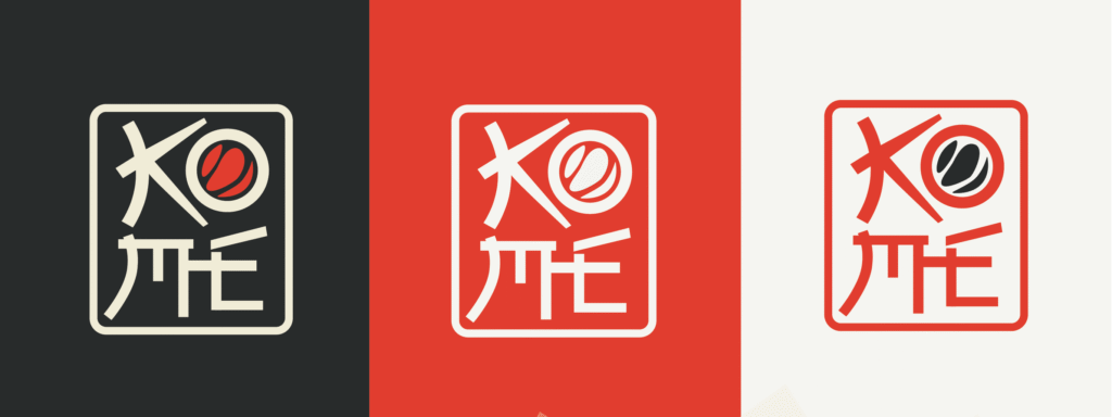
The Color palette draws inspiration from natural Japanese aesthetics; soft, serene neutrals anchored by a dark base, and highlighted with a refined pop of red.
The logo has a clever detail, the letters “K” and “O” come together to form an icon that looks like a piece of sushi held by chopsticks.
Overall, the design is clean, contemporary, and visually distinct.
-
Japanese Restaurant, Sushi Branding, Asian Restaurant Branding, Japanese Design, Minimalist Branding, Restaurant Identity, Japanese Aesthetics, Modern Japanese Restaurant, Sushi Bar Design, Branding Inspiration, Japanese Logo Design, Asian Fusion Branding, Japanese Brand Identity, Japanese Typography Design, Minimalist Restaurant Branding, Modern Asian Branding
#graphicdesignerindia #graphicdesignermumbai #designagencyindia #designagencymumbai #logodesignerindia #logodesignermumbai #brandingagencyindia #brandingagencymumbai
![Watch till the end to see how we built this brand identity. 🔥
An outdoor pizzeria café inspired by nature, open fire, and the art of slow-crafted food. Every detail is designed to feel raw, warm, and just a little magical. ✨🍕
If you love thoughtful, detail-driven logo design like this, get in touch with us.
--
[Brand Identity, Logo Design, Brand Strategy, Cafe Branding, Icon Logo, Chennai , Food Outlets
Brand Collaterals, Creative Direction, Premium Branding, Design Studio, Indian Brands, Minimalist Branding, Menu Design, Branding Inspiration, Pizzeria Branding, Cafe Opening, Opening, Launch]
#brandingdesign #cafebranding #brandingagencyindia #designagencyindia #graphicdesignagencyindia](https://scribbledspace.in/wp-content/uploads/2025/04/659982991_18226304473311590_8227529019433523932_n.jpg)
![Branding an outdoor pizzeria cafe inspired by nature, fire, and slow-crafted food.⭐️
@madrascrust approached us to build their brand identity from scratch with three key emotions in mind premium, peaceful, and familiar.
An outdoor pizzeria in Chennai inspired by nature, relaxation, and artisan food, the goal was to create a dining experience that feels like a calm escape from the city’s chaos.
To shape the brand, we worked around four defining elements:
Freshness & Wholesomeness
Wood Fire & Craftsmanship
Familiarity & Comfort
Nature & Nurture
The logo was designed as an icon-based mark, while the subtle curves in the letters “d” and “c” are inspired by Tamil script, reflecting the brand’s Madras roots.
For the color palette, we chose earthy tones,rich greens, terracotta, sand, and hints of flame orange capturing the warmth of wood-fire cooking and the calmness of nature.
The visual elements echo the ambience of the space wood-fire pizza, slow-made craftsmanship, open green surroundings, and a handcrafted homely atmosphere.
Extending the identity further, we designed brand collaterals including the menu card, where the text placement invites customers to rotate the menu for a dual-sided viewing experience, along with a comprehensive style guide to ensure consistency across the brand.
The final result is a brand that feels premium, peaceful, and familiar perfectly reflecting the essence of Madras Crust.😍
From scratch to logo to menu to full branding, every detail was designed to create a calm, welcoming identity rooted in craft, comfort, and nature.
Swipe to escape the city without leaving it.➡️
--
[Brand Identity, Logo Design, Brand Strategy, Cafe Branding, Icon Logo, Chennai , Food Outlets
Brand Collaterals, Creative Direction, Premium Branding, Design Studio, Indian Brands, Minimalist Branding, Menu Design, Branding Inspiration, Pizzeria Branding, Cafe Opening, Opening, Launch]
#brandingdesign #cafebranding #brandingagencyindia #designagencyindia #graphicdesignagencyindia](https://scontent-bom5-1.cdninstagram.com/v/t51.82787-15/650171766_18222402493311590_1480718506250368553_n.heic?stp=dst-jpg_e35_tt6&_nc_cat=110&ccb=7-5&_nc_sid=18de74&efg=eyJlZmdfdGFnIjoiQ0FST1VTRUxfSVRFTS5iZXN0X2ltYWdlX3VybGdlbi5DMyJ9&_nc_ohc=-B253rbCo-4Q7kNvwHR93nT&_nc_oc=Ado3VMoeHkMRUWmV3QprgEwdX1WH_FZNlBw_2mtzDQYqo7Fii-l2DQoD412yprjS2S1A5la6E6Y1rhJ3nxyRnGmZ&_nc_zt=23&_nc_ht=scontent-bom5-1.cdninstagram.com&edm=ANo9K5cEAAAA&_nc_gid=3e8ZdOYNl2jSsvto6B95aQ&_nc_tpa=Q5bMBQHdRCp369lpI7Mkdy15WjD471NvgSbeMA9H0nYV3KCwAPb6dMfaRC071QrBGBJ8RjxJL0cUf9O0&oh=00_Af37clceRXzpG7LH6YGGynYEeZgvYyInu4lA9qO3qJtV_Q&oe=69D97BEE)
![Branding an outdoor pizzeria cafe inspired by nature, fire, and slow-crafted food.⭐️
@madrascrust approached us to build their brand identity from scratch with three key emotions in mind premium, peaceful, and familiar.
An outdoor pizzeria in Chennai inspired by nature, relaxation, and artisan food, the goal was to create a dining experience that feels like a calm escape from the city’s chaos.
To shape the brand, we worked around four defining elements:
Freshness & Wholesomeness
Wood Fire & Craftsmanship
Familiarity & Comfort
Nature & Nurture
The logo was designed as an icon-based mark, while the subtle curves in the letters “d” and “c” are inspired by Tamil script, reflecting the brand’s Madras roots.
For the color palette, we chose earthy tones,rich greens, terracotta, sand, and hints of flame orange capturing the warmth of wood-fire cooking and the calmness of nature.
The visual elements echo the ambience of the space wood-fire pizza, slow-made craftsmanship, open green surroundings, and a handcrafted homely atmosphere.
Extending the identity further, we designed brand collaterals including the menu card, where the text placement invites customers to rotate the menu for a dual-sided viewing experience, along with a comprehensive style guide to ensure consistency across the brand.
The final result is a brand that feels premium, peaceful, and familiar perfectly reflecting the essence of Madras Crust.😍
From scratch to logo to menu to full branding, every detail was designed to create a calm, welcoming identity rooted in craft, comfort, and nature.
Swipe to escape the city without leaving it.➡️
--
[Brand Identity, Logo Design, Brand Strategy, Cafe Branding, Icon Logo, Chennai , Food Outlets
Brand Collaterals, Creative Direction, Premium Branding, Design Studio, Indian Brands, Minimalist Branding, Menu Design, Branding Inspiration, Pizzeria Branding, Cafe Opening, Opening, Launch]
#brandingdesign #cafebranding #brandingagencyindia #designagencyindia #graphicdesignagencyindia](https://scontent-bom5-1.cdninstagram.com/v/t51.82787-15/649976817_18222402502311590_3001001912357429784_n.heic?stp=dst-jpg_e35_tt6&_nc_cat=111&ccb=7-5&_nc_sid=18de74&efg=eyJlZmdfdGFnIjoiQ0FST1VTRUxfSVRFTS5iZXN0X2ltYWdlX3VybGdlbi5DMyJ9&_nc_ohc=6y3h6Mynhz0Q7kNvwEZuYaB&_nc_oc=AdobQOAzgAJAJF9gBuQEP75bjjjReu36-hCv8lE71dP5_EN85iSItaKYl7eFMx3fYrEmwmLmrfgK3e8wFtttLCzl&_nc_zt=23&_nc_ht=scontent-bom5-1.cdninstagram.com&edm=ANo9K5cEAAAA&_nc_gid=3e8ZdOYNl2jSsvto6B95aQ&_nc_tpa=Q5bMBQEFlM37eraTx4uXlj4NFTQ4976Lo7BeRE4zZuuazjSTY-OG1p7dX8y94crYxins-2_LPM1XEw3s&oh=00_Af03vsNWFXEX5nUQzdIsfNR-erO6Q--g5Vx5mrNMnNmPuA&oe=69D97008)
![Branding an outdoor pizzeria cafe inspired by nature, fire, and slow-crafted food.⭐️
@madrascrust approached us to build their brand identity from scratch with three key emotions in mind premium, peaceful, and familiar.
An outdoor pizzeria in Chennai inspired by nature, relaxation, and artisan food, the goal was to create a dining experience that feels like a calm escape from the city’s chaos.
To shape the brand, we worked around four defining elements:
Freshness & Wholesomeness
Wood Fire & Craftsmanship
Familiarity & Comfort
Nature & Nurture
The logo was designed as an icon-based mark, while the subtle curves in the letters “d” and “c” are inspired by Tamil script, reflecting the brand’s Madras roots.
For the color palette, we chose earthy tones,rich greens, terracotta, sand, and hints of flame orange capturing the warmth of wood-fire cooking and the calmness of nature.
The visual elements echo the ambience of the space wood-fire pizza, slow-made craftsmanship, open green surroundings, and a handcrafted homely atmosphere.
Extending the identity further, we designed brand collaterals including the menu card, where the text placement invites customers to rotate the menu for a dual-sided viewing experience, along with a comprehensive style guide to ensure consistency across the brand.
The final result is a brand that feels premium, peaceful, and familiar perfectly reflecting the essence of Madras Crust.😍
From scratch to logo to menu to full branding, every detail was designed to create a calm, welcoming identity rooted in craft, comfort, and nature.
Swipe to escape the city without leaving it.➡️
--
[Brand Identity, Logo Design, Brand Strategy, Cafe Branding, Icon Logo, Chennai , Food Outlets
Brand Collaterals, Creative Direction, Premium Branding, Design Studio, Indian Brands, Minimalist Branding, Menu Design, Branding Inspiration, Pizzeria Branding, Cafe Opening, Opening, Launch]
#brandingdesign #cafebranding #brandingagencyindia #designagencyindia #graphicdesignagencyindia](https://scontent-bom2-4.cdninstagram.com/v/t51.82787-15/650280299_18222402523311590_1833353524936066491_n.heic?stp=dst-jpg_e35_tt6&_nc_cat=106&ccb=7-5&_nc_sid=18de74&efg=eyJlZmdfdGFnIjoiQ0FST1VTRUxfSVRFTS5iZXN0X2ltYWdlX3VybGdlbi5DMyJ9&_nc_ohc=OCPGuZpiTwIQ7kNvwHBKJ3A&_nc_oc=AdrdP2ZAEI1EqiHK9LLtT3kvRjoAUgIKHq3NPxgVnqJXf4hrelW9Hv4Kw7OdFzb4L23ZrJ7FHEuq7bgvULPaKba4&_nc_zt=23&_nc_ht=scontent-bom2-4.cdninstagram.com&edm=ANo9K5cEAAAA&_nc_gid=3e8ZdOYNl2jSsvto6B95aQ&_nc_tpa=Q5bMBQFnfD0Uq3UcY49cjhEffJ_7OSwSNGjOd4wE1lqqq7tpmjdgu7rtymu8BKsTQn3Sz_HGy4cq7Ghg&oh=00_Af1edVc5Il8mUA3fFRlZ1c6HvHKaB-5RduPkwQ1QvNp2PA&oe=69D98601)
![Branding an outdoor pizzeria cafe inspired by nature, fire, and slow-crafted food.⭐️
@madrascrust approached us to build their brand identity from scratch with three key emotions in mind premium, peaceful, and familiar.
An outdoor pizzeria in Chennai inspired by nature, relaxation, and artisan food, the goal was to create a dining experience that feels like a calm escape from the city’s chaos.
To shape the brand, we worked around four defining elements:
Freshness & Wholesomeness
Wood Fire & Craftsmanship
Familiarity & Comfort
Nature & Nurture
The logo was designed as an icon-based mark, while the subtle curves in the letters “d” and “c” are inspired by Tamil script, reflecting the brand’s Madras roots.
For the color palette, we chose earthy tones,rich greens, terracotta, sand, and hints of flame orange capturing the warmth of wood-fire cooking and the calmness of nature.
The visual elements echo the ambience of the space wood-fire pizza, slow-made craftsmanship, open green surroundings, and a handcrafted homely atmosphere.
Extending the identity further, we designed brand collaterals including the menu card, where the text placement invites customers to rotate the menu for a dual-sided viewing experience, along with a comprehensive style guide to ensure consistency across the brand.
The final result is a brand that feels premium, peaceful, and familiar perfectly reflecting the essence of Madras Crust.😍
From scratch to logo to menu to full branding, every detail was designed to create a calm, welcoming identity rooted in craft, comfort, and nature.
Swipe to escape the city without leaving it.➡️
--
[Brand Identity, Logo Design, Brand Strategy, Cafe Branding, Icon Logo, Chennai , Food Outlets
Brand Collaterals, Creative Direction, Premium Branding, Design Studio, Indian Brands, Minimalist Branding, Menu Design, Branding Inspiration, Pizzeria Branding, Cafe Opening, Opening, Launch]
#brandingdesign #cafebranding #brandingagencyindia #designagencyindia #graphicdesignagencyindia](https://scontent-bom2-4.cdninstagram.com/v/t51.82787-15/641114513_18222402511311590_7190183784389504845_n.heic?stp=dst-jpg_e35_tt6&_nc_cat=106&ccb=7-5&_nc_sid=18de74&efg=eyJlZmdfdGFnIjoiQ0FST1VTRUxfSVRFTS5iZXN0X2ltYWdlX3VybGdlbi5DMyJ9&_nc_ohc=ar70WqKpDeQQ7kNvwH8Q2oq&_nc_oc=Adq6iMVmiy374eCRC29U9GNj276sRvGGSopbSHJAj6jowej-UXZtn6ePpJZZRoGJUZoB0xzAow2r2N6xdtdLu7FP&_nc_zt=23&_nc_ht=scontent-bom2-4.cdninstagram.com&edm=ANo9K5cEAAAA&_nc_gid=3e8ZdOYNl2jSsvto6B95aQ&_nc_tpa=Q5bMBQGYts8umkB442GfM_rl7OfFWmpUHbTHNlu4WI5neSCn-F-kQyV8HD7iLDv3RO7rawVKX4AqHHI3&oh=00_Af3ObpCqjWia8tq-Kj7XcAyBLxwQ-lvipfMHf9RbT64lcA&oe=69D97764)
![Branding an outdoor pizzeria cafe inspired by nature, fire, and slow-crafted food.⭐️
@madrascrust approached us to build their brand identity from scratch with three key emotions in mind premium, peaceful, and familiar.
An outdoor pizzeria in Chennai inspired by nature, relaxation, and artisan food, the goal was to create a dining experience that feels like a calm escape from the city’s chaos.
To shape the brand, we worked around four defining elements:
Freshness & Wholesomeness
Wood Fire & Craftsmanship
Familiarity & Comfort
Nature & Nurture
The logo was designed as an icon-based mark, while the subtle curves in the letters “d” and “c” are inspired by Tamil script, reflecting the brand’s Madras roots.
For the color palette, we chose earthy tones,rich greens, terracotta, sand, and hints of flame orange capturing the warmth of wood-fire cooking and the calmness of nature.
The visual elements echo the ambience of the space wood-fire pizza, slow-made craftsmanship, open green surroundings, and a handcrafted homely atmosphere.
Extending the identity further, we designed brand collaterals including the menu card, where the text placement invites customers to rotate the menu for a dual-sided viewing experience, along with a comprehensive style guide to ensure consistency across the brand.
The final result is a brand that feels premium, peaceful, and familiar perfectly reflecting the essence of Madras Crust.😍
From scratch to logo to menu to full branding, every detail was designed to create a calm, welcoming identity rooted in craft, comfort, and nature.
Swipe to escape the city without leaving it.➡️
--
[Brand Identity, Logo Design, Brand Strategy, Cafe Branding, Icon Logo, Chennai , Food Outlets
Brand Collaterals, Creative Direction, Premium Branding, Design Studio, Indian Brands, Minimalist Branding, Menu Design, Branding Inspiration, Pizzeria Branding, Cafe Opening, Opening, Launch]
#brandingdesign #cafebranding #brandingagencyindia #designagencyindia #graphicdesignagencyindia](https://scontent-bom5-2.cdninstagram.com/v/t51.82787-15/649925945_18222402532311590_2247791885157325207_n.heic?stp=dst-jpg_e35_tt6&_nc_cat=104&ccb=7-5&_nc_sid=18de74&efg=eyJlZmdfdGFnIjoiQ0FST1VTRUxfSVRFTS5iZXN0X2ltYWdlX3VybGdlbi5DMyJ9&_nc_ohc=lMFzvemdUvQQ7kNvwFPo5V2&_nc_oc=AdoIaCG9kgeFsbz7MIK2srJGHKQ-c7auZJzB-m2A3X5ezHY7GLHDSCrdk4r6LvuNgaPWJ5INk5Uso1KRGXy7qRuG&_nc_zt=23&_nc_ht=scontent-bom5-2.cdninstagram.com&edm=ANo9K5cEAAAA&_nc_gid=3e8ZdOYNl2jSsvto6B95aQ&_nc_tpa=Q5bMBQEbXHiLGsZkmWJijdfEc0UUaNmbLXzDeUcGe-onwqXaRxUdZR7f0s3irwy1jI05kwGVDsgzUhO_&oh=00_Af1zl2U3HEKsLUu-iIGSYDvbUkZa1JfilvG8GvTCU5LeVQ&oe=69D9972D)
![Branding an outdoor pizzeria cafe inspired by nature, fire, and slow-crafted food.⭐️
@madrascrust approached us to build their brand identity from scratch with three key emotions in mind premium, peaceful, and familiar.
An outdoor pizzeria in Chennai inspired by nature, relaxation, and artisan food, the goal was to create a dining experience that feels like a calm escape from the city’s chaos.
To shape the brand, we worked around four defining elements:
Freshness & Wholesomeness
Wood Fire & Craftsmanship
Familiarity & Comfort
Nature & Nurture
The logo was designed as an icon-based mark, while the subtle curves in the letters “d” and “c” are inspired by Tamil script, reflecting the brand’s Madras roots.
For the color palette, we chose earthy tones,rich greens, terracotta, sand, and hints of flame orange capturing the warmth of wood-fire cooking and the calmness of nature.
The visual elements echo the ambience of the space wood-fire pizza, slow-made craftsmanship, open green surroundings, and a handcrafted homely atmosphere.
Extending the identity further, we designed brand collaterals including the menu card, where the text placement invites customers to rotate the menu for a dual-sided viewing experience, along with a comprehensive style guide to ensure consistency across the brand.
The final result is a brand that feels premium, peaceful, and familiar perfectly reflecting the essence of Madras Crust.😍
From scratch to logo to menu to full branding, every detail was designed to create a calm, welcoming identity rooted in craft, comfort, and nature.
Swipe to escape the city without leaving it.➡️
--
[Brand Identity, Logo Design, Brand Strategy, Cafe Branding, Icon Logo, Chennai , Food Outlets
Brand Collaterals, Creative Direction, Premium Branding, Design Studio, Indian Brands, Minimalist Branding, Menu Design, Branding Inspiration, Pizzeria Branding, Cafe Opening, Opening, Launch]
#brandingdesign #cafebranding #brandingagencyindia #designagencyindia #graphicdesignagencyindia](https://scontent-bom2-1.cdninstagram.com/v/t51.82787-15/650373668_18222402541311590_5778898623459408510_n.heic?stp=dst-jpg_e35_tt6&_nc_cat=107&ccb=7-5&_nc_sid=18de74&efg=eyJlZmdfdGFnIjoiQ0FST1VTRUxfSVRFTS5iZXN0X2ltYWdlX3VybGdlbi5DMyJ9&_nc_ohc=7ik4En2kTRgQ7kNvwG0eDXN&_nc_oc=AdpEeDZEPqnPQeb-valWBC-tg-H-MIQmaTgOuUNsT0ymnhC0XZGSATjLS8F4JsHNkgmqYdAVPRMwJsOJX3fHAsOn&_nc_zt=23&_nc_ht=scontent-bom2-1.cdninstagram.com&edm=ANo9K5cEAAAA&_nc_gid=3e8ZdOYNl2jSsvto6B95aQ&_nc_tpa=Q5bMBQGgxlCIHfiDLfedyLE8Z5Qe7tr6BOvTRyTfPGMf-TUVPyqD-YRwQUPhVbn2K1RKDQmcuZ8CKZ5q&oh=00_Af1h11wSxZzw7szFpoeHCl4syeLj40BIUAGQC2NWAvdXJw&oe=69D98A18)
![Branding an outdoor pizzeria cafe inspired by nature, fire, and slow-crafted food.⭐️
@madrascrust approached us to build their brand identity from scratch with three key emotions in mind premium, peaceful, and familiar.
An outdoor pizzeria in Chennai inspired by nature, relaxation, and artisan food, the goal was to create a dining experience that feels like a calm escape from the city’s chaos.
To shape the brand, we worked around four defining elements:
Freshness & Wholesomeness
Wood Fire & Craftsmanship
Familiarity & Comfort
Nature & Nurture
The logo was designed as an icon-based mark, while the subtle curves in the letters “d” and “c” are inspired by Tamil script, reflecting the brand’s Madras roots.
For the color palette, we chose earthy tones,rich greens, terracotta, sand, and hints of flame orange capturing the warmth of wood-fire cooking and the calmness of nature.
The visual elements echo the ambience of the space wood-fire pizza, slow-made craftsmanship, open green surroundings, and a handcrafted homely atmosphere.
Extending the identity further, we designed brand collaterals including the menu card, where the text placement invites customers to rotate the menu for a dual-sided viewing experience, along with a comprehensive style guide to ensure consistency across the brand.
The final result is a brand that feels premium, peaceful, and familiar perfectly reflecting the essence of Madras Crust.😍
From scratch to logo to menu to full branding, every detail was designed to create a calm, welcoming identity rooted in craft, comfort, and nature.
Swipe to escape the city without leaving it.➡️
--
[Brand Identity, Logo Design, Brand Strategy, Cafe Branding, Icon Logo, Chennai , Food Outlets
Brand Collaterals, Creative Direction, Premium Branding, Design Studio, Indian Brands, Minimalist Branding, Menu Design, Branding Inspiration, Pizzeria Branding, Cafe Opening, Opening, Launch]
#brandingdesign #cafebranding #brandingagencyindia #designagencyindia #graphicdesignagencyindia](https://scontent-bom5-1.cdninstagram.com/v/t51.82787-15/649663158_18222402550311590_8183310296624334926_n.heic?stp=dst-jpg_e35_tt6&_nc_cat=111&ccb=7-5&_nc_sid=18de74&efg=eyJlZmdfdGFnIjoiQ0FST1VTRUxfSVRFTS5iZXN0X2ltYWdlX3VybGdlbi5DMyJ9&_nc_ohc=TLClG3bdELAQ7kNvwEdcfLu&_nc_oc=AdqSkSqS2OkDHtsyjGLFigEIbWZgOzSThTxRogwGwRoowtDqduVkwrlBJLX5sRStHu_OMNEKNua8lGbhwUnOQvry&_nc_zt=23&_nc_ht=scontent-bom5-1.cdninstagram.com&edm=ANo9K5cEAAAA&_nc_gid=3e8ZdOYNl2jSsvto6B95aQ&_nc_tpa=Q5bMBQEgbbO6sov1KNTYIMZJmmvsb9i-AHq1hKNC96zllTjX9na8mRgdGFRDzUXfxKf7su_8l6DbAa_9&oh=00_Af0F8s1VfarByvgirRMB_SBxhbGKidtcA4mvx0pb1g1g9w&oe=69D99B9D)
![Branding an outdoor pizzeria cafe inspired by nature, fire, and slow-crafted food.⭐️
@madrascrust approached us to build their brand identity from scratch with three key emotions in mind premium, peaceful, and familiar.
An outdoor pizzeria in Chennai inspired by nature, relaxation, and artisan food, the goal was to create a dining experience that feels like a calm escape from the city’s chaos.
To shape the brand, we worked around four defining elements:
Freshness & Wholesomeness
Wood Fire & Craftsmanship
Familiarity & Comfort
Nature & Nurture
The logo was designed as an icon-based mark, while the subtle curves in the letters “d” and “c” are inspired by Tamil script, reflecting the brand’s Madras roots.
For the color palette, we chose earthy tones,rich greens, terracotta, sand, and hints of flame orange capturing the warmth of wood-fire cooking and the calmness of nature.
The visual elements echo the ambience of the space wood-fire pizza, slow-made craftsmanship, open green surroundings, and a handcrafted homely atmosphere.
Extending the identity further, we designed brand collaterals including the menu card, where the text placement invites customers to rotate the menu for a dual-sided viewing experience, along with a comprehensive style guide to ensure consistency across the brand.
The final result is a brand that feels premium, peaceful, and familiar perfectly reflecting the essence of Madras Crust.😍
From scratch to logo to menu to full branding, every detail was designed to create a calm, welcoming identity rooted in craft, comfort, and nature.
Swipe to escape the city without leaving it.➡️
--
[Brand Identity, Logo Design, Brand Strategy, Cafe Branding, Icon Logo, Chennai , Food Outlets
Brand Collaterals, Creative Direction, Premium Branding, Design Studio, Indian Brands, Minimalist Branding, Menu Design, Branding Inspiration, Pizzeria Branding, Cafe Opening, Opening, Launch]
#brandingdesign #cafebranding #brandingagencyindia #designagencyindia #graphicdesignagencyindia](https://scontent-bom5-1.cdninstagram.com/v/t51.82787-15/650066570_18222402562311590_8473910201062120355_n.heic?stp=dst-jpg_e35_tt6&_nc_cat=110&ccb=7-5&_nc_sid=18de74&efg=eyJlZmdfdGFnIjoiQ0FST1VTRUxfSVRFTS5iZXN0X2ltYWdlX3VybGdlbi5DMyJ9&_nc_ohc=NTMEMdMPmCoQ7kNvwExaB1a&_nc_oc=AdptjS9RQxxeJHaNRiM-8NY4HMcCnq6CI1q8KotQoWSJSVAW1NfSx9x1LRJrds71MeFEhiVbUNn6s0eNaawhw90l&_nc_zt=23&_nc_ht=scontent-bom5-1.cdninstagram.com&edm=ANo9K5cEAAAA&_nc_gid=3e8ZdOYNl2jSsvto6B95aQ&_nc_tpa=Q5bMBQFPWG7FoWCmTez-ZsiUEcGE8pgLh3itpvz271WYRh7Rzv7-cdx66-naIk1-KdeLwmK0AVuLKckQ&oh=00_Af3AMPCxrjXjUP6ffMYU1YKT4V0fcLgWePyMtuyW8l8Ecw&oe=69D99335)
![Branding an outdoor pizzeria cafe inspired by nature, fire, and slow-crafted food.⭐️
@madrascrust approached us to build their brand identity from scratch with three key emotions in mind premium, peaceful, and familiar.
An outdoor pizzeria in Chennai inspired by nature, relaxation, and artisan food, the goal was to create a dining experience that feels like a calm escape from the city’s chaos.
To shape the brand, we worked around four defining elements:
Freshness & Wholesomeness
Wood Fire & Craftsmanship
Familiarity & Comfort
Nature & Nurture
The logo was designed as an icon-based mark, while the subtle curves in the letters “d” and “c” are inspired by Tamil script, reflecting the brand’s Madras roots.
For the color palette, we chose earthy tones,rich greens, terracotta, sand, and hints of flame orange capturing the warmth of wood-fire cooking and the calmness of nature.
The visual elements echo the ambience of the space wood-fire pizza, slow-made craftsmanship, open green surroundings, and a handcrafted homely atmosphere.
Extending the identity further, we designed brand collaterals including the menu card, where the text placement invites customers to rotate the menu for a dual-sided viewing experience, along with a comprehensive style guide to ensure consistency across the brand.
The final result is a brand that feels premium, peaceful, and familiar perfectly reflecting the essence of Madras Crust.😍
From scratch to logo to menu to full branding, every detail was designed to create a calm, welcoming identity rooted in craft, comfort, and nature.
Swipe to escape the city without leaving it.➡️
--
[Brand Identity, Logo Design, Brand Strategy, Cafe Branding, Icon Logo, Chennai , Food Outlets
Brand Collaterals, Creative Direction, Premium Branding, Design Studio, Indian Brands, Minimalist Branding, Menu Design, Branding Inspiration, Pizzeria Branding, Cafe Opening, Opening, Launch]
#brandingdesign #cafebranding #brandingagencyindia #designagencyindia #graphicdesignagencyindia](https://scontent-bom2-3.cdninstagram.com/v/t51.82787-15/650894991_18222402571311590_9168316276595716553_n.heic?stp=dst-jpg_e35_tt6&_nc_cat=101&ccb=7-5&_nc_sid=18de74&efg=eyJlZmdfdGFnIjoiQ0FST1VTRUxfSVRFTS5iZXN0X2ltYWdlX3VybGdlbi5DMyJ9&_nc_ohc=dbaiudrePjMQ7kNvwGiAOu4&_nc_oc=AdoJgDMbwo4AtKZoI3pMgQRCVBDmQcvaHUKhHNZld8cGV6KTYCGVrO7DzgxIgXzZ1hjV0URhO3N2aHBpV9AMHORi&_nc_zt=23&_nc_ht=scontent-bom2-3.cdninstagram.com&edm=ANo9K5cEAAAA&_nc_gid=3e8ZdOYNl2jSsvto6B95aQ&_nc_tpa=Q5bMBQFeocUDhqx_c0CpzHkf27mDhw_uaj8BTpsiPmcXYTKwQQtq2V68DL_cA-EmvLEHuR6PZY24IaKD&oh=00_Af3CJwOZFmgKomy2PlOCR3aFWsl4C-ITSQFFABFpGcZnIw&oe=69D97172)


![Build your brand right — for FREE.
30th Jan 2026 (One day only)
DM us to register now | Limited slots
⏳ Register by 28th January
💰 This becomes a paid service after 30th Jan, 2026
[Consultation, Brand Consultation, Free Consultation, Free, Branding, Scribbled Space, One Day Consultation, Build Your Brand, Brand Positioning, Limited Slots, Growing Business, Register Now]](https://scribbledspace.in/wp-content/uploads/2025/03/619093432_2147096529031064_5321326965320640057_n.jpg)