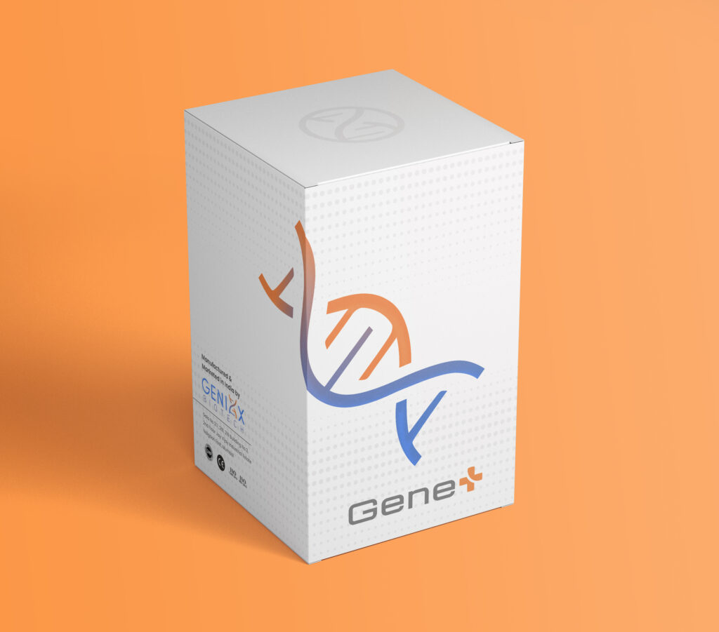
Full Branding for Genixx Biotech, a company specializing in manufacturing chemical reagents for medical diagnosis kits used in laboratories, hospitals and medical chains.
Our scope of work encompassed creating a brand name, logos for both the company and its flagship product, packaging design and other visual assets.
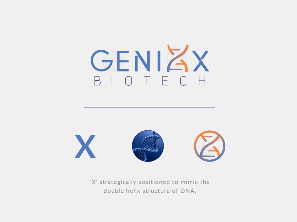
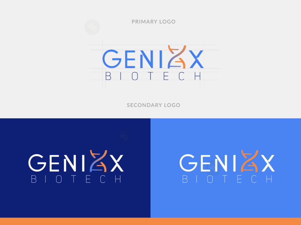
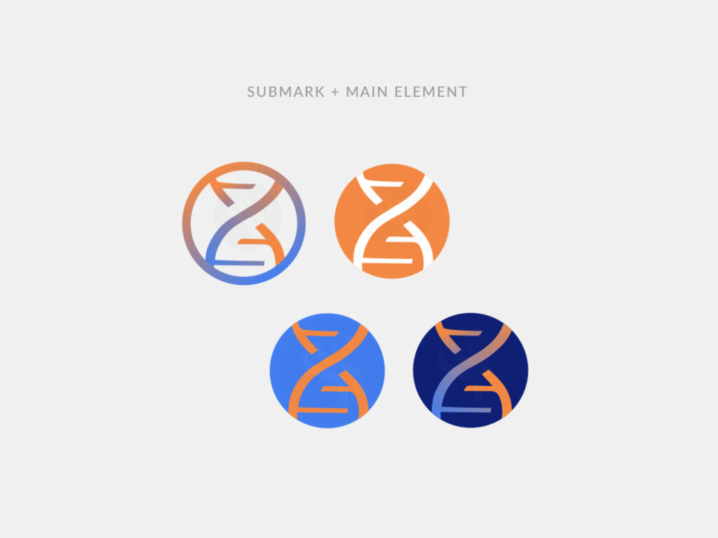
We conceptualise a Wordmark for the main company logo by cleverly using the “xx” or “x” in the company name. Within this Wordmark, we added a DNA helix-inspired design element, highlighting Genixx Biotech’s focus on genetics and the life sciences. This DNA symbol is widely recognized in the field, making it a powerful visual representation.
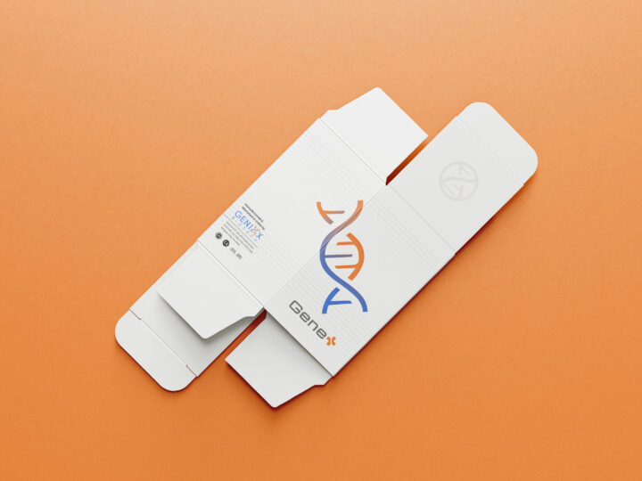
Also a clean and uncluttered design for the packaging box features their distinctive DNA helix icon which reinforces their branding and centered flagship product’s name allowing to take the spotlight which ensures that the product is easily recognizable and communicates a sense of quality and professionalism.
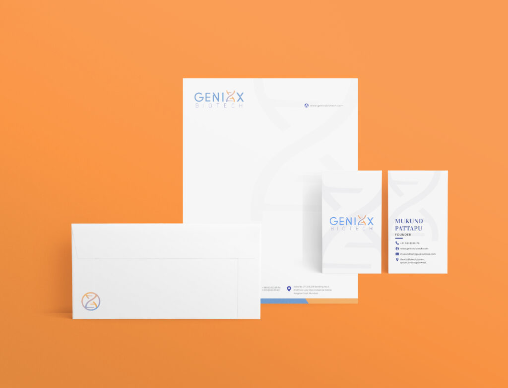
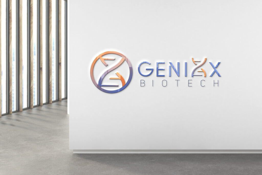
One of our primary challenges was to craft two distinct yet harmonious logos, one for the company itself and another for its flagship product. We began with the company’s existing name, “Genixx,” and the client’s preference for the color blue. Using these as starting points, we embarked on a thorough exploration of potential product names. This process involved extensive research within the industry.
Inspired by the name “Genixx,” we brainstormed numerous concepts, ultimately settling on “Gene +” as the ideal product name. This choice not only complemented the company name but also cleverly incorporated the letter “x” from “Genixx.” By turning the “+” symbol into an “x” or vice versa, we ingeniously established a visual connection between both names.
