Scribbled Space partnered with Art Bazar to elevate its brand presence through creative content, product photography, packaging, and strategic organic social media management. Our work included multiple professional product shoots, each tailored to different collections and seasonal campaigns. We executed dedicated shoots for their signature wall hanging collection, a fresh and vibrant Spring Collection, and a festive Christmas Collection, ensuring every range was presented with a unique visual identity. We also designed premium packaging that aligned seamlessly with the brand’s visual identity, creating a memorable unboxing experience that reflected Art Bazar’s quality and craftsmanship. Beyond photography, Scribbled Space managed the brand’s complete organic social media presence. From content ideation and styling to shooting, editing, posting, and community-focused content creation, we handled the entire process. The goal was simple, because apparently “getting noticed online” is now a full-time sport. Through consistent organic content, we helped Art Bazar achieve stronger reach, improved engagement, and enhanced brand visibility without relying on paid advertising. The focus remained on storytelling, aesthetic presentation, and building a loyal audience of home decor enthusiasts. Art Bazar stands as a complete home decor content creation, product photography, packaging design, and organic social media management project. Previous Post
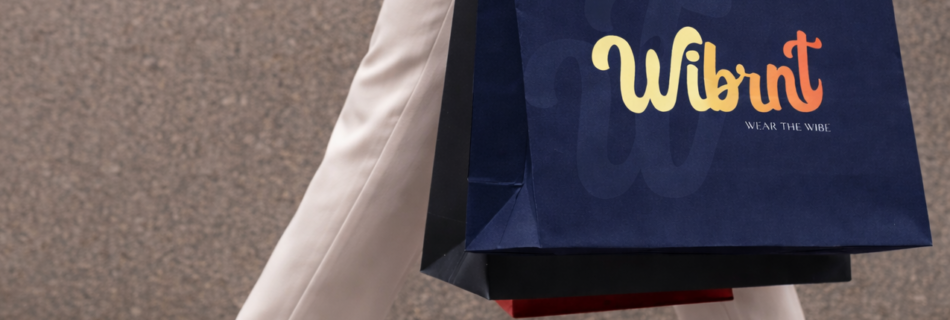
The branding was developed to reflect a vibrant, youthful, and trend-forward identity. From logo design to visual language, every element was crafted to resonate with a fashion-conscious audience while maintaining a premium and scalable brand feel. Scribbled Space handled the entire scope of the project, including branding, logo design, packaging box design, hand tags, garment labels, shopping bags, and social media design, ensuring consistency across both physical and digital touch points. The packaging and brand collaterals were designed to enhance the unboxing experience and reinforce brand recall, creating a cohesive journey from online discovery to product delivery. Wibrnt stands as a complete fashion branding and e-commerce website project, showcasing how strategic branding, packaging design, and Shopify development come together to build a strong and scalable apparel brand. A key part of the project was building a strong e-commerce presence. The brand’s Shopify store and website design were developed to deliver a seamless shopping experience, combining clean UI, smooth navigation, and conversion-focused layouts tailored for online fashion buyers. Previous Post

The Decafe Bar is a passion project by Scribbled Space, created as a contemporary coffee bar concept that also represents a premium coffee bean manufacturer. The project was developed to explore branding, logo design, and packaging solutions for modern coffee businesses. The brand identity focuses on the culture and craftsmanship behind specialty coffee. From the café experience to coffee bean packaging, the design language was built to reflect warmth, authenticity, and a refined yet approachable aesthetic. The logo design was created to be bold, memorable, and versatile across multiple touchpoints including café signage, takeaway cups, coffee bean packaging, and merchandise. The visual identity blends modern typography with minimal design elements to give the brand a distinctive presence in the competitive coffee market. A key part of the project was the coffee packaging design, developed for coffee bean bags and retail coffee products. The packaging system focuses on clarity, shelf impact, and strong brand recall while maintaining a premium and contemporary look.Through this passion project, Scribbled Space demonstrates its expertise in logo design, coffee branding, and packaging design for coffee brands, coffee manufacturers, cafés, and coffee bars looking to build strong and memorable brand identities Previous Post
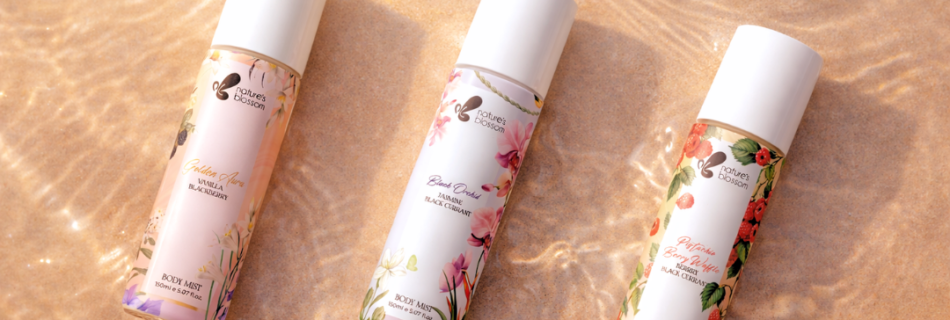
Nature’s Blossom is a body mist brand inspired by the freshness and beauty of nature. For this project, we designed the label packaging with a focus on elegance, simplicity, and a soft botanical aesthetic that reflects the brand’s natural essence. The body mist market in India is highly competitive, with countless brands competing for consumer attention, so the label was designed to instantly communicate a fresh, floral, nature-inspired identity while maintaining a premium yet approachable look. Subtle botanical elements, soft floral textures, and clean layouts were used to capture the natural inspiration behind the fragrances. The result is a packaging/label that feels light, modern, and inviting, ensuring the product stands out both on retail shelves and online platforms. Through thoughtful design and brand storytelling, the packaging reflects exactly what the product promises: a refreshing floral escape in every spray. Previous Post
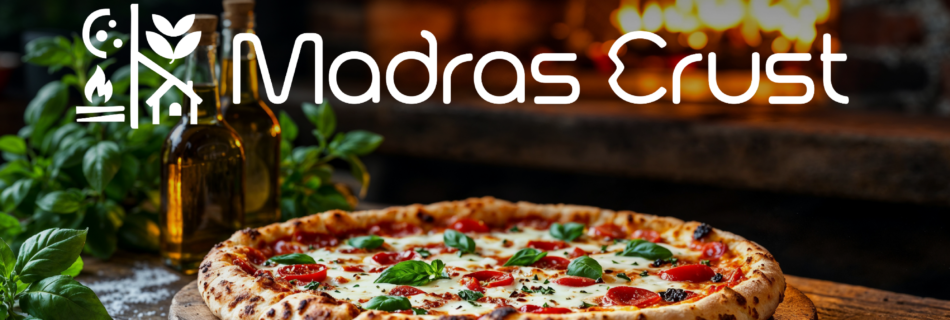
Madras Crust is a premium outdoor pizzeria set amidst a lush green lawn at an existing café in Chennai. From logo design to menu card design to complete restaurant branding, every touchpoint was carefully crafted to influence perception, elevate positioning, and create emotional connection. The vision was to create a serene dining destination where artisan wood-fired pizzas are enjoyed in a tranquil, nature-filled setting. The entire restaurant branding concept was inspired by four defining elements of the business. Together, these elements form a complete pizza; symbolizing harmony and balance. Freshness & Wholesomeness – Representing high-quality ingredients and honest flavors. Wood-Fire & Craftsmanship – Celebrating the artisanal process behind every pizza; handcrafted, slow-made, and authentic. Familiarity & Comfort – Creating a space that feels welcoming, warm, and socially inviting. Nature & Nurture – Reflecting the lush lawn setting and the calming outdoor environment that defines the dining experience. A distinctive detail lies in the subtle curves of the letters ‘d’ and ‘c’, inspired by Tamil script; a tribute to the brand’s Madras roots. This thoughtful typographic influence adds local charm while keeping the identity contemporary and premium. As part of the complete restaurant branding, we designed a unique square menu card design that enhances customer interaction. The text placement subtly invites guests to rotate the menu for a dual-sided viewing experience; adding a playful, thoughtful element to the dining journey. As part of the complete restaurant branding, we designed a unique square menu card design that enhances customer interaction. The text placement subtly invites guests to rotate the menu for a dual-sided viewing experience; adding a playful, thoughtful element to the dining journey. The design stays minimal and clean, allowing the food to take center stage while maintaining visual interest. The complete branding for Madras Crust establishes it as a premium outdoor pizzeria in Chennai that offers more than just food; it delivers atmosphere, craftsmanship, and comfort. Previous PostNext Post
Kridha Fashion is an ethnic wear brand focused on contemporary Indian clothing rooted in tradition and craftsmanship. The branding direction was inspired by Indian culture, traditional textiles, and festive elegance, translated into a modern and refined visual language. A key focus of the project was the logo design. Kridha Fashion is based in Uttar Pradesh, the land of Lord Krishna, which became a central inspiration for the brand mark. To reflect this connection, a peacock feather was thoughtfully integrated into the logo, symbolising grace, divinity, and Indian heritage. The monogram is custom-designed to subtly incorporate the entire spelling of “Kridha”, while visually highlighting the initial ‘K’ as the core identifier. This approach allowed the logo to feel intricate yet balanced, traditional yet modern, making it versatile across garments, labels, and packaging applications. The overall brand identity blends cultural depth with contemporary aesthetics. Elegant typography, rich yet restrained colors, and refined detailing were used to ensure the brand feels premium without losing its ethnic essence. The packaging design was created to elevate the unboxing experience, reinforcing brand recall and emotional connection. Kridha Fashion stands as a complete ethnic wear branding and logo design project, where cultural storytelling, thoughtful design, and strategic branding come together seamlessly. Scribbled Space handled the complete scope of work including branding strategy, logo design, and packaging box, poly bag and shopping bag design, helping Kridha Fashion establish a cohesive and recognisable presence in the Indian ethnic wear market. Previous Post
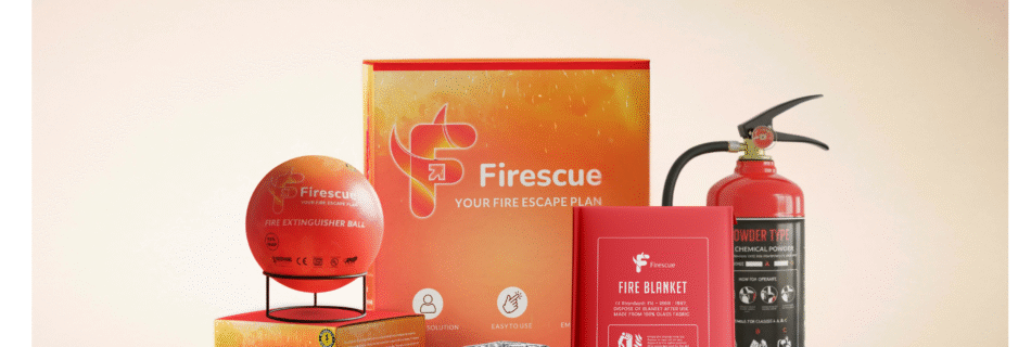
Firescue, a proud brand under Monsher India, creates first-line defense products against fire hazards — solutions that are easy-to-use, accessible, and lifesaving. 🚨✨ Yet, their earlier packaging didn’t reflect the true purpose behind the brand— it looked more like wholesale stock than a brand designed to connect with everyday people. So we gave the entire Firescue product range — fire kits, extinguisher balls, blankets, escape masks, and extinguishers along with designing their exhibition stall and standee — a refreshing new packaging. Sticking to their core colors- Red, Orange, White and Black, the design now feels bold, approachable, and true to their mission of safety, accessibility & trust. Previous Post
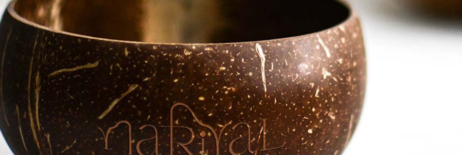
From concept to creation, we brought the essence of Nariyal to life with a brand identity that’s as refreshing and rooted as the product itself. One of our biggest challenges was positioning Nariyal — a Canada-based Indian brand — in a way that felt authentically Indian yet globally appealing. To bridge this cultural connection, we thoughtfully incorporated a Devanagari ‘R’ into the logo, subtly tying back to its Indian roots, while blending it with the silhouette of a coconut tree to reflect freshness and nature. The visual language — from serene color palettes and minimal typography to packaging that feels both premium and grounded — was designed to reflect purity, wellness, and simplicity, making Nariyal stand out on shelves and stay top-of-mind in hearts Previous Post
One Step was a passion-project a exploration into bold and minimal branding. At Scribbled Space, we brought this idea to life by crafting a brand identity that’s clean, confident, and purposefully simple—just like the brand’s core message: Zero Hassle. One Step. Ready to Go. From designing a sharp, modern logo to developing eye-catching packaging that speaks convenience and clarity, every element was thoughtfully created to reflect ease, speed, and readiness. As a passion project, this branding journey gave us full creative freedom to experiment, align visual storytelling with function, and build a brand that feels fresh, relatable, and instantly memorable. It’s a perfect example of how powerful logo design and packaging design can turn a simple concept into a standout identity. Previous PostNext Post
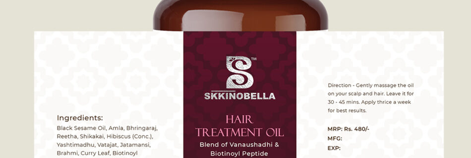
For Skinobella, a Mumbai-based hair and skincare brand, we crafted elegant and modern label designs for their shampoo bottles—blending aesthetics with clarity to enhance shelf appeal. Our goal was to create packaging design that not only aligned with the brand’s premium feel but also communicated trust and quality to beauty-conscious consumers. Previous PostNext Post

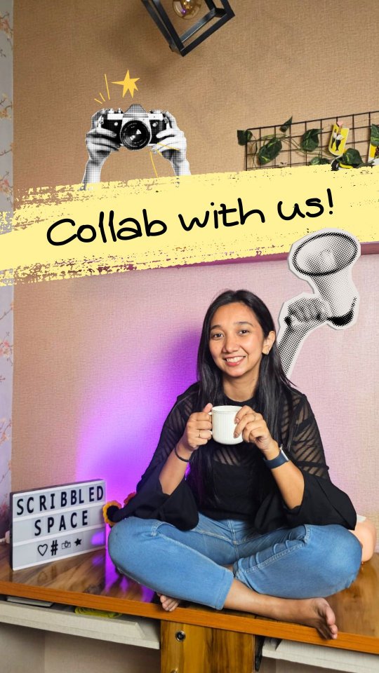
![If this reel finds a girl building her brand from scratch… this is your sign ✨
You don’t need a huge budget to make your products look premium.
You just need the right shoot.
We offer professional product photography that actually makes sense—no overpricing, just quality that sells.
Comment “Hi” and let’s create something amazing together 💬
[Girls, Women, Business, Girl led Business, Women Led Brand, Product Shoot, Photo Shoot, Photography, Product Photography, Scribbled Space, Building Brands, Trending, Collaboration, Lets Collab]](https://scribbledspace.in/wp-content/uploads/2025/03/671114966_18227987749311590_6868305233484609768_n.jpg)
![POV: Your brand finally gets the photos it deserves 📸🔥
--
[Small Brands, Product Photography, Small Brand Photography, Brand Visuals, Product Shoot, Startup Brands, Elevate Your Brand, Premium Visuals, Studio Quality, Creative Direction, Product Styling, Brand Glowup, Levelup Your Brand, Photoshoot, Brand Identity, Design Studio, Indian Brands]
#collab #bookashoot #brandingagency #logodesinger #mumbaidesigner](https://scontent-bom2-3.cdninstagram.com/v/t51.82787-15/670343674_18227339524311590_8792348788362360982_n.webp?stp=dst-jpg_e35_tt6&_nc_cat=103&ccb=7-5&_nc_sid=18de74&efg=eyJlZmdfdGFnIjoiQ0FST1VTRUxfSVRFTS5iZXN0X2ltYWdlX3VybGdlbi5DMyJ9&_nc_ohc=6V3MNylj7RYQ7kNvwELtfdZ&_nc_oc=Adp8b7BlJ_1JI7pedttFbYpf9GhPcb9b6PKRXr5Ov8xoJdPrG-fDZhz_XeJj6FjsTXZL_lDfbw1C5pq9vpeKsnYx&_nc_zt=23&_nc_ht=scontent-bom2-3.cdninstagram.com&edm=ANo9K5cEAAAA&_nc_gid=T0s_m1zWsjd1aY6roZ_12A&_nc_tpa=Q5bMBQHrp3ESqt2WZ6rArJ5kKGeDhxo4ZyaiEvXawTBVWL3OfRPol80FH641Lv5jFhB7l7Z7MbCbjDnw&oh=00_Af6bTZhVyhDlBQEEAWtIh1D9utk4VBRGTI5ih-NDMTB4Wg&oe=6A18AA76)
![POV: Your brand finally gets the photos it deserves 📸🔥
--
[Small Brands, Product Photography, Small Brand Photography, Brand Visuals, Product Shoot, Startup Brands, Elevate Your Brand, Premium Visuals, Studio Quality, Creative Direction, Product Styling, Brand Glowup, Levelup Your Brand, Photoshoot, Brand Identity, Design Studio, Indian Brands]
#collab #bookashoot #brandingagency #logodesinger #mumbaidesigner](https://scontent-bom2-3.cdninstagram.com/v/t51.82787-15/670006146_18227339515311590_6512975998880644735_n.webp?stp=dst-jpg_e35_tt6&_nc_cat=103&ccb=7-5&_nc_sid=18de74&efg=eyJlZmdfdGFnIjoiQ0FST1VTRUxfSVRFTS5iZXN0X2ltYWdlX3VybGdlbi5DMyJ9&_nc_ohc=l4_bQ2wVEqsQ7kNvwEQ4088&_nc_oc=Adr2hGzfNMGarlntLX7smLdCKDxPPiV9-gwv9aJ7wLYhra-Dtde7nSqKFIq3-r4Mp59h8QngNPgVjddackzogNnN&_nc_zt=23&_nc_ht=scontent-bom2-3.cdninstagram.com&edm=ANo9K5cEAAAA&_nc_gid=T0s_m1zWsjd1aY6roZ_12A&_nc_tpa=Q5bMBQGISg7NzzMlrVMQ12noY-izv7p4MDD4GbxBRdV-0Tkpcxb4NO7tBbRp_xDSkvplrSndeubH2Q24&oh=00_Af5Muu4QustiAkttINwme38V3vJag4QP6CYmURlAL19Z9A&oe=6A18A924)
![POV: Your brand finally gets the photos it deserves 📸🔥
--
[Small Brands, Product Photography, Small Brand Photography, Brand Visuals, Product Shoot, Startup Brands, Elevate Your Brand, Premium Visuals, Studio Quality, Creative Direction, Product Styling, Brand Glowup, Levelup Your Brand, Photoshoot, Brand Identity, Design Studio, Indian Brands]
#collab #bookashoot #brandingagency #logodesinger #mumbaidesigner](https://scontent-bom5-2.cdninstagram.com/v/t51.82787-15/670823383_18227339533311590_510160244516602930_n.webp?stp=dst-jpg_e35_tt6&_nc_cat=100&ccb=7-5&_nc_sid=18de74&efg=eyJlZmdfdGFnIjoiQ0FST1VTRUxfSVRFTS5iZXN0X2ltYWdlX3VybGdlbi5DMyJ9&_nc_ohc=_RiJcTMa8KEQ7kNvwGQ4uEx&_nc_oc=AdrSPWm8rtc_s1kMfklPj8uy8J236gZBvXIEB-jImaXqxz-mJFGHoWKvJIlR3-_kXkoExDmpA9OK7zEeiwuVsLpu&_nc_zt=23&_nc_ht=scontent-bom5-2.cdninstagram.com&edm=ANo9K5cEAAAA&_nc_gid=T0s_m1zWsjd1aY6roZ_12A&_nc_tpa=Q5bMBQEdmJm8a_bMS6BkrUiwQLSME85-iXfRjn8FeuyqA6-eZTWHFPksuLXH8wfxibTjUf3b5169Axx1&oh=00_Af7SPwyhGDP1gNTMhPyawHCG4A9NaW8WX7lT0TyJ24heKA&oe=6A188412)
![POV: Your brand finally gets the photos it deserves 📸🔥
--
[Small Brands, Product Photography, Small Brand Photography, Brand Visuals, Product Shoot, Startup Brands, Elevate Your Brand, Premium Visuals, Studio Quality, Creative Direction, Product Styling, Brand Glowup, Levelup Your Brand, Photoshoot, Brand Identity, Design Studio, Indian Brands]
#collab #bookashoot #brandingagency #logodesinger #mumbaidesigner](https://scontent-bom2-1.cdninstagram.com/v/t51.82787-15/670278328_18227339542311590_8090356755590287139_n.webp?stp=dst-jpg_e35_tt6&_nc_cat=107&ccb=7-5&_nc_sid=18de74&efg=eyJlZmdfdGFnIjoiQ0FST1VTRUxfSVRFTS5iZXN0X2ltYWdlX3VybGdlbi5DMyJ9&_nc_ohc=DdkZ58nh6OAQ7kNvwFkjFFp&_nc_oc=AdqHm1GuTezQqdYllii0Og7MWw-AY4ZGcEzfB42eO4OVQiv5ptV2Uk6738ya72MesPIKR_P9rFszYpVxUoVtcpIo&_nc_zt=23&_nc_ht=scontent-bom2-1.cdninstagram.com&edm=ANo9K5cEAAAA&_nc_gid=T0s_m1zWsjd1aY6roZ_12A&_nc_tpa=Q5bMBQGooVu2D4Lqz_LlEKD7jX4-ii8iAnho1VaIirrWXIPuzVgCvORlOo4v7lhVM6g57zhW5CWpyWvr&oh=00_Af7vMVF2Aj7l9ozPDTIGB_fPVMVrmNKu7DSyFX9kVrcR9Q&oe=6A189C61)
![Quick question—what’s the FIRST thing you see in a café? ☕👀
--
[Brand Identity, Interior Branding, Brand Experience, Design Storytelling, Brand Aesthetics, Color Palette, Typography Design, Menu Design, Custom Tableware, Logo Design, Brand Strategy, Cafe Branding, Creative Direction, Premium Branding, Design Studio, Indian Brands, Menu Design, Branding Inspiration]
#interiorbranding #brandingdesign #cafebranding #brandingagencyindia #designagencyindia graphicdesignagencyindia](https://scribbledspace.in/wp-content/uploads/2025/03/661730068_18226722064311590_6682878964062534332_n.jpg)
![Watch till the end to see how we built this brand identity. 🔥 @madrascrust
An outdoor pizzeria café inspired by nature, open fire, and the art of slow-crafted food. Every detail is designed to feel raw, warm, and just a little magical. ✨🍕
If you love thoughtful, detail-driven logo design like this, get in touch with us.
--
[Brand Identity, Logo Design, Brand Strategy, Cafe Branding, Icon Logo, Chennai , Food Outlets
Brand Collaterals, Creative Direction, Premium Branding, Design Studio, Indian Brands, Minimalist Branding, Menu Design, Branding Inspiration, Pizzeria Branding, Cafe Opening, Opening, Launch]
#brandingdesign #cafebranding #brandingagencyindia #designagencyindia #graphicdesignagencyindia](https://scribbledspace.in/wp-content/uploads/2025/04/659982991_18226304473311590_8227529019433523932_n.jpg)
![Branding an outdoor pizzeria cafe inspired by nature, fire, and slow-crafted food.⭐️
@madrascrust approached us to build their brand identity from scratch with three key emotions in mind premium, peaceful, and familiar.
An outdoor pizzeria in Chennai inspired by nature, relaxation, and artisan food, the goal was to create a dining experience that feels like a calm escape from the city’s chaos.
To shape the brand, we worked around four defining elements:
Freshness & Wholesomeness
Wood Fire & Craftsmanship
Familiarity & Comfort
Nature & Nurture
The logo was designed as an icon-based mark, while the subtle curves in the letters “d” and “c” are inspired by Tamil script, reflecting the brand’s Madras roots.
For the color palette, we chose earthy tones,rich greens, terracotta, sand, and hints of flame orange capturing the warmth of wood-fire cooking and the calmness of nature.
The visual elements echo the ambience of the space wood-fire pizza, slow-made craftsmanship, open green surroundings, and a handcrafted homely atmosphere.
Extending the identity further, we designed brand collaterals including the menu card, where the text placement invites customers to rotate the menu for a dual-sided viewing experience, along with a comprehensive style guide to ensure consistency across the brand.
The final result is a brand that feels premium, peaceful, and familiar perfectly reflecting the essence of Madras Crust.😍
From scratch to logo to menu to full branding, every detail was designed to create a calm, welcoming identity rooted in craft, comfort, and nature.
Swipe to escape the city without leaving it.➡️
--
[Brand Identity, Logo Design, Brand Strategy, Cafe Branding, Icon Logo, Chennai , Food Outlets
Brand Collaterals, Creative Direction, Premium Branding, Design Studio, Indian Brands, Minimalist Branding, Menu Design, Branding Inspiration, Pizzeria Branding, Cafe Opening, Opening, Launch]
#brandingdesign #cafebranding #brandingagencyindia #designagencyindia #graphicdesignagencyindia](https://scontent-bom5-1.cdninstagram.com/v/t51.82787-15/650171766_18222402493311590_1480718506250368553_n.heic?stp=dst-jpg_e35_tt6&_nc_cat=110&ccb=7-5&_nc_sid=18de74&efg=eyJlZmdfdGFnIjoiQ0FST1VTRUxfSVRFTS5iZXN0X2ltYWdlX3VybGdlbi5DMyJ9&_nc_ohc=zqy6_VVRdrkQ7kNvwF9B9f1&_nc_oc=AdqopRNFBbsgqmGFKex7HLzRl9LtdK58GLnmoKiGOG8-dT0jvzaOZ82pokZdwA-dKs5AY0PLPCyej_Vq6F4QEMvh&_nc_zt=23&_nc_ht=scontent-bom5-1.cdninstagram.com&edm=ANo9K5cEAAAA&_nc_gid=T0s_m1zWsjd1aY6roZ_12A&_nc_tpa=Q5bMBQG6rBdVhZUvKroMiCyuiAvkDqgpiMRHq7RweZT9taMh98J_gU9TBVls6mdluiXDFz46BcGg7CmQ&oh=00_Af5Q1hNIhAusmNh1kWgLkTY5-RanMSQoLKMadGuWZTTKIg&oe=6A188BAE)
![Branding an outdoor pizzeria cafe inspired by nature, fire, and slow-crafted food.⭐️
@madrascrust approached us to build their brand identity from scratch with three key emotions in mind premium, peaceful, and familiar.
An outdoor pizzeria in Chennai inspired by nature, relaxation, and artisan food, the goal was to create a dining experience that feels like a calm escape from the city’s chaos.
To shape the brand, we worked around four defining elements:
Freshness & Wholesomeness
Wood Fire & Craftsmanship
Familiarity & Comfort
Nature & Nurture
The logo was designed as an icon-based mark, while the subtle curves in the letters “d” and “c” are inspired by Tamil script, reflecting the brand’s Madras roots.
For the color palette, we chose earthy tones,rich greens, terracotta, sand, and hints of flame orange capturing the warmth of wood-fire cooking and the calmness of nature.
The visual elements echo the ambience of the space wood-fire pizza, slow-made craftsmanship, open green surroundings, and a handcrafted homely atmosphere.
Extending the identity further, we designed brand collaterals including the menu card, where the text placement invites customers to rotate the menu for a dual-sided viewing experience, along with a comprehensive style guide to ensure consistency across the brand.
The final result is a brand that feels premium, peaceful, and familiar perfectly reflecting the essence of Madras Crust.😍
From scratch to logo to menu to full branding, every detail was designed to create a calm, welcoming identity rooted in craft, comfort, and nature.
Swipe to escape the city without leaving it.➡️
--
[Brand Identity, Logo Design, Brand Strategy, Cafe Branding, Icon Logo, Chennai , Food Outlets
Brand Collaterals, Creative Direction, Premium Branding, Design Studio, Indian Brands, Minimalist Branding, Menu Design, Branding Inspiration, Pizzeria Branding, Cafe Opening, Opening, Launch]
#brandingdesign #cafebranding #brandingagencyindia #designagencyindia #graphicdesignagencyindia](https://scontent-bom5-1.cdninstagram.com/v/t51.82787-15/649976817_18222402502311590_3001001912357429784_n.heic?stp=dst-jpg_e35_tt6&_nc_cat=111&ccb=7-5&_nc_sid=18de74&efg=eyJlZmdfdGFnIjoiQ0FST1VTRUxfSVRFTS5iZXN0X2ltYWdlX3VybGdlbi5DMyJ9&_nc_ohc=Pa6IkP2I5XgQ7kNvwEysHDP&_nc_oc=Adr59ZpxNCP_b8ji9kKs3iqn94l2vesygP2TdkDRbGpUT2MUzCX8we8eR8Bv9WD-8UKDtwo2SW_7PWtQx1O-gHkl&_nc_zt=23&_nc_ht=scontent-bom5-1.cdninstagram.com&edm=ANo9K5cEAAAA&_nc_gid=T0s_m1zWsjd1aY6roZ_12A&_nc_tpa=Q5bMBQEMRvNDIGxXy6-M1IvQr0or3TKAJcbtP8HZnnHkZZwJy4Nbxsu4XMGg-9rVkSh8YvMe8KVQXJRW&oh=00_Af6_CKfL573i1jsBTy35y1dNsUU5ITImwVdJIhIAawWB3Q&oe=6A187FC8)
![Branding an outdoor pizzeria cafe inspired by nature, fire, and slow-crafted food.⭐️
@madrascrust approached us to build their brand identity from scratch with three key emotions in mind premium, peaceful, and familiar.
An outdoor pizzeria in Chennai inspired by nature, relaxation, and artisan food, the goal was to create a dining experience that feels like a calm escape from the city’s chaos.
To shape the brand, we worked around four defining elements:
Freshness & Wholesomeness
Wood Fire & Craftsmanship
Familiarity & Comfort
Nature & Nurture
The logo was designed as an icon-based mark, while the subtle curves in the letters “d” and “c” are inspired by Tamil script, reflecting the brand’s Madras roots.
For the color palette, we chose earthy tones,rich greens, terracotta, sand, and hints of flame orange capturing the warmth of wood-fire cooking and the calmness of nature.
The visual elements echo the ambience of the space wood-fire pizza, slow-made craftsmanship, open green surroundings, and a handcrafted homely atmosphere.
Extending the identity further, we designed brand collaterals including the menu card, where the text placement invites customers to rotate the menu for a dual-sided viewing experience, along with a comprehensive style guide to ensure consistency across the brand.
The final result is a brand that feels premium, peaceful, and familiar perfectly reflecting the essence of Madras Crust.😍
From scratch to logo to menu to full branding, every detail was designed to create a calm, welcoming identity rooted in craft, comfort, and nature.
Swipe to escape the city without leaving it.➡️
--
[Brand Identity, Logo Design, Brand Strategy, Cafe Branding, Icon Logo, Chennai , Food Outlets
Brand Collaterals, Creative Direction, Premium Branding, Design Studio, Indian Brands, Minimalist Branding, Menu Design, Branding Inspiration, Pizzeria Branding, Cafe Opening, Opening, Launch]
#brandingdesign #cafebranding #brandingagencyindia #designagencyindia #graphicdesignagencyindia](https://scontent-bom2-4.cdninstagram.com/v/t51.82787-15/650280299_18222402523311590_1833353524936066491_n.heic?stp=dst-jpg_e35_tt6&_nc_cat=106&ccb=7-5&_nc_sid=18de74&efg=eyJlZmdfdGFnIjoiQ0FST1VTRUxfSVRFTS5iZXN0X2ltYWdlX3VybGdlbi5DMyJ9&_nc_ohc=me9NUWYUMJ0Q7kNvwF9QqaO&_nc_oc=AdqJylHHnzN9JRgQCAKYY0pBuy-_y6IJbXIrFzzRRTIs_QVMP31mcawXst_0vCfbxRanS0gsL8MbKRilid2YOT-V&_nc_zt=23&_nc_ht=scontent-bom2-4.cdninstagram.com&edm=ANo9K5cEAAAA&_nc_gid=T0s_m1zWsjd1aY6roZ_12A&_nc_tpa=Q5bMBQE7KMoswWcd0MCRv-z16ceFUXEEqWb3kOy8sKrZg_Y3Ho8ZUWLD1uR6DzWjYMOzgVZ9I3x0cF0G&oh=00_Af4c6ZNe97VrCMdNaTnr_vWyO8jXwB5HWhn3GpWRiufpPg&oe=6A1895C1)
![Branding an outdoor pizzeria cafe inspired by nature, fire, and slow-crafted food.⭐️
@madrascrust approached us to build their brand identity from scratch with three key emotions in mind premium, peaceful, and familiar.
An outdoor pizzeria in Chennai inspired by nature, relaxation, and artisan food, the goal was to create a dining experience that feels like a calm escape from the city’s chaos.
To shape the brand, we worked around four defining elements:
Freshness & Wholesomeness
Wood Fire & Craftsmanship
Familiarity & Comfort
Nature & Nurture
The logo was designed as an icon-based mark, while the subtle curves in the letters “d” and “c” are inspired by Tamil script, reflecting the brand’s Madras roots.
For the color palette, we chose earthy tones,rich greens, terracotta, sand, and hints of flame orange capturing the warmth of wood-fire cooking and the calmness of nature.
The visual elements echo the ambience of the space wood-fire pizza, slow-made craftsmanship, open green surroundings, and a handcrafted homely atmosphere.
Extending the identity further, we designed brand collaterals including the menu card, where the text placement invites customers to rotate the menu for a dual-sided viewing experience, along with a comprehensive style guide to ensure consistency across the brand.
The final result is a brand that feels premium, peaceful, and familiar perfectly reflecting the essence of Madras Crust.😍
From scratch to logo to menu to full branding, every detail was designed to create a calm, welcoming identity rooted in craft, comfort, and nature.
Swipe to escape the city without leaving it.➡️
--
[Brand Identity, Logo Design, Brand Strategy, Cafe Branding, Icon Logo, Chennai , Food Outlets
Brand Collaterals, Creative Direction, Premium Branding, Design Studio, Indian Brands, Minimalist Branding, Menu Design, Branding Inspiration, Pizzeria Branding, Cafe Opening, Opening, Launch]
#brandingdesign #cafebranding #brandingagencyindia #designagencyindia #graphicdesignagencyindia](https://scontent-bom2-4.cdninstagram.com/v/t51.82787-15/641114513_18222402511311590_7190183784389504845_n.heic?stp=dst-jpg_e35_tt6&_nc_cat=106&ccb=7-5&_nc_sid=18de74&efg=eyJlZmdfdGFnIjoiQ0FST1VTRUxfSVRFTS5iZXN0X2ltYWdlX3VybGdlbi5DMyJ9&_nc_ohc=2YAarI_KKhsQ7kNvwFM9VX0&_nc_oc=AdrKMqoxT-muPyal6FCs1IZEhNeM9F--a_14g2hqNsRbEVATeDxvthIcDVUjVEjxgx9OB23fgKVKU73UWTJc5YHG&_nc_zt=23&_nc_ht=scontent-bom2-4.cdninstagram.com&edm=ANo9K5cEAAAA&_nc_gid=T0s_m1zWsjd1aY6roZ_12A&_nc_tpa=Q5bMBQGvBh0aL2sjqdYBtG_qga8o673psl8F3aKRPDG6su9vZJqCgvVW3QoWEGxq3akQzSYEX_QaLHd-&oh=00_Af61Oy7EjCDeWpRyqKYRbm28FlNxa7vRnW1TRWfYdpm_8g&oe=6A188724)
![Branding an outdoor pizzeria cafe inspired by nature, fire, and slow-crafted food.⭐️
@madrascrust approached us to build their brand identity from scratch with three key emotions in mind premium, peaceful, and familiar.
An outdoor pizzeria in Chennai inspired by nature, relaxation, and artisan food, the goal was to create a dining experience that feels like a calm escape from the city’s chaos.
To shape the brand, we worked around four defining elements:
Freshness & Wholesomeness
Wood Fire & Craftsmanship
Familiarity & Comfort
Nature & Nurture
The logo was designed as an icon-based mark, while the subtle curves in the letters “d” and “c” are inspired by Tamil script, reflecting the brand’s Madras roots.
For the color palette, we chose earthy tones,rich greens, terracotta, sand, and hints of flame orange capturing the warmth of wood-fire cooking and the calmness of nature.
The visual elements echo the ambience of the space wood-fire pizza, slow-made craftsmanship, open green surroundings, and a handcrafted homely atmosphere.
Extending the identity further, we designed brand collaterals including the menu card, where the text placement invites customers to rotate the menu for a dual-sided viewing experience, along with a comprehensive style guide to ensure consistency across the brand.
The final result is a brand that feels premium, peaceful, and familiar perfectly reflecting the essence of Madras Crust.😍
From scratch to logo to menu to full branding, every detail was designed to create a calm, welcoming identity rooted in craft, comfort, and nature.
Swipe to escape the city without leaving it.➡️
--
[Brand Identity, Logo Design, Brand Strategy, Cafe Branding, Icon Logo, Chennai , Food Outlets
Brand Collaterals, Creative Direction, Premium Branding, Design Studio, Indian Brands, Minimalist Branding, Menu Design, Branding Inspiration, Pizzeria Branding, Cafe Opening, Opening, Launch]
#brandingdesign #cafebranding #brandingagencyindia #designagencyindia #graphicdesignagencyindia](https://scontent-bom5-2.cdninstagram.com/v/t51.82787-15/649925945_18222402532311590_2247791885157325207_n.heic?stp=dst-jpg_e35_tt6&_nc_cat=104&ccb=7-5&_nc_sid=18de74&efg=eyJlZmdfdGFnIjoiQ0FST1VTRUxfSVRFTS5iZXN0X2ltYWdlX3VybGdlbi5DMyJ9&_nc_ohc=uovUv624ZZMQ7kNvwEkRGj1&_nc_oc=AdoTRUzZUWLjXgKOg2z3rqRobVCRcCblGGx2LqoMrXc-7mEI1bvIJhvMblNMEDv4ZmJXwNLAZkZQwyLmRxr6Opyh&_nc_zt=23&_nc_ht=scontent-bom5-2.cdninstagram.com&edm=ANo9K5cEAAAA&_nc_gid=T0s_m1zWsjd1aY6roZ_12A&_nc_tpa=Q5bMBQGZ1f_tsQ0j16GbrRpfjWdHGwhKxfZ0zRfBy1faUQsz8vwBBHnjbaDh5baok1s9v-Vywpolby6o&oh=00_Af4ajE9etvhxke1uytnbF6HYK4fihdIcEDul1usOBM0Hyw&oe=6A18A6ED)
![Branding an outdoor pizzeria cafe inspired by nature, fire, and slow-crafted food.⭐️
@madrascrust approached us to build their brand identity from scratch with three key emotions in mind premium, peaceful, and familiar.
An outdoor pizzeria in Chennai inspired by nature, relaxation, and artisan food, the goal was to create a dining experience that feels like a calm escape from the city’s chaos.
To shape the brand, we worked around four defining elements:
Freshness & Wholesomeness
Wood Fire & Craftsmanship
Familiarity & Comfort
Nature & Nurture
The logo was designed as an icon-based mark, while the subtle curves in the letters “d” and “c” are inspired by Tamil script, reflecting the brand’s Madras roots.
For the color palette, we chose earthy tones,rich greens, terracotta, sand, and hints of flame orange capturing the warmth of wood-fire cooking and the calmness of nature.
The visual elements echo the ambience of the space wood-fire pizza, slow-made craftsmanship, open green surroundings, and a handcrafted homely atmosphere.
Extending the identity further, we designed brand collaterals including the menu card, where the text placement invites customers to rotate the menu for a dual-sided viewing experience, along with a comprehensive style guide to ensure consistency across the brand.
The final result is a brand that feels premium, peaceful, and familiar perfectly reflecting the essence of Madras Crust.😍
From scratch to logo to menu to full branding, every detail was designed to create a calm, welcoming identity rooted in craft, comfort, and nature.
Swipe to escape the city without leaving it.➡️
--
[Brand Identity, Logo Design, Brand Strategy, Cafe Branding, Icon Logo, Chennai , Food Outlets
Brand Collaterals, Creative Direction, Premium Branding, Design Studio, Indian Brands, Minimalist Branding, Menu Design, Branding Inspiration, Pizzeria Branding, Cafe Opening, Opening, Launch]
#brandingdesign #cafebranding #brandingagencyindia #designagencyindia #graphicdesignagencyindia](https://scontent-bom2-1.cdninstagram.com/v/t51.82787-15/650373668_18222402541311590_5778898623459408510_n.heic?stp=dst-jpg_e35_tt6&_nc_cat=107&ccb=7-5&_nc_sid=18de74&efg=eyJlZmdfdGFnIjoiQ0FST1VTRUxfSVRFTS5iZXN0X2ltYWdlX3VybGdlbi5DMyJ9&_nc_ohc=xfMvmZdzVLYQ7kNvwHGUGTK&_nc_oc=Adrd4MyjQPUW5PkX4UZl-G4lGTA803mrNWIW2sqLg7NyYVz4oPhSSHHTtdtekXCpfYIexjsrHsNU9-efBu0yY-Xj&_nc_zt=23&_nc_ht=scontent-bom2-1.cdninstagram.com&edm=ANo9K5cEAAAA&_nc_gid=T0s_m1zWsjd1aY6roZ_12A&_nc_tpa=Q5bMBQF68hGM_--WOVP61LbIq9f_uzetkxI12ivBMwZ_lOyc1W1VSz1GqGqYMfHpaSyOKETqCa7CcBCD&oh=00_Af7UEr5Ac93yRS-J07T2Y3fyOcByzx-smvXb_D5IugEO_Q&oe=6A1899D8)
![Branding an outdoor pizzeria cafe inspired by nature, fire, and slow-crafted food.⭐️
@madrascrust approached us to build their brand identity from scratch with three key emotions in mind premium, peaceful, and familiar.
An outdoor pizzeria in Chennai inspired by nature, relaxation, and artisan food, the goal was to create a dining experience that feels like a calm escape from the city’s chaos.
To shape the brand, we worked around four defining elements:
Freshness & Wholesomeness
Wood Fire & Craftsmanship
Familiarity & Comfort
Nature & Nurture
The logo was designed as an icon-based mark, while the subtle curves in the letters “d” and “c” are inspired by Tamil script, reflecting the brand’s Madras roots.
For the color palette, we chose earthy tones,rich greens, terracotta, sand, and hints of flame orange capturing the warmth of wood-fire cooking and the calmness of nature.
The visual elements echo the ambience of the space wood-fire pizza, slow-made craftsmanship, open green surroundings, and a handcrafted homely atmosphere.
Extending the identity further, we designed brand collaterals including the menu card, where the text placement invites customers to rotate the menu for a dual-sided viewing experience, along with a comprehensive style guide to ensure consistency across the brand.
The final result is a brand that feels premium, peaceful, and familiar perfectly reflecting the essence of Madras Crust.😍
From scratch to logo to menu to full branding, every detail was designed to create a calm, welcoming identity rooted in craft, comfort, and nature.
Swipe to escape the city without leaving it.➡️
--
[Brand Identity, Logo Design, Brand Strategy, Cafe Branding, Icon Logo, Chennai , Food Outlets
Brand Collaterals, Creative Direction, Premium Branding, Design Studio, Indian Brands, Minimalist Branding, Menu Design, Branding Inspiration, Pizzeria Branding, Cafe Opening, Opening, Launch]
#brandingdesign #cafebranding #brandingagencyindia #designagencyindia #graphicdesignagencyindia](https://scontent-bom5-1.cdninstagram.com/v/t51.82787-15/649663158_18222402550311590_8183310296624334926_n.heic?stp=dst-jpg_e35_tt6&_nc_cat=111&ccb=7-5&_nc_sid=18de74&efg=eyJlZmdfdGFnIjoiQ0FST1VTRUxfSVRFTS5iZXN0X2ltYWdlX3VybGdlbi5DMyJ9&_nc_ohc=UCvgNSuXDG8Q7kNvwGRzWek&_nc_oc=AdrOuQsUW6zmiAE-YxcU82fj7Acf4bnoK0eFoVNvrsZ2rV26jx_NEEIaCs7S3VlipIt3riz0L88PUUg_NEtCh-CK&_nc_zt=23&_nc_ht=scontent-bom5-1.cdninstagram.com&edm=ANo9K5cEAAAA&_nc_gid=T0s_m1zWsjd1aY6roZ_12A&_nc_tpa=Q5bMBQHJU708Uf3V2bvoVow8ZGDslKRNRuAqHcCAWImEd9kLWEl1GJwDTBQNo0bTq3B2FcqVdDDgqjNQ&oh=00_Af7-yGHYUH531phSQ8GqKYOHZr8zotMsgPzD-1F6aTOH3w&oe=6A18AB5D)
![Branding an outdoor pizzeria cafe inspired by nature, fire, and slow-crafted food.⭐️
@madrascrust approached us to build their brand identity from scratch with three key emotions in mind premium, peaceful, and familiar.
An outdoor pizzeria in Chennai inspired by nature, relaxation, and artisan food, the goal was to create a dining experience that feels like a calm escape from the city’s chaos.
To shape the brand, we worked around four defining elements:
Freshness & Wholesomeness
Wood Fire & Craftsmanship
Familiarity & Comfort
Nature & Nurture
The logo was designed as an icon-based mark, while the subtle curves in the letters “d” and “c” are inspired by Tamil script, reflecting the brand’s Madras roots.
For the color palette, we chose earthy tones,rich greens, terracotta, sand, and hints of flame orange capturing the warmth of wood-fire cooking and the calmness of nature.
The visual elements echo the ambience of the space wood-fire pizza, slow-made craftsmanship, open green surroundings, and a handcrafted homely atmosphere.
Extending the identity further, we designed brand collaterals including the menu card, where the text placement invites customers to rotate the menu for a dual-sided viewing experience, along with a comprehensive style guide to ensure consistency across the brand.
The final result is a brand that feels premium, peaceful, and familiar perfectly reflecting the essence of Madras Crust.😍
From scratch to logo to menu to full branding, every detail was designed to create a calm, welcoming identity rooted in craft, comfort, and nature.
Swipe to escape the city without leaving it.➡️
--
[Brand Identity, Logo Design, Brand Strategy, Cafe Branding, Icon Logo, Chennai , Food Outlets
Brand Collaterals, Creative Direction, Premium Branding, Design Studio, Indian Brands, Minimalist Branding, Menu Design, Branding Inspiration, Pizzeria Branding, Cafe Opening, Opening, Launch]
#brandingdesign #cafebranding #brandingagencyindia #designagencyindia #graphicdesignagencyindia](https://scontent-bom5-1.cdninstagram.com/v/t51.82787-15/650066570_18222402562311590_8473910201062120355_n.heic?stp=dst-jpg_e35_tt6&_nc_cat=110&ccb=7-5&_nc_sid=18de74&efg=eyJlZmdfdGFnIjoiQ0FST1VTRUxfSVRFTS5iZXN0X2ltYWdlX3VybGdlbi5DMyJ9&_nc_ohc=88BRyie8j3YQ7kNvwHMtQ_o&_nc_oc=AdpeSiQ6HbrOnApt4_2Rnvh9QZjjAtA-mtbBrS2jDCXb5MbYdEmaBIb2kECF9ujnOAMhnuZSlJzQOmgJmotqO7h7&_nc_zt=23&_nc_ht=scontent-bom5-1.cdninstagram.com&edm=ANo9K5cEAAAA&_nc_gid=T0s_m1zWsjd1aY6roZ_12A&_nc_tpa=Q5bMBQHjQV9UprLjgITOH3RTuiXD6S3O1V0T7nTGcYrxFlL4sQ4iiLHHAiudTLV5uXFC6RIX0Ld9nR1l&oh=00_Af50ITcEbqQVmA-BqolnYLBOOEfEIitVpBafF7xQBJKIXg&oe=6A18A2F5)
![Branding an outdoor pizzeria cafe inspired by nature, fire, and slow-crafted food.⭐️
@madrascrust approached us to build their brand identity from scratch with three key emotions in mind premium, peaceful, and familiar.
An outdoor pizzeria in Chennai inspired by nature, relaxation, and artisan food, the goal was to create a dining experience that feels like a calm escape from the city’s chaos.
To shape the brand, we worked around four defining elements:
Freshness & Wholesomeness
Wood Fire & Craftsmanship
Familiarity & Comfort
Nature & Nurture
The logo was designed as an icon-based mark, while the subtle curves in the letters “d” and “c” are inspired by Tamil script, reflecting the brand’s Madras roots.
For the color palette, we chose earthy tones,rich greens, terracotta, sand, and hints of flame orange capturing the warmth of wood-fire cooking and the calmness of nature.
The visual elements echo the ambience of the space wood-fire pizza, slow-made craftsmanship, open green surroundings, and a handcrafted homely atmosphere.
Extending the identity further, we designed brand collaterals including the menu card, where the text placement invites customers to rotate the menu for a dual-sided viewing experience, along with a comprehensive style guide to ensure consistency across the brand.
The final result is a brand that feels premium, peaceful, and familiar perfectly reflecting the essence of Madras Crust.😍
From scratch to logo to menu to full branding, every detail was designed to create a calm, welcoming identity rooted in craft, comfort, and nature.
Swipe to escape the city without leaving it.➡️
--
[Brand Identity, Logo Design, Brand Strategy, Cafe Branding, Icon Logo, Chennai , Food Outlets
Brand Collaterals, Creative Direction, Premium Branding, Design Studio, Indian Brands, Minimalist Branding, Menu Design, Branding Inspiration, Pizzeria Branding, Cafe Opening, Opening, Launch]
#brandingdesign #cafebranding #brandingagencyindia #designagencyindia #graphicdesignagencyindia](https://scontent-bom2-3.cdninstagram.com/v/t51.82787-15/650894991_18222402571311590_9168316276595716553_n.heic?stp=dst-jpg_e35_tt6&_nc_cat=101&ccb=7-5&_nc_sid=18de74&efg=eyJlZmdfdGFnIjoiQ0FST1VTRUxfSVRFTS5iZXN0X2ltYWdlX3VybGdlbi5DMyJ9&_nc_ohc=1Oy7Es-3dRMQ7kNvwGPFD3m&_nc_oc=AdqgZ0kH_8FCDybp6o4Ftl9Ip35TPPhrysIP70FFGw3KV8RPOlFzIsvIkGh-BBl0Xnx2cOk3mLYeQzI9l6KEDr01&_nc_zt=23&_nc_ht=scontent-bom2-3.cdninstagram.com&edm=ANo9K5cEAAAA&_nc_gid=T0s_m1zWsjd1aY6roZ_12A&_nc_tpa=Q5bMBQGr79MdEc7c489D2nqyZlc4N4-TVop7319P4DQqMUrEea5pybLvPcqYc6h2MNJm_G30B7vszGZF&oh=00_Af6YrztHfT9HwHigsDd47B89hFApLrwneWiNxOAjQa3bwg&oe=6A188132)