One Step was a passion-project a exploration into bold and minimal branding. At Scribbled Space, we brought this idea to life by crafting a brand identity that’s clean, confident, and purposefully simple—just like the brand’s core message: Zero Hassle. One Step. Ready to Go. From designing a sharp, modern logo to developing eye-catching packaging that speaks convenience and clarity, every element was thoughtfully created to reflect ease, speed, and readiness. As a passion project, this branding journey gave us full creative freedom to experiment, align visual storytelling with function, and build a brand that feels fresh, relatable, and instantly memorable. It’s a perfect example of how powerful logo design and packaging design can turn a simple concept into a standout identity. Previous PostNext Post
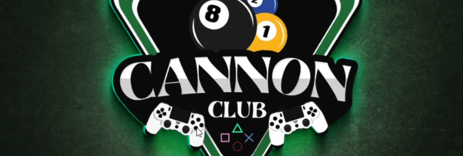
For Cannon Club, a vibrant snooker and PlayStation gaming lounge based in Rajasthan, we developed a bold logo design and cohesive brand identity that reflect its energetic, competitive spirit. From the dynamic logo to the striking club board design, every branding element was crafted to capture the pulse of the space and resonate with both gaming enthusiasts and snooker lovers alike. Previous PostNext Post

When Incredible Heart, a renowned cardiac care centre based in the US, approached us, their goal was clear — to create a brand logo that reflects both medical excellence and genuine compassion for every heartbeat they care for. At Scribbled Space, we took on the challenge of redesigning their logo while preserving the essence of their original concept. The new identity was crafted to symbolize trust, innovation, and the human touch that defines the healthcare experience. Our design approach for Incredible Heart focused on reimagining the existing logo into a modern and meaningful Icon that stayed true to its original essence. We thoughtfully blended symbolism — incorporating a heart, stethoscope, and out of the box — to represent cardiology, connection, and innovative thinking in healthcare. Clean yet confident typography balanced professional authority with approachability, while a carefully chosen color palette evoked trust, vitality, and care. The result is a sophisticated visual identity that positions Incredible Heart as a forward-thinking healthcare brand that seamlessly blends science with empathy. At Scribbled Space, we help doctors, healthcare centres, and medical professionals craft brands that inspire confidence and create lasting human connections. Previous PostNext Post
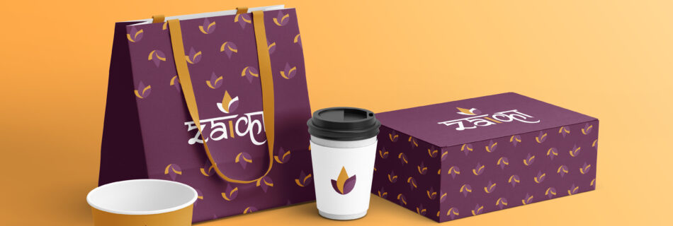
Building a Future-Ready Zaika – The Indian Kitchen | Branding by Scribbled Space. A passion project by Scribbled Space, Zaika is a premium Indian restaurant based in London. We crafted a bold and meaningful brand identity blending Indian tradition with modern elegance. A powerful fusion of Hindi & English typography with a symbolic flame element representing warmth, tradition, and culinary excellence. The logo balances elegance with authenticity, making it memorable and meaningful. We designed Zaika’s menu and packaging to reflect the brand’s premium yet rooted identity — combining traditional Indian elements with a modern aesthetic. While the menu offers a clean, elegant layout for a refined dining experience, the packaging ensures every takeaway feels just as special, with thoughtful details and consistent branding across all touchpoints. Previous PostNext Post
Genixx Building a Future-Ready Brand from the Ground Up. we had the opportunity to craft a strong and meaningful brand identity for Genixx Biotech, a visionary player in the biotechnology space. Starting with a modern, minimal yet impactful logo design, we built a brand language that reflects innovation, trust, and scientific excellence. We extended this identity into thoughtfully designed product packaging that balanced aesthetics with function—ensuring shelf appeal while maintaining industry compliance. To further elevate their digital presence, we designed and developed their website www.genixxbiotech.com, creating a clean and intuitive user experience that aligns perfectly with their brand ethos. The client loved the complete branding experience—right from logo creation to packaging design and website design—and now Genixx Biotech proudly stands out with a cohesive and future-forward identity. Previous PostNext Post
Kimaya was one of those rare brandning passion projects that truly sparked our creative energy. A contemporary gold jewellery brand, Kimaya needed a distinct brand identity that balanced elegance with modern sophistication. We began by crafting a refined monogram logo, intricately designed using the initials to reflect timeless luxury with a modern twist. We extended this identity into premium packaging design, ensuring every detail—from textures to finishes—reflected the finesse of handcrafted gold jewellery. To build a strong digital presence from day one, we also curated their initial social media design, creating a visual grid that was elegant, engaging, and brand-aligned. The client was absolutely thrilled with the outcome. From logo designing to branding, packaging, and social media, Kimaya is a perfect example of how passion-fueled creativity can transform a vision into a luxurious and memorable brand experience. Previous PostNext Post
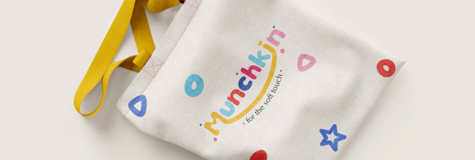
At Scribbled Space, Munchkin was more than just a design project—it was a passion project straight from the heart. We poured our creativity into building a playful and feel-good brand for kids, one that radiates warmth, innocence, and imagination. Right from the logo to the packaging, every detail was thoughtfully crafted to evoke a sense of wonder and comfort. We developed a soft, pastel-driven visual identity, paired with adorable hand-drawn elements and a charming mascot that instantly connects with both kids and parents. From the stickers to the boxes, every touchpoint was designed to create a cohesive brand world that’s not just aesthetically pleasing but emotionally meaningful. This project allowed us to experiment with storytelling, textures, and tone in the most whimsical way—and the result is a brand that feels like a hug in design form. Munchkin is a beautiful reminder of why we do what we do: to bring ideas to life with heart, purpose, and joy. Previous PostNext Post
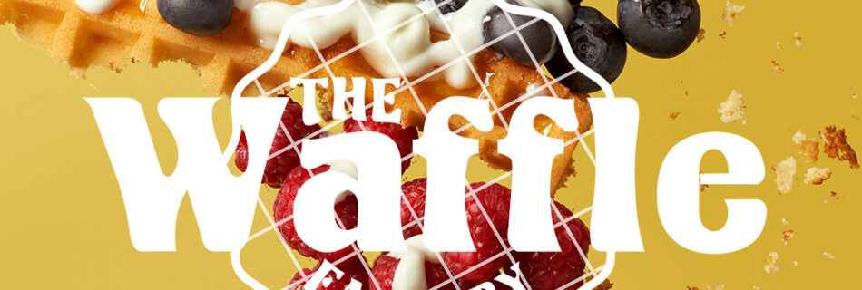
The Waffle Factory is a fun and flavor-packed café brand that celebrates the joy of waffles. For this passion project, Scribbled Space crafted a complete branding and design identity that’s as irresistible as the brand’s menu. From logo design to packaging, tent card, and menu design, every element was created to reflect the café’s playful spirit and mouth-watering appeal. The logo captures the warmth and indulgence of waffles, while the packaging design ensures every order feels premium, memorable, and on-brand. Our goal was to create a cohesive visual identity that not only looks delicious but also builds strong brand recall. The result — a design experience that’s bold, inviting, and perfectly suited for a modern café brand. Previous PostNext Post
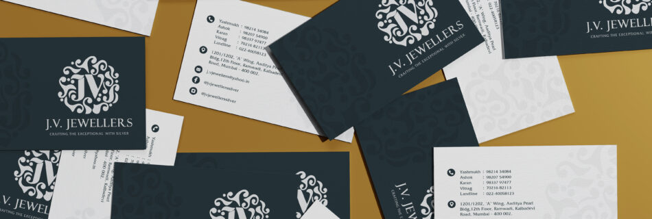
JV Jewellers We had the incredible opportunity to redefine the visual story of JV Jewellers, a legacy brand rooted in pure silver and authentic craftsmanship. Our journey began with logo designing, where we transformed their dated identity into a regal, intricately designed emblem that reflects the richness and tradition of their jewellery-making heritage. From there, we crafted a cohesive brand identity with elegant color palettes, ornamental brand patterns, and refined typography that speaks directly to their core clientele. As social media managers, we launched their initial campaign with curated storytelling, behind-the-scenes glimpses of artisans at work, and captivating visuals that celebrated the beauty of handcrafted silver jewellery. The audience response was phenomenal—organic engagement soared, and the client loved how the branding and social media seamlessly mirrored their legacy and vision. This project is a true example of how thoughtful branding, logo designing, and social media strategy can breathe new life into a traditional business.


![If this reel finds a girl building her brand from scratch… this is your sign ✨
You don’t need a huge budget to make your products look premium.
You just need the right shoot.
We offer professional product photography that actually makes sense—no overpricing, just quality that sells.
Comment “Hi” and let’s create something amazing together 💬
[Girls, Women, Business, Girl led Business, Women Led Brand, Product Shoot, Photo Shoot, Photography, Product Photography, Scribbled Space, Building Brands, Trending, Collaboration, Lets Collab]](https://scribbledspace.in/wp-content/uploads/2025/03/671114966_18227987749311590_6868305233484609768_n.jpg)
![POV: Your brand finally gets the photos it deserves 📸🔥
--
[Small Brands, Product Photography, Small Brand Photography, Brand Visuals, Product Shoot, Startup Brands, Elevate Your Brand, Premium Visuals, Studio Quality, Creative Direction, Product Styling, Brand Glowup, Levelup Your Brand, Photoshoot, Brand Identity, Design Studio, Indian Brands]
#collab #bookashoot #brandingagency #logodesinger #mumbaidesigner](https://scontent-bom2-3.cdninstagram.com/v/t51.82787-15/670343674_18227339524311590_8792348788362360982_n.webp?stp=dst-jpg_e35_tt6&_nc_cat=103&ccb=7-5&_nc_sid=18de74&efg=eyJlZmdfdGFnIjoiQ0FST1VTRUxfSVRFTS5iZXN0X2ltYWdlX3VybGdlbi5DMyJ9&_nc_ohc=awwUHaaejoQQ7kNvwF2wEAV&_nc_oc=AdpJHx0opsMFPPH4slUavKu7Z0629GtLre52DrfCHtZp460P1pnmGDa1gBYUMgy5jPO1ylxFPKB5oUISPkMKkf4Z&_nc_zt=23&_nc_ht=scontent-bom2-3.cdninstagram.com&edm=ANo9K5cEAAAA&_nc_gid=rcox-5Yzug4wNllaStB5dg&_nc_tpa=Q5bMBQE1ZccODEll8-v7rc9nM9ILK96Lhrd7fZAUKMljSQK5vpgS89pMcIbHDROANF9VzZcSRTz8QoPT&oh=00_AQD2eva31NHGLkaQ8pZ0IzTHFSP4aeV6FRPZ0ymZhYpjQA&oe=6A62B6B6)
![POV: Your brand finally gets the photos it deserves 📸🔥
--
[Small Brands, Product Photography, Small Brand Photography, Brand Visuals, Product Shoot, Startup Brands, Elevate Your Brand, Premium Visuals, Studio Quality, Creative Direction, Product Styling, Brand Glowup, Levelup Your Brand, Photoshoot, Brand Identity, Design Studio, Indian Brands]
#collab #bookashoot #brandingagency #logodesinger #mumbaidesigner](https://scontent-bom2-3.cdninstagram.com/v/t51.82787-15/670006146_18227339515311590_6512975998880644735_n.webp?stp=dst-jpg_e35_tt6&_nc_cat=103&ccb=7-5&_nc_sid=18de74&efg=eyJlZmdfdGFnIjoiQ0FST1VTRUxfSVRFTS5iZXN0X2ltYWdlX3VybGdlbi5DMyJ9&_nc_ohc=ibz138oAp5UQ7kNvwG3wg2o&_nc_oc=AdrfkfNKAvQw-0ia-93UA8AEvrAV2swn0apRkIpZ-5Eq7-1GEQqBImVOdQcHIYD7SxPn0dqNpJudMaLutHT2D9MC&_nc_zt=23&_nc_ht=scontent-bom2-3.cdninstagram.com&edm=ANo9K5cEAAAA&_nc_gid=rcox-5Yzug4wNllaStB5dg&_nc_tpa=Q5bMBQH-xM3qiF4GSGdJ_7aHhuTLV3Fj_CHdBTtuPD8R88_TXgnMrzG31OGiX5sFxucLVbpYZzIGsBt9&oh=00_AQAieX3pWngFq2dWgS65qOOQIMZxOvLVlVOVBa-0T8BuKQ&oe=6A62B564)
![POV: Your brand finally gets the photos it deserves 📸🔥
--
[Small Brands, Product Photography, Small Brand Photography, Brand Visuals, Product Shoot, Startup Brands, Elevate Your Brand, Premium Visuals, Studio Quality, Creative Direction, Product Styling, Brand Glowup, Levelup Your Brand, Photoshoot, Brand Identity, Design Studio, Indian Brands]
#collab #bookashoot #brandingagency #logodesinger #mumbaidesigner](https://scontent-bom5-2.cdninstagram.com/v/t51.82787-15/670823383_18227339533311590_510160244516602930_n.webp?stp=dst-jpg_e35_tt6&_nc_cat=100&ccb=7-5&_nc_sid=18de74&efg=eyJlZmdfdGFnIjoiQ0FST1VTRUxfSVRFTS5iZXN0X2ltYWdlX3VybGdlbi5DMyJ9&_nc_ohc=1IFMq7jFSO4Q7kNvwFd0buM&_nc_oc=Adotyx6fUww75104O-Os1mhWSQmfdtTgktHnQdaWlTUiC-dkdDmDz3f1Vh-PXUoRmCKVhOsrxbA0iGbpTdiPmquS&_nc_zt=23&_nc_ht=scontent-bom5-2.cdninstagram.com&edm=ANo9K5cEAAAA&_nc_gid=rcox-5Yzug4wNllaStB5dg&_nc_tpa=Q5bMBQHdQDSM6v78PwA8tUD2uBEssik33OI9pHWZivjQUgYXCFcjW-MTqjATlR_1UPRg543h-wy81auC&oh=00_AQCZx5CZFieIN0Qqhv0xDMvznltIdR36pgfB4ZtiqJN_wg&oe=6A62C892)
![POV: Your brand finally gets the photos it deserves 📸🔥
--
[Small Brands, Product Photography, Small Brand Photography, Brand Visuals, Product Shoot, Startup Brands, Elevate Your Brand, Premium Visuals, Studio Quality, Creative Direction, Product Styling, Brand Glowup, Levelup Your Brand, Photoshoot, Brand Identity, Design Studio, Indian Brands]
#collab #bookashoot #brandingagency #logodesinger #mumbaidesigner](https://scontent-bom2-4.cdninstagram.com/v/t51.82787-15/670278328_18227339542311590_8090356755590287139_n.webp?stp=dst-jpg_e35_tt6&_nc_cat=107&ccb=7-5&_nc_sid=18de74&efg=eyJlZmdfdGFnIjoiQ0FST1VTRUxfSVRFTS5iZXN0X2ltYWdlX3VybGdlbi5DMyJ9&_nc_ohc=FhgDsiEhxwIQ7kNvwE60brz&_nc_oc=AdoOS2Yar019XEGaE_YMOniktubDWEy5BNrsQo2-d3HVw0k15qOZxcorAoskGS2FvjGlOCnNuZlNvBTrsTQ_FDxX&_nc_zt=23&_nc_ht=scontent-bom2-4.cdninstagram.com&edm=ANo9K5cEAAAA&_nc_gid=rcox-5Yzug4wNllaStB5dg&_nc_tpa=Q5bMBQGkJjbPGF-7OPkFRsKvOgDxljvVoUZp2HPXSiPSoFapPkPiEzOYu6ppR8_Q12M45DR3pRisdlWh&oh=00_AQAiRWQeKJS1HImzLb5_lcqe4km-77H4w3y3tq7tIcbMSQ&oe=6A62A8A1)
![Quick question—what’s the FIRST thing you see in a café? ☕👀
--
[Brand Identity, Interior Branding, Brand Experience, Design Storytelling, Brand Aesthetics, Color Palette, Typography Design, Menu Design, Custom Tableware, Logo Design, Brand Strategy, Cafe Branding, Creative Direction, Premium Branding, Design Studio, Indian Brands, Menu Design, Branding Inspiration]
#interiorbranding #brandingdesign #cafebranding #brandingagencyindia #designagencyindia graphicdesignagencyindia](https://scribbledspace.in/wp-content/uploads/2025/03/661730068_18226722064311590_6682878964062534332_n.jpg)
![Watch till the end to see how we built this brand identity. 🔥 @madrascrust
An outdoor pizzeria café inspired by nature, open fire, and the art of slow-crafted food. Every detail is designed to feel raw, warm, and just a little magical. ✨🍕
If you love thoughtful, detail-driven logo design like this, get in touch with us.
--
[Brand Identity, Logo Design, Brand Strategy, Cafe Branding, Icon Logo, Chennai , Food Outlets
Brand Collaterals, Creative Direction, Premium Branding, Design Studio, Indian Brands, Minimalist Branding, Menu Design, Branding Inspiration, Pizzeria Branding, Cafe Opening, Opening, Launch]
#brandingdesign #cafebranding #brandingagencyindia #designagencyindia #graphicdesignagencyindia](https://scribbledspace.in/wp-content/uploads/2025/04/659982991_18226304473311590_8227529019433523932_n.jpg)
![Branding an outdoor pizzeria cafe inspired by nature, fire, and slow-crafted food.⭐️
@madrascrust approached us to build their brand identity from scratch with three key emotions in mind premium, peaceful, and familiar.
An outdoor pizzeria in Chennai inspired by nature, relaxation, and artisan food, the goal was to create a dining experience that feels like a calm escape from the city’s chaos.
To shape the brand, we worked around four defining elements:
Freshness & Wholesomeness
Wood Fire & Craftsmanship
Familiarity & Comfort
Nature & Nurture
The logo was designed as an icon-based mark, while the subtle curves in the letters “d” and “c” are inspired by Tamil script, reflecting the brand’s Madras roots.
For the color palette, we chose earthy tones,rich greens, terracotta, sand, and hints of flame orange capturing the warmth of wood-fire cooking and the calmness of nature.
The visual elements echo the ambience of the space wood-fire pizza, slow-made craftsmanship, open green surroundings, and a handcrafted homely atmosphere.
Extending the identity further, we designed brand collaterals including the menu card, where the text placement invites customers to rotate the menu for a dual-sided viewing experience, along with a comprehensive style guide to ensure consistency across the brand.
The final result is a brand that feels premium, peaceful, and familiar perfectly reflecting the essence of Madras Crust.😍
From scratch to logo to menu to full branding, every detail was designed to create a calm, welcoming identity rooted in craft, comfort, and nature.
Swipe to escape the city without leaving it.➡️
--
[Brand Identity, Logo Design, Brand Strategy, Cafe Branding, Icon Logo, Chennai , Food Outlets
Brand Collaterals, Creative Direction, Premium Branding, Design Studio, Indian Brands, Minimalist Branding, Menu Design, Branding Inspiration, Pizzeria Branding, Cafe Opening, Opening, Launch]
#brandingdesign #cafebranding #brandingagencyindia #designagencyindia #graphicdesignagencyindia](https://scontent-bom5-1.cdninstagram.com/v/t51.82787-15/650171766_18222402493311590_1480718506250368553_n.heic?stp=dst-jpg_e35_tt6&_nc_cat=110&ccb=7-5&_nc_sid=18de74&efg=eyJlZmdfdGFnIjoiQ0FST1VTRUxfSVRFTS5iZXN0X2ltYWdlX3VybGdlbi5DMyJ9&_nc_ohc=KXcIooCwsi4Q7kNvwFO79m5&_nc_oc=AdqgBpvmgN9x4RoWTIy11-aXF4e8OJLHqzfMWoGkHxO5pj_pWVnVBMv_MgK8wWwH-jaZUVXFupEhF6pEZAL3tf3a&_nc_zt=23&_nc_ht=scontent-bom5-1.cdninstagram.com&edm=ANo9K5cEAAAA&_nc_gid=rcox-5Yzug4wNllaStB5dg&_nc_tpa=Q5bMBQHYYAoaWL-GExSNv2fS2JCDLmvKQSgeGQ7Em6ydb3NPayqzlFrbsFbiFO57iTuL1TOwRcJD09pP&oh=00_AQDfaAMpVYCXb33AHXuaSSrh53sQ7DAqbeD9U3RxOme5ng&oe=6A62D02E)
![Branding an outdoor pizzeria cafe inspired by nature, fire, and slow-crafted food.⭐️
@madrascrust approached us to build their brand identity from scratch with three key emotions in mind premium, peaceful, and familiar.
An outdoor pizzeria in Chennai inspired by nature, relaxation, and artisan food, the goal was to create a dining experience that feels like a calm escape from the city’s chaos.
To shape the brand, we worked around four defining elements:
Freshness & Wholesomeness
Wood Fire & Craftsmanship
Familiarity & Comfort
Nature & Nurture
The logo was designed as an icon-based mark, while the subtle curves in the letters “d” and “c” are inspired by Tamil script, reflecting the brand’s Madras roots.
For the color palette, we chose earthy tones,rich greens, terracotta, sand, and hints of flame orange capturing the warmth of wood-fire cooking and the calmness of nature.
The visual elements echo the ambience of the space wood-fire pizza, slow-made craftsmanship, open green surroundings, and a handcrafted homely atmosphere.
Extending the identity further, we designed brand collaterals including the menu card, where the text placement invites customers to rotate the menu for a dual-sided viewing experience, along with a comprehensive style guide to ensure consistency across the brand.
The final result is a brand that feels premium, peaceful, and familiar perfectly reflecting the essence of Madras Crust.😍
From scratch to logo to menu to full branding, every detail was designed to create a calm, welcoming identity rooted in craft, comfort, and nature.
Swipe to escape the city without leaving it.➡️
--
[Brand Identity, Logo Design, Brand Strategy, Cafe Branding, Icon Logo, Chennai , Food Outlets
Brand Collaterals, Creative Direction, Premium Branding, Design Studio, Indian Brands, Minimalist Branding, Menu Design, Branding Inspiration, Pizzeria Branding, Cafe Opening, Opening, Launch]
#brandingdesign #cafebranding #brandingagencyindia #designagencyindia #graphicdesignagencyindia](https://scontent-bom5-1.cdninstagram.com/v/t51.82787-15/649976817_18222402502311590_3001001912357429784_n.heic?stp=dst-jpg_e35_tt6&_nc_cat=111&ccb=7-5&_nc_sid=18de74&efg=eyJlZmdfdGFnIjoiQ0FST1VTRUxfSVRFTS5iZXN0X2ltYWdlX3VybGdlbi5DMyJ9&_nc_ohc=hxvgY54TBDEQ7kNvwH3OBWm&_nc_oc=AdonjcRrUbPynQt5YxwrNE_iqAEUUv7waLFvZqSvjP-Ql7252d5TGoLCy7gUzhatcWDryEKucRK0uPu0xytHmJ3J&_nc_zt=23&_nc_ht=scontent-bom5-1.cdninstagram.com&edm=ANo9K5cEAAAA&_nc_gid=rcox-5Yzug4wNllaStB5dg&_nc_tpa=Q5bMBQG6jyfZaOOOY81IvtZfn-6RPCpK_EM_bPdM8MPXqomx02UqASQcI9bpGeJMKHjFpGO2VwOKAWvo&oh=00_AQDejPPvqm-wIeDKKSL1B25uNhVKKk0fyLj3UfzjRKC8bA&oe=6A62C448)
![Branding an outdoor pizzeria cafe inspired by nature, fire, and slow-crafted food.⭐️
@madrascrust approached us to build their brand identity from scratch with three key emotions in mind premium, peaceful, and familiar.
An outdoor pizzeria in Chennai inspired by nature, relaxation, and artisan food, the goal was to create a dining experience that feels like a calm escape from the city’s chaos.
To shape the brand, we worked around four defining elements:
Freshness & Wholesomeness
Wood Fire & Craftsmanship
Familiarity & Comfort
Nature & Nurture
The logo was designed as an icon-based mark, while the subtle curves in the letters “d” and “c” are inspired by Tamil script, reflecting the brand’s Madras roots.
For the color palette, we chose earthy tones,rich greens, terracotta, sand, and hints of flame orange capturing the warmth of wood-fire cooking and the calmness of nature.
The visual elements echo the ambience of the space wood-fire pizza, slow-made craftsmanship, open green surroundings, and a handcrafted homely atmosphere.
Extending the identity further, we designed brand collaterals including the menu card, where the text placement invites customers to rotate the menu for a dual-sided viewing experience, along with a comprehensive style guide to ensure consistency across the brand.
The final result is a brand that feels premium, peaceful, and familiar perfectly reflecting the essence of Madras Crust.😍
From scratch to logo to menu to full branding, every detail was designed to create a calm, welcoming identity rooted in craft, comfort, and nature.
Swipe to escape the city without leaving it.➡️
--
[Brand Identity, Logo Design, Brand Strategy, Cafe Branding, Icon Logo, Chennai , Food Outlets
Brand Collaterals, Creative Direction, Premium Branding, Design Studio, Indian Brands, Minimalist Branding, Menu Design, Branding Inspiration, Pizzeria Branding, Cafe Opening, Opening, Launch]
#brandingdesign #cafebranding #brandingagencyindia #designagencyindia #graphicdesignagencyindia](https://scontent-bom2-4.cdninstagram.com/v/t51.82787-15/650280299_18222402523311590_1833353524936066491_n.heic?stp=dst-jpg_e35_tt6&_nc_cat=106&ccb=7-5&_nc_sid=18de74&efg=eyJlZmdfdGFnIjoiQ0FST1VTRUxfSVRFTS5iZXN0X2ltYWdlX3VybGdlbi5DMyJ9&_nc_ohc=X9r9JTOLrmUQ7kNvwFaksxu&_nc_oc=AdrfS8qha-Tq7AGbImIBFdHg6kKPk3gM7-EScQz6HIXg4oon3AxLNNzbKuQnfDEVWfROk1quTzeV0ViNzScpWPS2&_nc_zt=23&_nc_ht=scontent-bom2-4.cdninstagram.com&edm=ANo9K5cEAAAA&_nc_gid=rcox-5Yzug4wNllaStB5dg&_nc_tpa=Q5bMBQGuRmW4F6MXSN23VbWLbeoMgeMH2W03y4MpgqEzm21FkXI07HoTnTndl_1evBaaEZCSuYJS1pdt&oh=00_AQBT64WD4pjswOW45cg5DHth_QpBT8i-PztyZcRAvVzooA&oe=6A62DA41)
![Branding an outdoor pizzeria cafe inspired by nature, fire, and slow-crafted food.⭐️
@madrascrust approached us to build their brand identity from scratch with three key emotions in mind premium, peaceful, and familiar.
An outdoor pizzeria in Chennai inspired by nature, relaxation, and artisan food, the goal was to create a dining experience that feels like a calm escape from the city’s chaos.
To shape the brand, we worked around four defining elements:
Freshness & Wholesomeness
Wood Fire & Craftsmanship
Familiarity & Comfort
Nature & Nurture
The logo was designed as an icon-based mark, while the subtle curves in the letters “d” and “c” are inspired by Tamil script, reflecting the brand’s Madras roots.
For the color palette, we chose earthy tones,rich greens, terracotta, sand, and hints of flame orange capturing the warmth of wood-fire cooking and the calmness of nature.
The visual elements echo the ambience of the space wood-fire pizza, slow-made craftsmanship, open green surroundings, and a handcrafted homely atmosphere.
Extending the identity further, we designed brand collaterals including the menu card, where the text placement invites customers to rotate the menu for a dual-sided viewing experience, along with a comprehensive style guide to ensure consistency across the brand.
The final result is a brand that feels premium, peaceful, and familiar perfectly reflecting the essence of Madras Crust.😍
From scratch to logo to menu to full branding, every detail was designed to create a calm, welcoming identity rooted in craft, comfort, and nature.
Swipe to escape the city without leaving it.➡️
--
[Brand Identity, Logo Design, Brand Strategy, Cafe Branding, Icon Logo, Chennai , Food Outlets
Brand Collaterals, Creative Direction, Premium Branding, Design Studio, Indian Brands, Minimalist Branding, Menu Design, Branding Inspiration, Pizzeria Branding, Cafe Opening, Opening, Launch]
#brandingdesign #cafebranding #brandingagencyindia #designagencyindia #graphicdesignagencyindia](https://scontent-bom2-4.cdninstagram.com/v/t51.82787-15/641114513_18222402511311590_7190183784389504845_n.heic?stp=dst-jpg_e35_tt6&_nc_cat=106&ccb=7-5&_nc_sid=18de74&efg=eyJlZmdfdGFnIjoiQ0FST1VTRUxfSVRFTS5iZXN0X2ltYWdlX3VybGdlbi5DMyJ9&_nc_ohc=EdBMi9VaXi8Q7kNvwF_Dbnc&_nc_oc=Adp9BI6pUOTIF10l9bKhi8xd_AWmhmYUPXhTMqGprqFYuj6R9-MUCPLQo6pGX-4ZJz0qH7NF0Y85jnAf0SiJCGtm&_nc_zt=23&_nc_ht=scontent-bom2-4.cdninstagram.com&edm=ANo9K5cEAAAA&_nc_gid=rcox-5Yzug4wNllaStB5dg&_nc_tpa=Q5bMBQG7lqbirGATnR618qwXeo2HC-TZYD2jydKOrrhpovodc-0mgm0YKD-JkM9NmxkNJ5ei-1WquX1w&oh=00_AQB4mYWLtHn-rmXOJkCSERm8ueuYEgCzUlqOtrqETsBCwQ&oe=6A62CBA4)
![Branding an outdoor pizzeria cafe inspired by nature, fire, and slow-crafted food.⭐️
@madrascrust approached us to build their brand identity from scratch with three key emotions in mind premium, peaceful, and familiar.
An outdoor pizzeria in Chennai inspired by nature, relaxation, and artisan food, the goal was to create a dining experience that feels like a calm escape from the city’s chaos.
To shape the brand, we worked around four defining elements:
Freshness & Wholesomeness
Wood Fire & Craftsmanship
Familiarity & Comfort
Nature & Nurture
The logo was designed as an icon-based mark, while the subtle curves in the letters “d” and “c” are inspired by Tamil script, reflecting the brand’s Madras roots.
For the color palette, we chose earthy tones,rich greens, terracotta, sand, and hints of flame orange capturing the warmth of wood-fire cooking and the calmness of nature.
The visual elements echo the ambience of the space wood-fire pizza, slow-made craftsmanship, open green surroundings, and a handcrafted homely atmosphere.
Extending the identity further, we designed brand collaterals including the menu card, where the text placement invites customers to rotate the menu for a dual-sided viewing experience, along with a comprehensive style guide to ensure consistency across the brand.
The final result is a brand that feels premium, peaceful, and familiar perfectly reflecting the essence of Madras Crust.😍
From scratch to logo to menu to full branding, every detail was designed to create a calm, welcoming identity rooted in craft, comfort, and nature.
Swipe to escape the city without leaving it.➡️
--
[Brand Identity, Logo Design, Brand Strategy, Cafe Branding, Icon Logo, Chennai , Food Outlets
Brand Collaterals, Creative Direction, Premium Branding, Design Studio, Indian Brands, Minimalist Branding, Menu Design, Branding Inspiration, Pizzeria Branding, Cafe Opening, Opening, Launch]
#brandingdesign #cafebranding #brandingagencyindia #designagencyindia #graphicdesignagencyindia](https://scontent-bom5-2.cdninstagram.com/v/t51.82787-15/649925945_18222402532311590_2247791885157325207_n.heic?stp=dst-jpg_e35_tt6&_nc_cat=104&ccb=7-5&_nc_sid=18de74&efg=eyJlZmdfdGFnIjoiQ0FST1VTRUxfSVRFTS5iZXN0X2ltYWdlX3VybGdlbi5DMyJ9&_nc_ohc=xIzWDkDURwAQ7kNvwGAn3ln&_nc_oc=AdrMgZ8gh1gLo4lpALCfNkc2cj1-8BsHIC5ZMq0lFTw9QqdG2t7Kj6kmox7p8hGvqTpcV_evzu19rcd-5QUFhcu4&_nc_zt=23&_nc_ht=scontent-bom5-2.cdninstagram.com&edm=ANo9K5cEAAAA&_nc_gid=rcox-5Yzug4wNllaStB5dg&_nc_tpa=Q5bMBQFOcqTJy1YT_Dv1p1PhzKqUwoB1yWk2ijsMuiJaGrL9lILi3XkiobyqXyrIhtZ_JP5SQMz3Lt9z&oh=00_AQALtw5oFfg-GeY8zNdl4H_DNmh2z5Zwn3CKgGdnYKiZvQ&oe=6A62B32D)
![Branding an outdoor pizzeria cafe inspired by nature, fire, and slow-crafted food.⭐️
@madrascrust approached us to build their brand identity from scratch with three key emotions in mind premium, peaceful, and familiar.
An outdoor pizzeria in Chennai inspired by nature, relaxation, and artisan food, the goal was to create a dining experience that feels like a calm escape from the city’s chaos.
To shape the brand, we worked around four defining elements:
Freshness & Wholesomeness
Wood Fire & Craftsmanship
Familiarity & Comfort
Nature & Nurture
The logo was designed as an icon-based mark, while the subtle curves in the letters “d” and “c” are inspired by Tamil script, reflecting the brand’s Madras roots.
For the color palette, we chose earthy tones,rich greens, terracotta, sand, and hints of flame orange capturing the warmth of wood-fire cooking and the calmness of nature.
The visual elements echo the ambience of the space wood-fire pizza, slow-made craftsmanship, open green surroundings, and a handcrafted homely atmosphere.
Extending the identity further, we designed brand collaterals including the menu card, where the text placement invites customers to rotate the menu for a dual-sided viewing experience, along with a comprehensive style guide to ensure consistency across the brand.
The final result is a brand that feels premium, peaceful, and familiar perfectly reflecting the essence of Madras Crust.😍
From scratch to logo to menu to full branding, every detail was designed to create a calm, welcoming identity rooted in craft, comfort, and nature.
Swipe to escape the city without leaving it.➡️
--
[Brand Identity, Logo Design, Brand Strategy, Cafe Branding, Icon Logo, Chennai , Food Outlets
Brand Collaterals, Creative Direction, Premium Branding, Design Studio, Indian Brands, Minimalist Branding, Menu Design, Branding Inspiration, Pizzeria Branding, Cafe Opening, Opening, Launch]
#brandingdesign #cafebranding #brandingagencyindia #designagencyindia #graphicdesignagencyindia](https://scontent-bom2-4.cdninstagram.com/v/t51.82787-15/650373668_18222402541311590_5778898623459408510_n.heic?stp=dst-jpg_e35_tt6&_nc_cat=107&ccb=7-5&_nc_sid=18de74&efg=eyJlZmdfdGFnIjoiQ0FST1VTRUxfSVRFTS5iZXN0X2ltYWdlX3VybGdlbi5DMyJ9&_nc_ohc=ZMlfsZ9wlnYQ7kNvwGFKL8u&_nc_oc=AdrnV1u6YnBvJGc-viHOUej00pnQ7_GaWElSFAopVRMpfeqYfQIYJe5PymUvAeCDT-lBtokpIYUsSM5Nu4PkevS9&_nc_zt=23&_nc_ht=scontent-bom2-4.cdninstagram.com&edm=ANo9K5cEAAAA&_nc_gid=rcox-5Yzug4wNllaStB5dg&_nc_tpa=Q5bMBQE5EwjKKLV7kGWVAqr-c-3LYWI7HQ9SVrTUu2Ed1WfdZ472MDQ8yIBB0G84LRJAWL3iBLkztf2r&oh=00_AQANef7hmHmuqKU9bmRY71rFUWo_QjV0nNVq_3vFH0vaBA&oe=6A62DE58)
![Branding an outdoor pizzeria cafe inspired by nature, fire, and slow-crafted food.⭐️
@madrascrust approached us to build their brand identity from scratch with three key emotions in mind premium, peaceful, and familiar.
An outdoor pizzeria in Chennai inspired by nature, relaxation, and artisan food, the goal was to create a dining experience that feels like a calm escape from the city’s chaos.
To shape the brand, we worked around four defining elements:
Freshness & Wholesomeness
Wood Fire & Craftsmanship
Familiarity & Comfort
Nature & Nurture
The logo was designed as an icon-based mark, while the subtle curves in the letters “d” and “c” are inspired by Tamil script, reflecting the brand’s Madras roots.
For the color palette, we chose earthy tones,rich greens, terracotta, sand, and hints of flame orange capturing the warmth of wood-fire cooking and the calmness of nature.
The visual elements echo the ambience of the space wood-fire pizza, slow-made craftsmanship, open green surroundings, and a handcrafted homely atmosphere.
Extending the identity further, we designed brand collaterals including the menu card, where the text placement invites customers to rotate the menu for a dual-sided viewing experience, along with a comprehensive style guide to ensure consistency across the brand.
The final result is a brand that feels premium, peaceful, and familiar perfectly reflecting the essence of Madras Crust.😍
From scratch to logo to menu to full branding, every detail was designed to create a calm, welcoming identity rooted in craft, comfort, and nature.
Swipe to escape the city without leaving it.➡️
--
[Brand Identity, Logo Design, Brand Strategy, Cafe Branding, Icon Logo, Chennai , Food Outlets
Brand Collaterals, Creative Direction, Premium Branding, Design Studio, Indian Brands, Minimalist Branding, Menu Design, Branding Inspiration, Pizzeria Branding, Cafe Opening, Opening, Launch]
#brandingdesign #cafebranding #brandingagencyindia #designagencyindia #graphicdesignagencyindia](https://scontent-bom5-1.cdninstagram.com/v/t51.82787-15/649663158_18222402550311590_8183310296624334926_n.heic?stp=dst-jpg_e35_tt6&_nc_cat=111&ccb=7-5&_nc_sid=18de74&efg=eyJlZmdfdGFnIjoiQ0FST1VTRUxfSVRFTS5iZXN0X2ltYWdlX3VybGdlbi5DMyJ9&_nc_ohc=97D__0itt8wQ7kNvwF-NGK5&_nc_oc=AdpoLeNPDkbWuADkZYBTcbx5_ecyMo6hOrBvfXrP2As3SwPfirDbJEU2j26lTKkBqiL6inAxC1X2NOajJHVk4QUw&_nc_zt=23&_nc_ht=scontent-bom5-1.cdninstagram.com&edm=ANo9K5cEAAAA&_nc_gid=rcox-5Yzug4wNllaStB5dg&_nc_tpa=Q5bMBQEJDntsVcjPyMwp_DbzwtpqJynZ42fulC5ngzKbbMbvYyQFrxq3mkN2oY6SI67oP3RmkDhsEReV&oh=00_AQA7yrT7MiQT1-sXTigiVcrfUs_VXqcmugY2XKLJspo8hg&oe=6A62B79D)
![Branding an outdoor pizzeria cafe inspired by nature, fire, and slow-crafted food.⭐️
@madrascrust approached us to build their brand identity from scratch with three key emotions in mind premium, peaceful, and familiar.
An outdoor pizzeria in Chennai inspired by nature, relaxation, and artisan food, the goal was to create a dining experience that feels like a calm escape from the city’s chaos.
To shape the brand, we worked around four defining elements:
Freshness & Wholesomeness
Wood Fire & Craftsmanship
Familiarity & Comfort
Nature & Nurture
The logo was designed as an icon-based mark, while the subtle curves in the letters “d” and “c” are inspired by Tamil script, reflecting the brand’s Madras roots.
For the color palette, we chose earthy tones,rich greens, terracotta, sand, and hints of flame orange capturing the warmth of wood-fire cooking and the calmness of nature.
The visual elements echo the ambience of the space wood-fire pizza, slow-made craftsmanship, open green surroundings, and a handcrafted homely atmosphere.
Extending the identity further, we designed brand collaterals including the menu card, where the text placement invites customers to rotate the menu for a dual-sided viewing experience, along with a comprehensive style guide to ensure consistency across the brand.
The final result is a brand that feels premium, peaceful, and familiar perfectly reflecting the essence of Madras Crust.😍
From scratch to logo to menu to full branding, every detail was designed to create a calm, welcoming identity rooted in craft, comfort, and nature.
Swipe to escape the city without leaving it.➡️
--
[Brand Identity, Logo Design, Brand Strategy, Cafe Branding, Icon Logo, Chennai , Food Outlets
Brand Collaterals, Creative Direction, Premium Branding, Design Studio, Indian Brands, Minimalist Branding, Menu Design, Branding Inspiration, Pizzeria Branding, Cafe Opening, Opening, Launch]
#brandingdesign #cafebranding #brandingagencyindia #designagencyindia #graphicdesignagencyindia](https://scontent-bom5-1.cdninstagram.com/v/t51.82787-15/650066570_18222402562311590_8473910201062120355_n.heic?stp=dst-jpg_e35_tt6&_nc_cat=110&ccb=7-5&_nc_sid=18de74&efg=eyJlZmdfdGFnIjoiQ0FST1VTRUxfSVRFTS5iZXN0X2ltYWdlX3VybGdlbi5DMyJ9&_nc_ohc=RE7U8G2w02EQ7kNvwHzgZj8&_nc_oc=AdreFzswynBPM29MEJBTJTP-LZeV6_ZrrxETCdu6bE-5z_6ckZEq4dpzr41x_d1EfWSHhn46P16B7mU_6yidRDU_&_nc_zt=23&_nc_ht=scontent-bom5-1.cdninstagram.com&edm=ANo9K5cEAAAA&_nc_gid=rcox-5Yzug4wNllaStB5dg&_nc_tpa=Q5bMBQHTWuTElfzjhLFcklqh2NOh_62DkewYLvmgWmC4AzZbzXlpiGWDwLVYRWIrwPMviWC-rurzSeNo&oh=00_AQAYljuXz2YeeDGKNDNTKsfyMhSlKbcYXpwYJkialrebJw&oe=6A62AF35)
![Branding an outdoor pizzeria cafe inspired by nature, fire, and slow-crafted food.⭐️
@madrascrust approached us to build their brand identity from scratch with three key emotions in mind premium, peaceful, and familiar.
An outdoor pizzeria in Chennai inspired by nature, relaxation, and artisan food, the goal was to create a dining experience that feels like a calm escape from the city’s chaos.
To shape the brand, we worked around four defining elements:
Freshness & Wholesomeness
Wood Fire & Craftsmanship
Familiarity & Comfort
Nature & Nurture
The logo was designed as an icon-based mark, while the subtle curves in the letters “d” and “c” are inspired by Tamil script, reflecting the brand’s Madras roots.
For the color palette, we chose earthy tones,rich greens, terracotta, sand, and hints of flame orange capturing the warmth of wood-fire cooking and the calmness of nature.
The visual elements echo the ambience of the space wood-fire pizza, slow-made craftsmanship, open green surroundings, and a handcrafted homely atmosphere.
Extending the identity further, we designed brand collaterals including the menu card, where the text placement invites customers to rotate the menu for a dual-sided viewing experience, along with a comprehensive style guide to ensure consistency across the brand.
The final result is a brand that feels premium, peaceful, and familiar perfectly reflecting the essence of Madras Crust.😍
From scratch to logo to menu to full branding, every detail was designed to create a calm, welcoming identity rooted in craft, comfort, and nature.
Swipe to escape the city without leaving it.➡️
--
[Brand Identity, Logo Design, Brand Strategy, Cafe Branding, Icon Logo, Chennai , Food Outlets
Brand Collaterals, Creative Direction, Premium Branding, Design Studio, Indian Brands, Minimalist Branding, Menu Design, Branding Inspiration, Pizzeria Branding, Cafe Opening, Opening, Launch]
#brandingdesign #cafebranding #brandingagencyindia #designagencyindia #graphicdesignagencyindia](https://scontent-bom2-3.cdninstagram.com/v/t51.82787-15/650894991_18222402571311590_9168316276595716553_n.heic?stp=dst-jpg_e35_tt6&_nc_cat=101&ccb=7-5&_nc_sid=18de74&efg=eyJlZmdfdGFnIjoiQ0FST1VTRUxfSVRFTS5iZXN0X2ltYWdlX3VybGdlbi5DMyJ9&_nc_ohc=fwMDldJ3Jk0Q7kNvwF4LS72&_nc_oc=AdrMcLbFF8rp3aFFzZy1TmReIh1Rq1H9UQlfxtGo1x-aMG3KdfQNM4gBGVYhroBMOB3p6qE6kS8Cp2dwSUHv1p3h&_nc_zt=23&_nc_ht=scontent-bom2-3.cdninstagram.com&edm=ANo9K5cEAAAA&_nc_gid=rcox-5Yzug4wNllaStB5dg&_nc_tpa=Q5bMBQEF8XVctpfCf9GuWDUCoXbp48e7oSqNiKJzqZasoUOlTLVOWIb72zIaotPntgyFvKn2GPYwJ7ni&oh=00_AQBKQlBcNzVBWNp9btA8BWWENoenEfwHAxOvHLJzrc7bOg&oe=6A62C5B2)